Branding - AWSM
case studies
07/24/2025

Overview
When I set out to design the Awesome (AWSM) brand, my goal was to create an identity that felt bold, modern, and versatile — a brand that could scale across digital products, print, and culture while still feeling approachable and inspiring.
Challenge
Awesome needed more than just a logo; it needed a visual language that could stand out in competitive markets while being flexible enough for future growth. The challenge was to strike the right balance between:
Simplicity – clean enough to be instantly recognizable.
Energy – conveying the excitement and dynamism behind the brand name.
Versatility – adaptable across social, app icons, print, and merch.
Process
- Exploration & Ideation
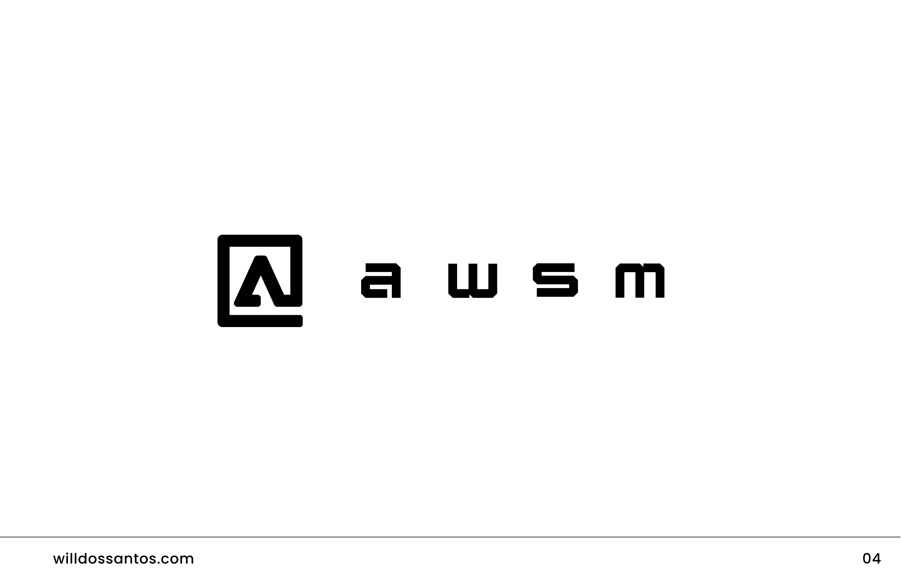
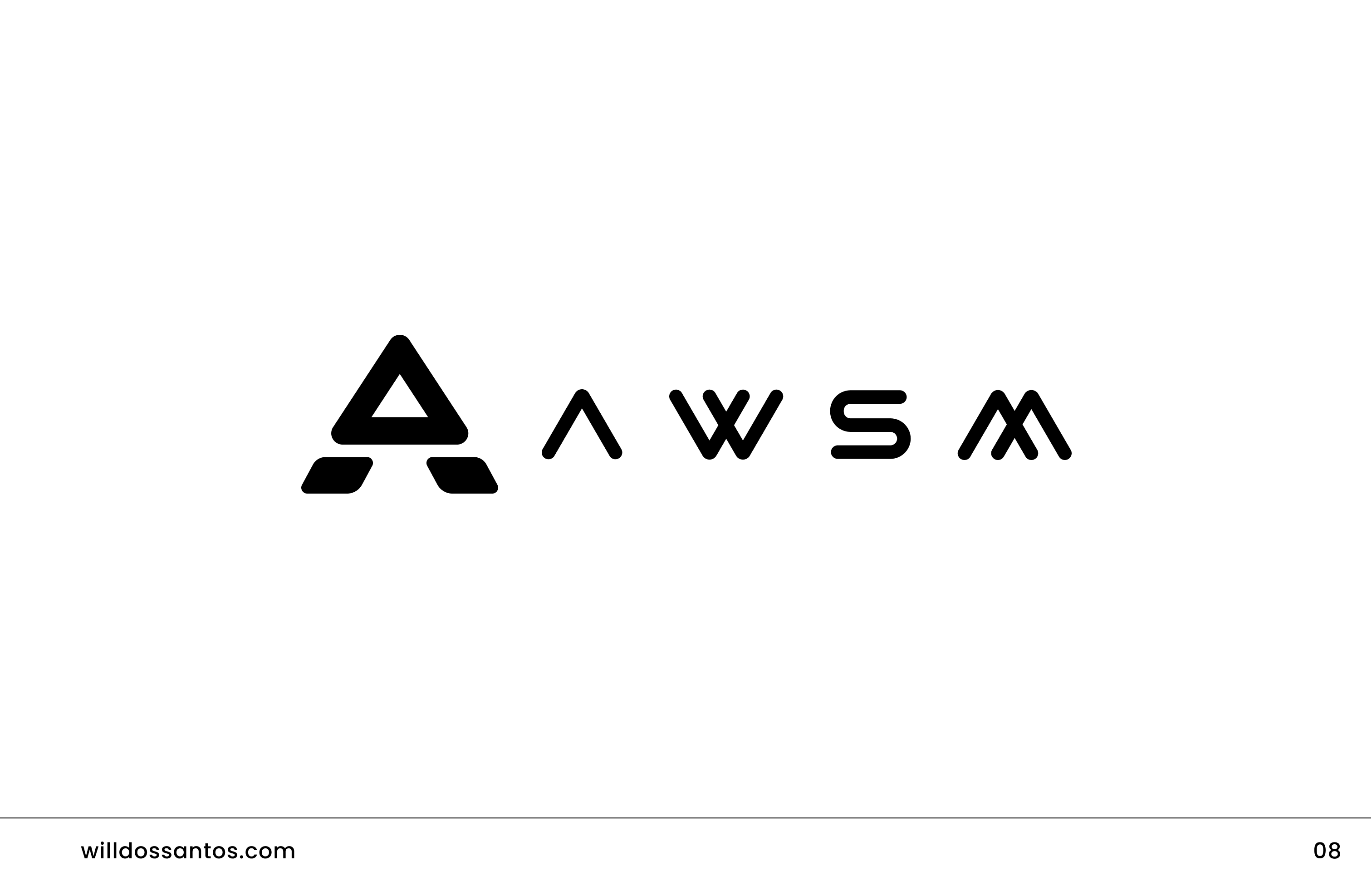
I began by sketching broad concepts around the core idea of “make it awesome.” Early explorations included wordmarks, geometric marks, and abstract symbols. I tested ideas with different weights, alignments, and typographic personalities.
- Logo Development
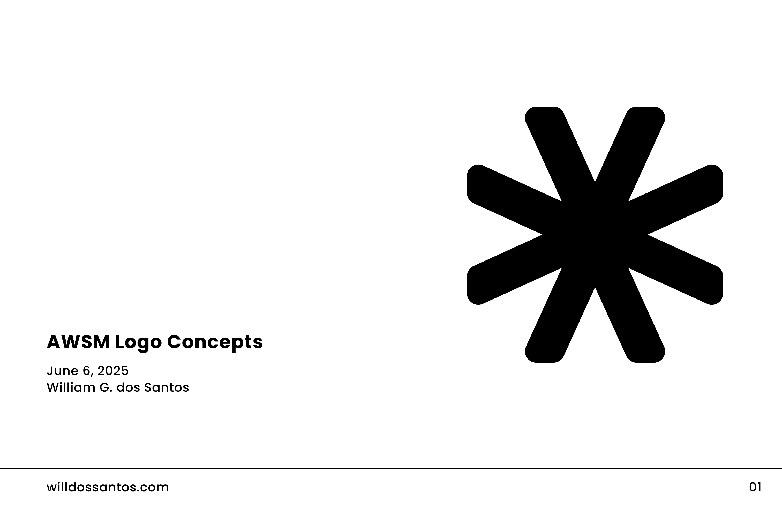
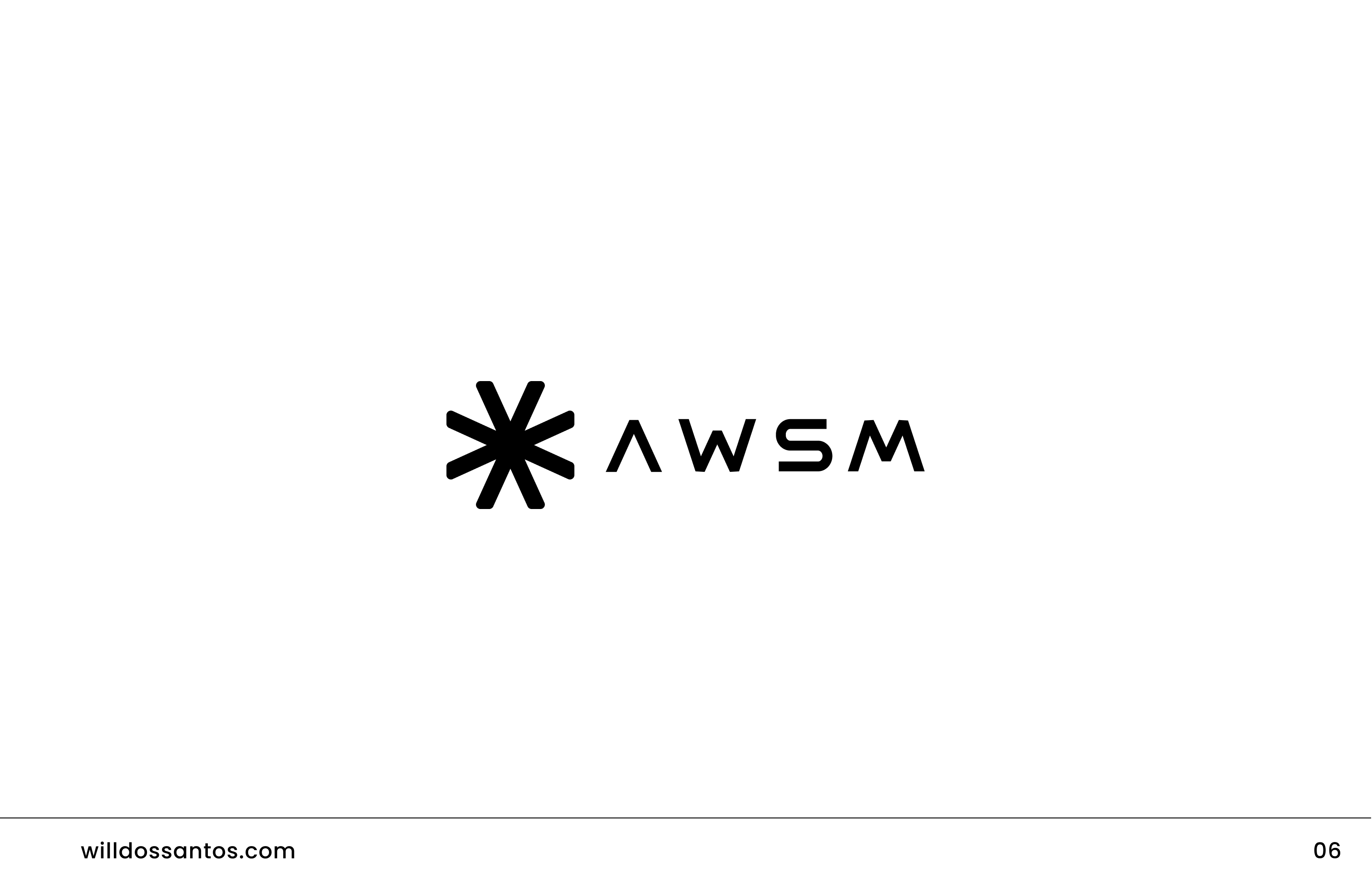
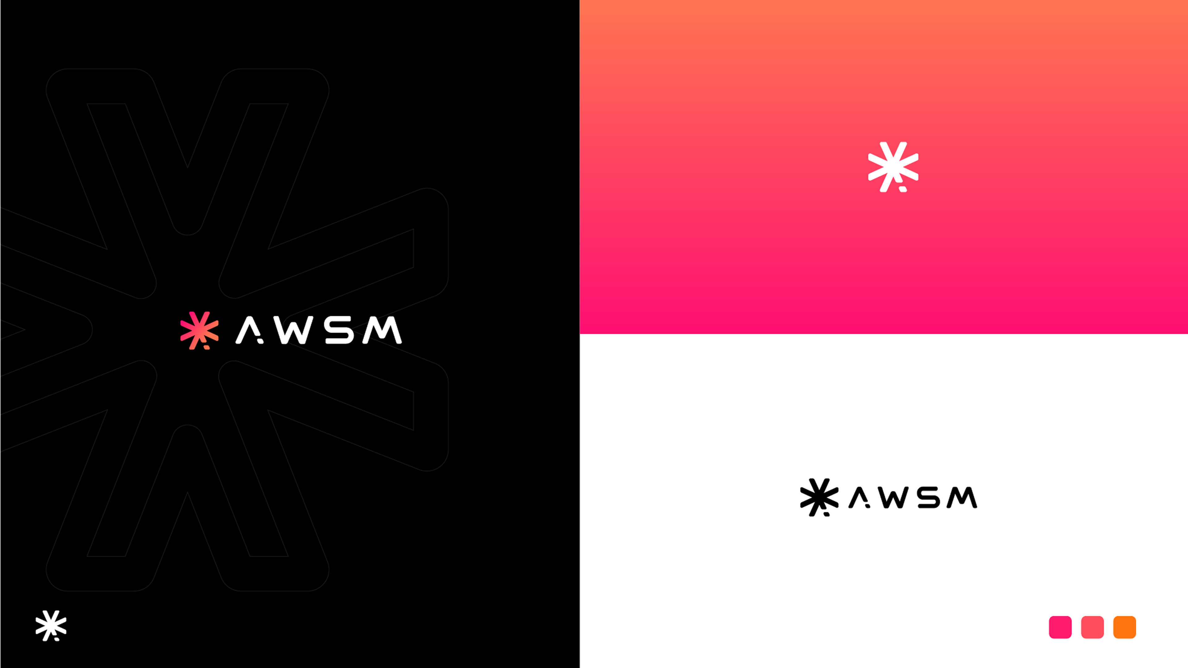
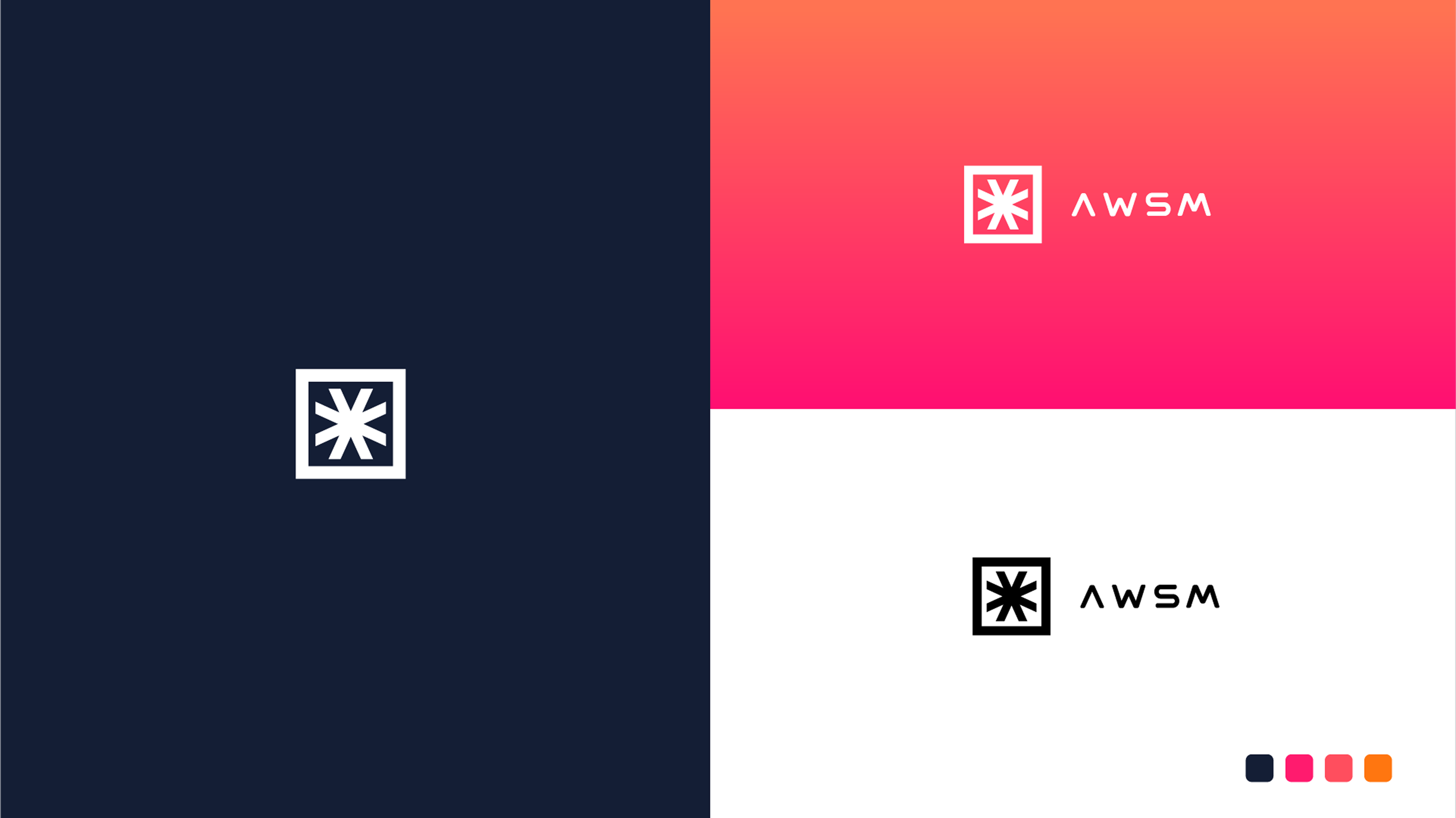
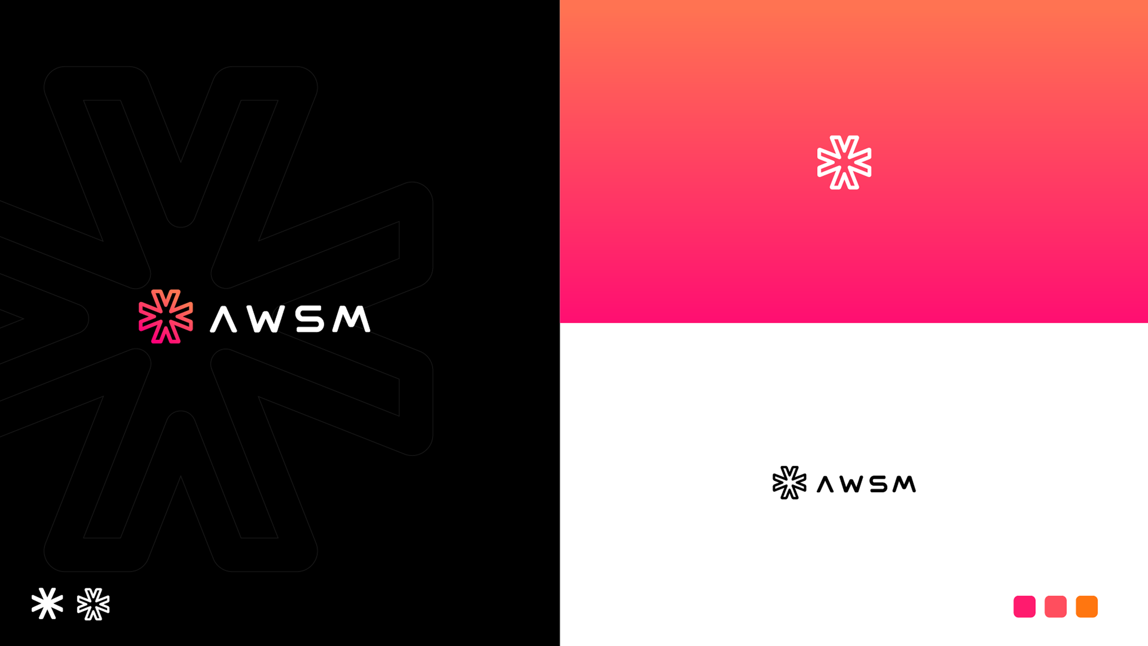
Through iterations, I refined the logomark into a radiating starburst / asterisk symbol — a bold form that conveys excitement, amplification, and possibility. Paired with a strong wordmark, it created a flexible lockup system.
-
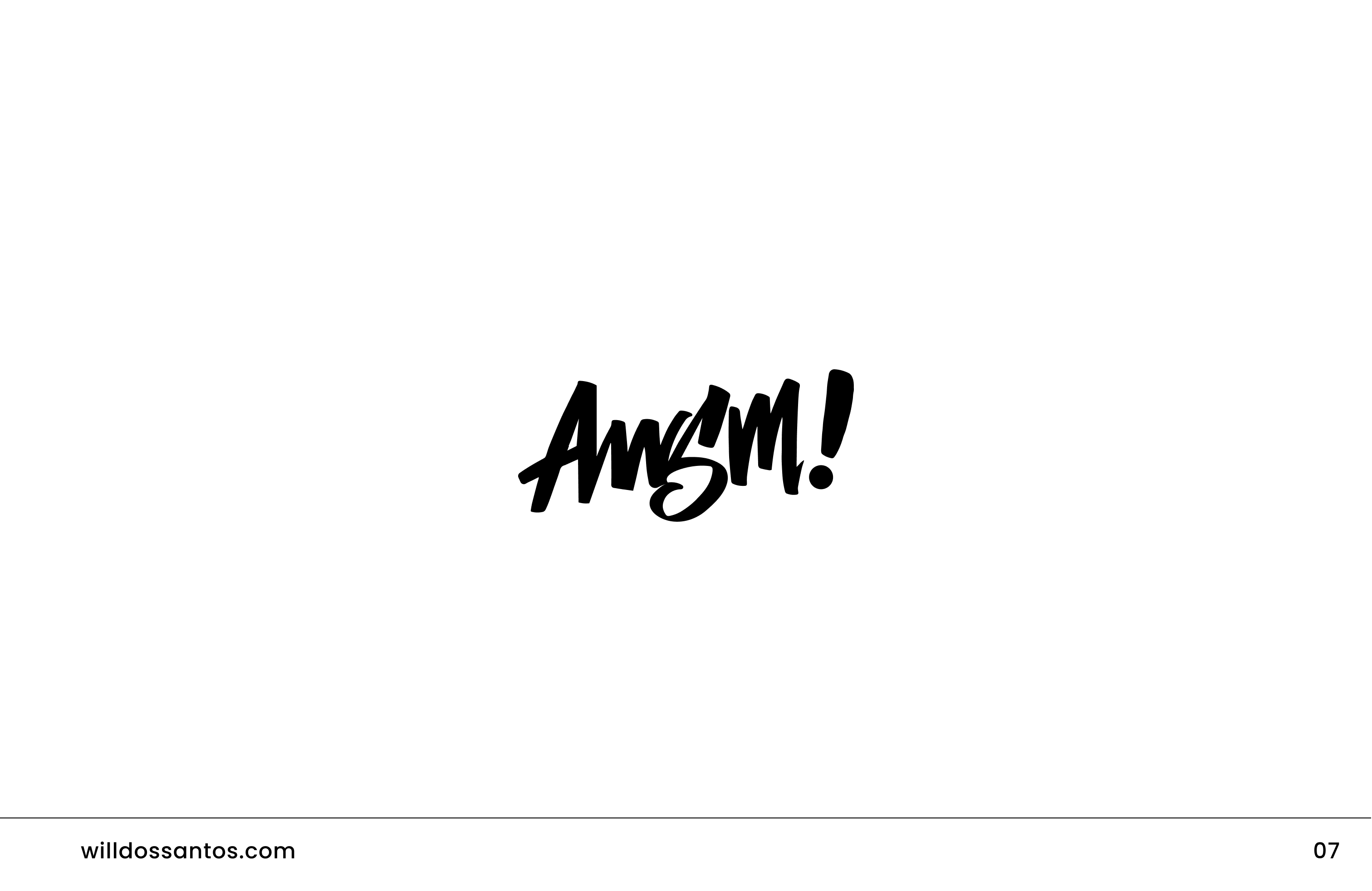
Explored variations of “AWSM” in all caps, lowercase, and stylized fonts.
-
Tested minimalist vs. expressive versions to see which resonated with the brand values.
-
Balanced the geometric precision of the mark with human-centered typography.
- Color & Typography
To push the energy of the brand, I selected a vibrant pink-to-orange gradient as a primary color treatment. It reflects momentum and creativity. Typography leaned toward modern sans-serifs, providing legibility and impact while pairing well with the energetic logo.
- Visual Extensions
-
Beyond the logo, I expanded the brand system with:
-
Tagline lockups: “MAKE IT AWESOME” in bold stacked forms.
-
Pattern systems: radiating star motifs as backgrounds.
-
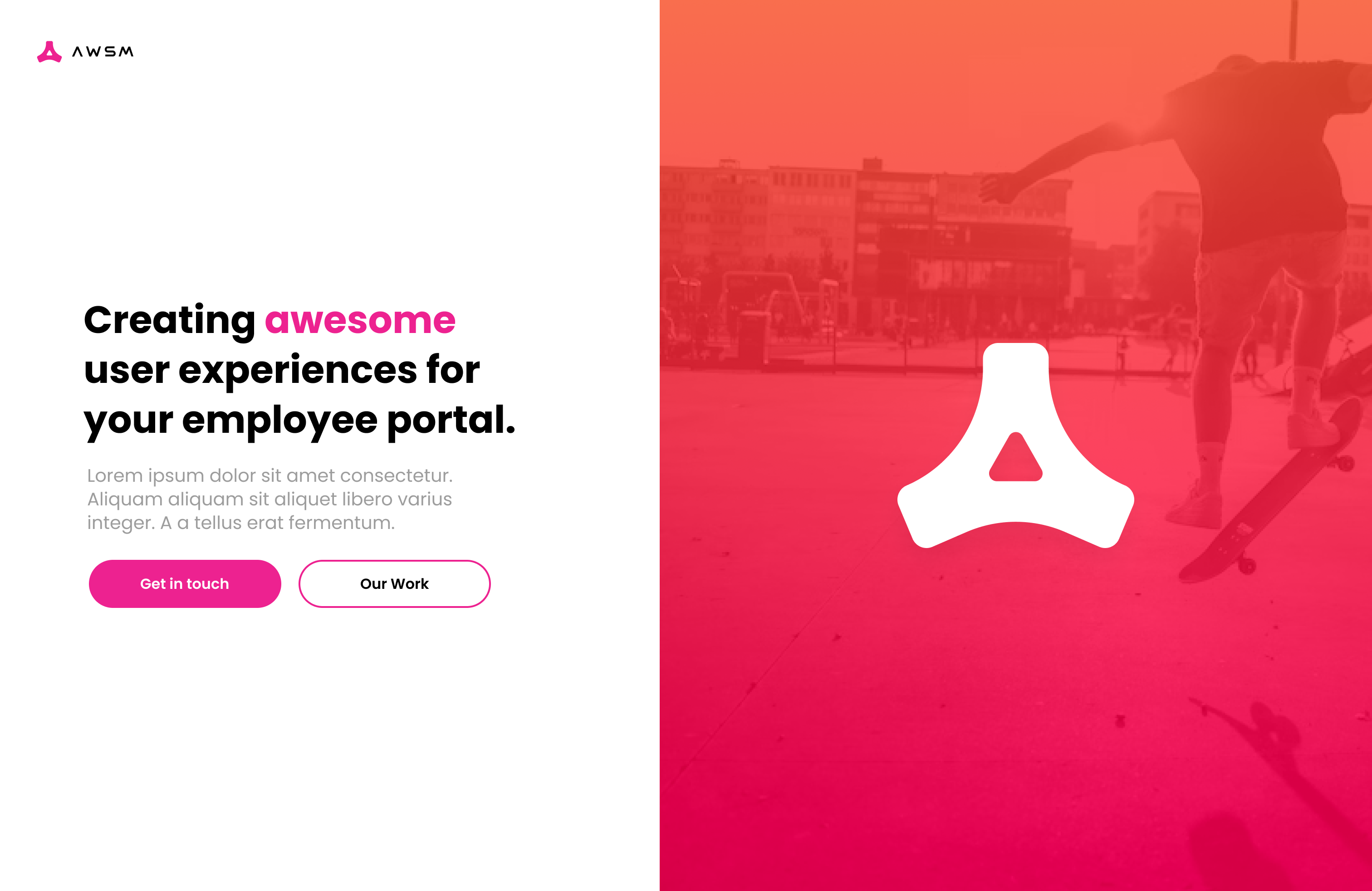
Dynamic applications: gradient overlays, cut-out photography inside the logomark, and vibrant product mockups.

Outcome
The final brand identity established Awesome as bold, energetic, and scalable. The design system:
-
Works seamlessly across digital, social, and product applications.
-
Creates instant recognition through the iconic starburst/asterisk mark.
-
Reinforces the message of energy, momentum, and making it awesome.
-
The result is a brand that doesn’t just look good — it communicates a mindset.
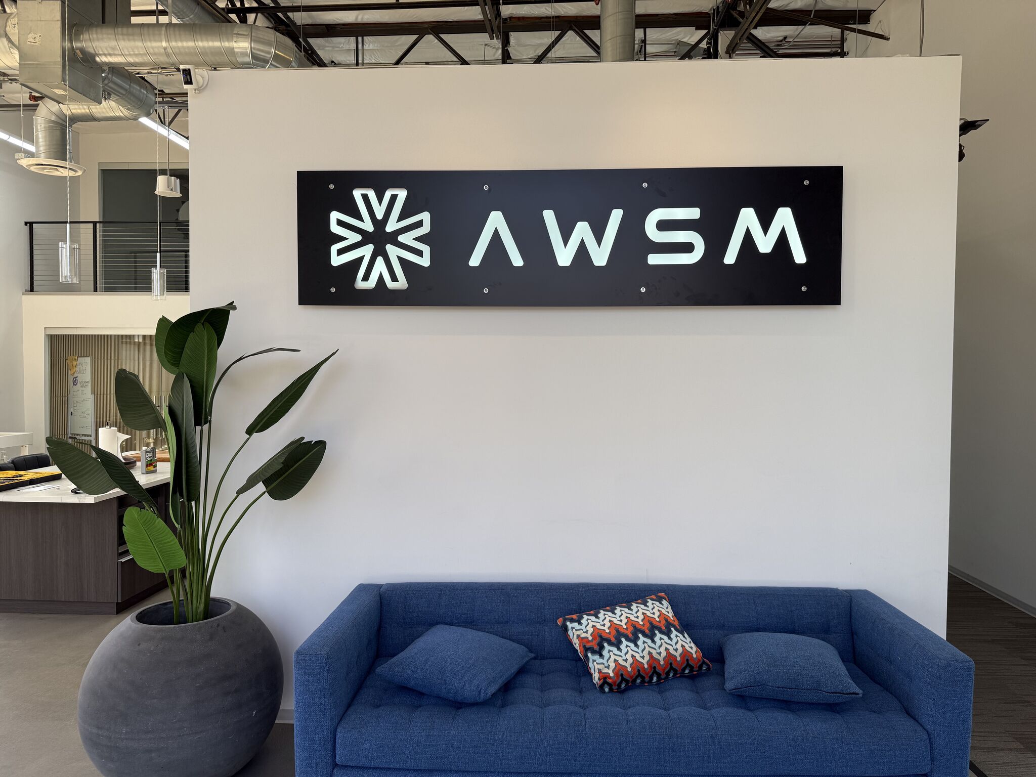
Great to see it in the office!
