UI Design - AVAX Gas Station
case studies
03/30/2025

Overview
Hypha’s Depot is the hub where users contribute towards Layer 1 gas fees and track their rewards. While the product was powerful, the previous design had usability challenges — crowded layouts, unclear hierarchy, and too much technical information competing for attention. My goal as Lead Designer was to create a cleaner, more intuitive interface that improves clarity, user trust, and engagement.
Challenge
The old Depot design made it difficult for users to quickly understand:
-
How much they had contributed.
-
What their rewards were.
-
Where to take action.
Information was technically correct, but the presentation lacked structure. Users needed a clearer information hierarchy, simpler navigation, and a more modern, trustworthy aesthetic.
Exploration & Ideation
I began by sketching broad concepts around the core idea of “make it awesome.” Early explorations included wordmarks, geometric marks, and abstract symbols. I tested ideas with different weights, alignments, and typographic personalities.
Logo Development
Through iterations, I refined the logomark into a radiating starburst / asterisk symbol — a bold form that conveys excitement, amplification, and possibility. Paired with a strong wordmark, it created a flexible lockup system.
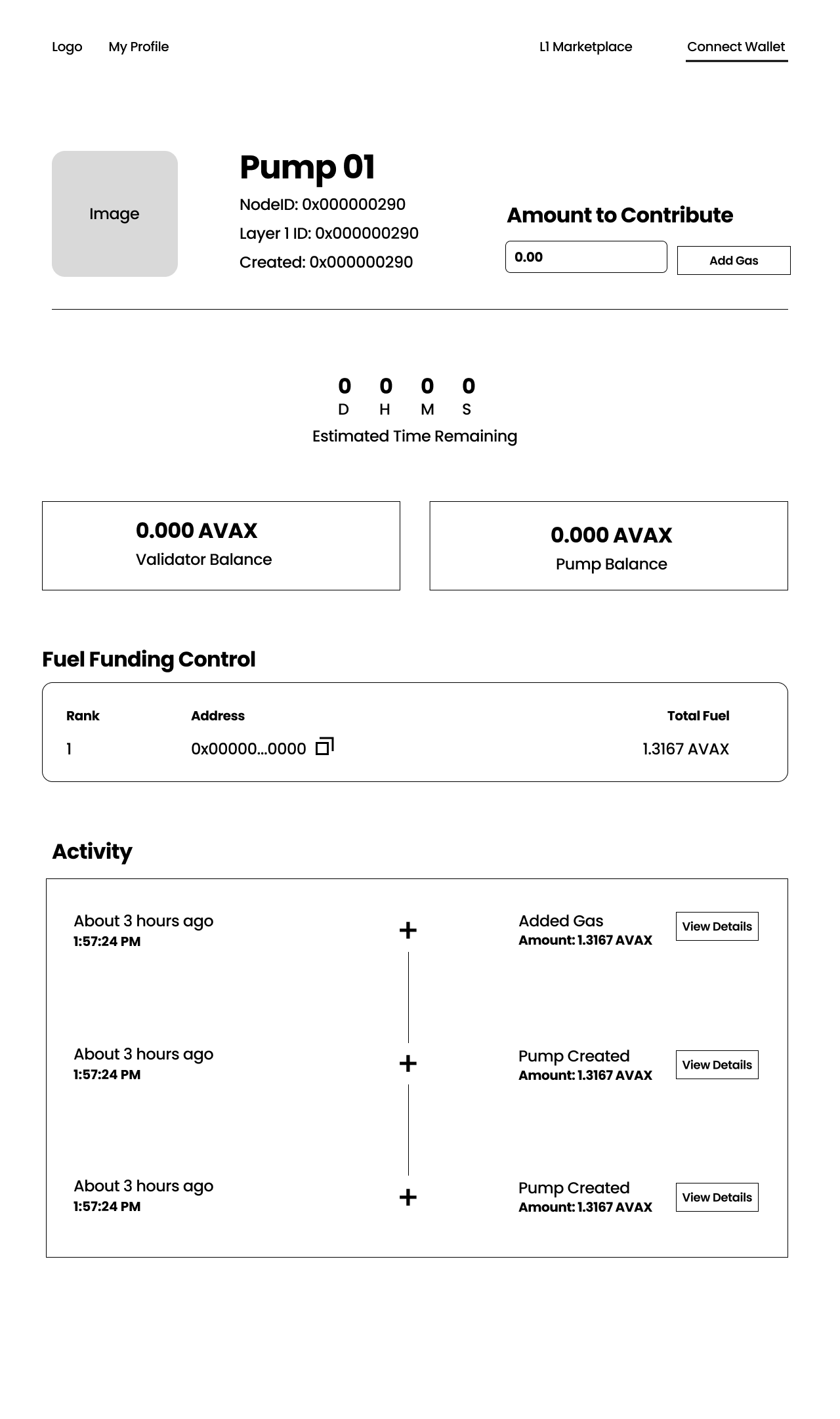
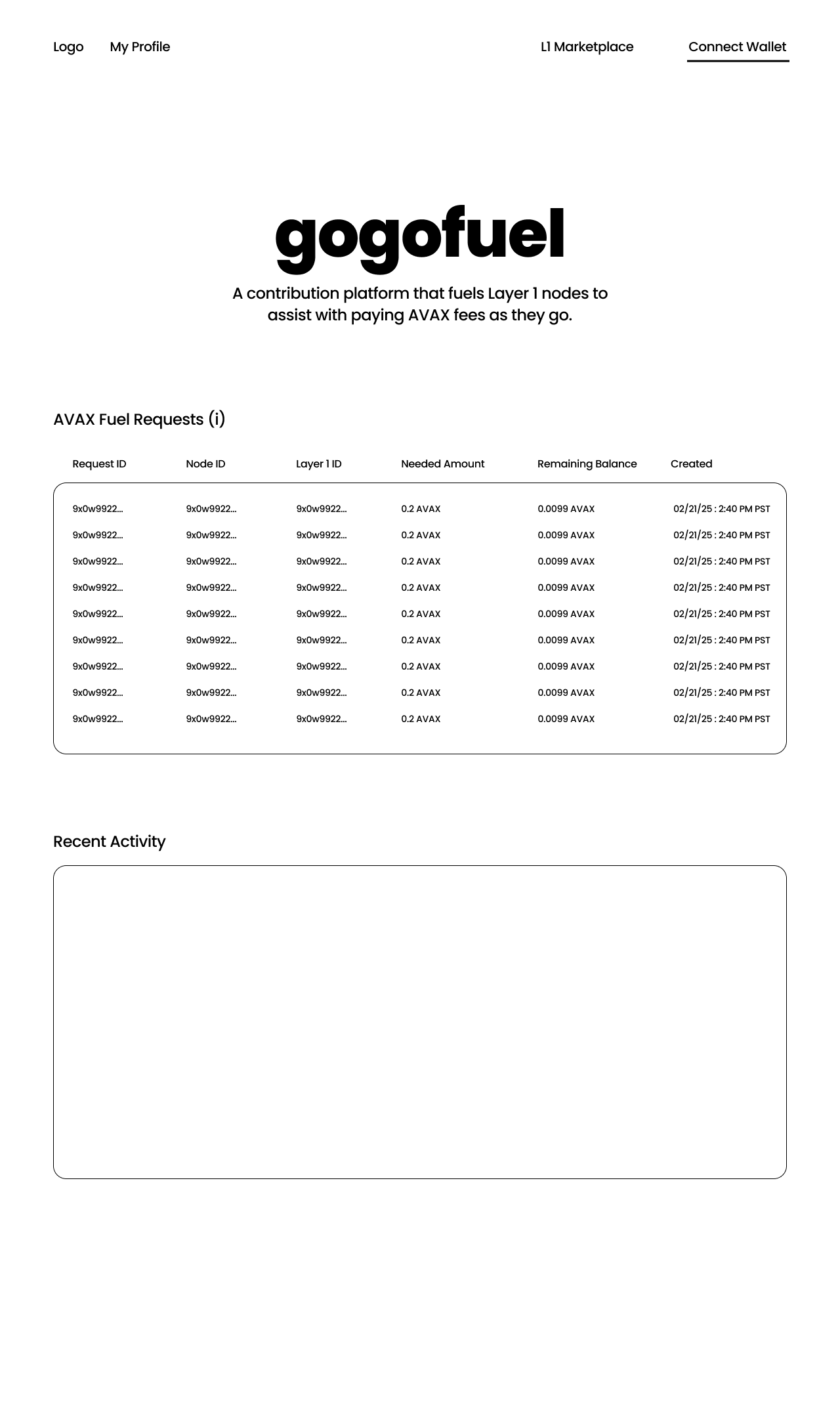
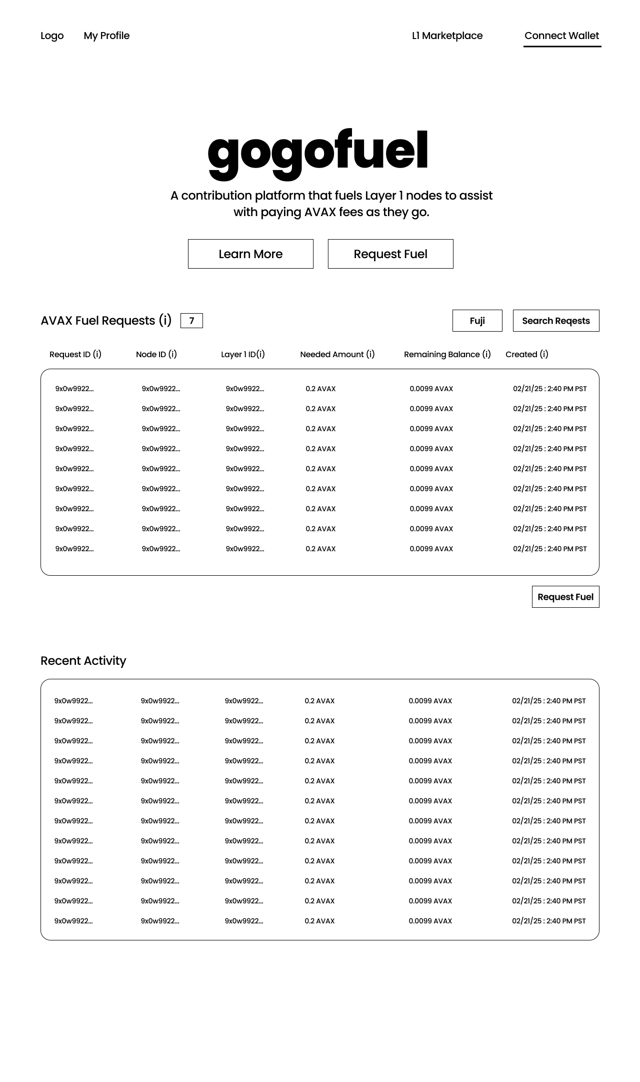
- Restructuring the Layout
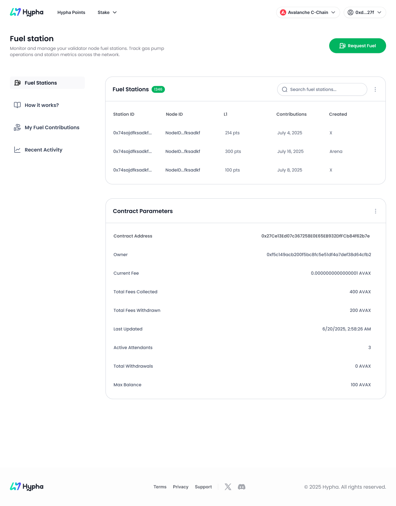
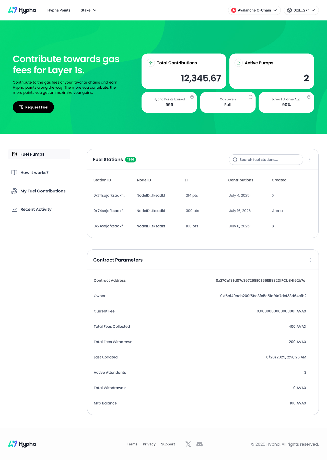
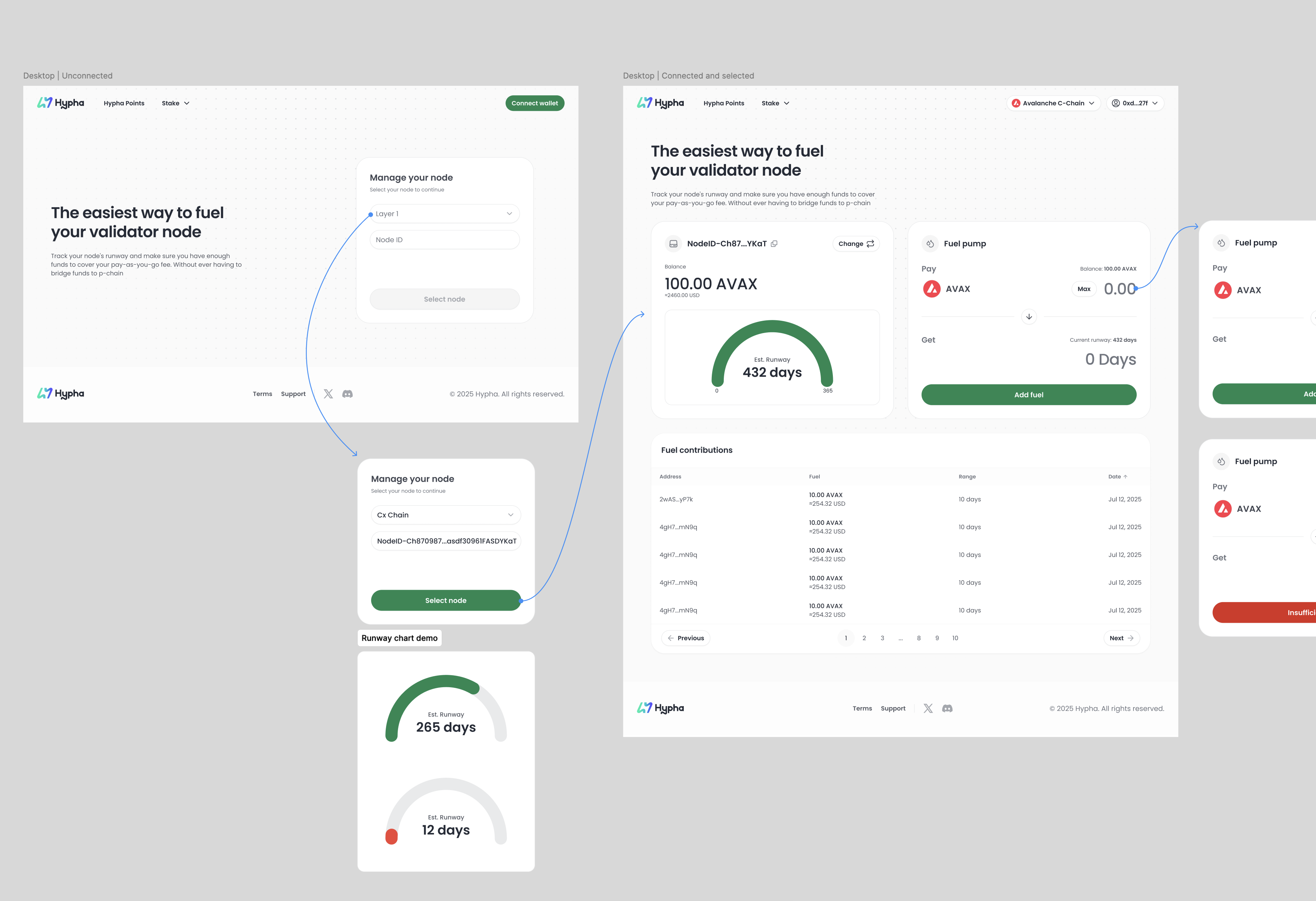
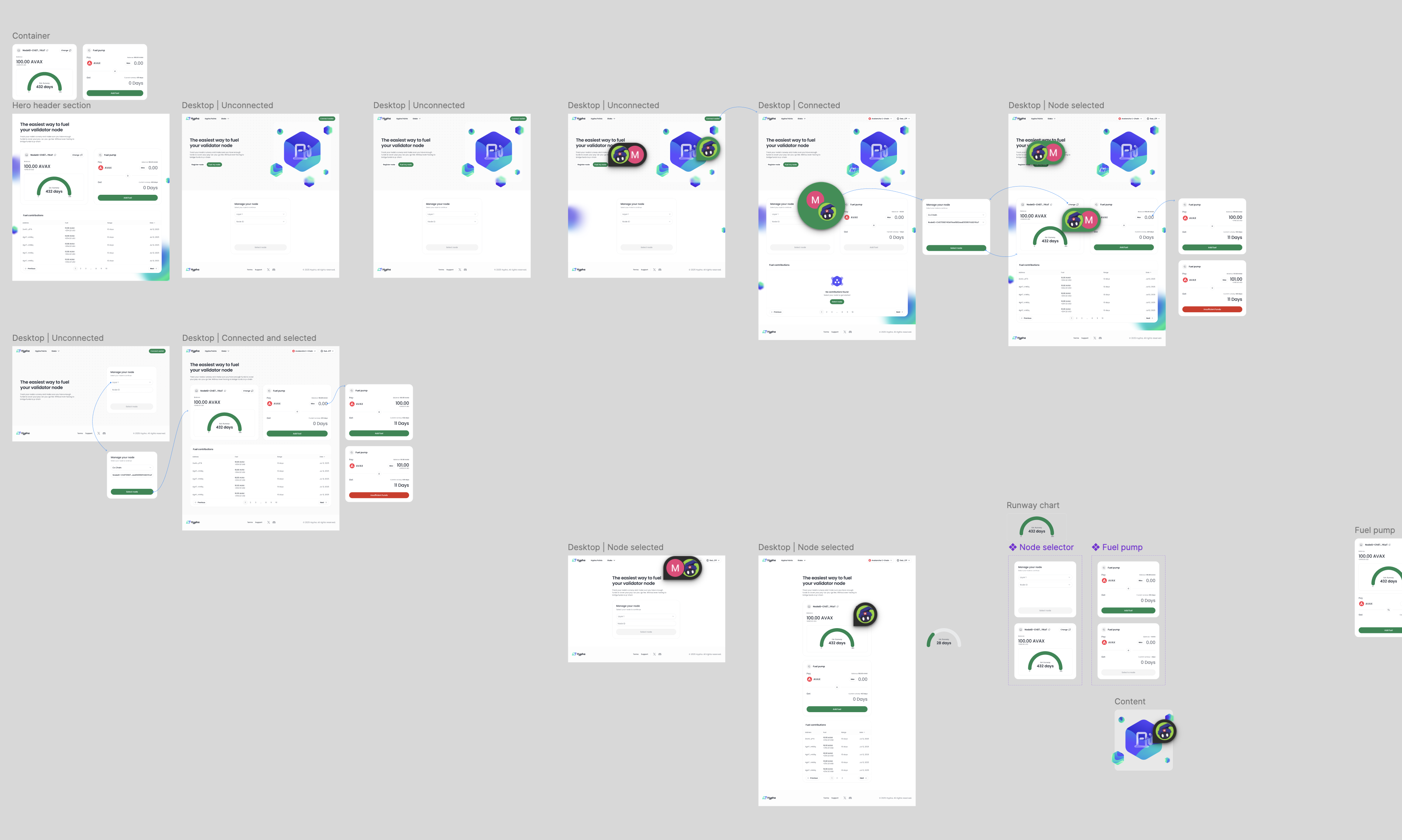
I introduced a two-tier hierarchy:
-
Dashboard Metrics (at a glance) → Total Contributions, Active Pumps, Hypha Points, Gas Levels, and Uptime. These give users immediate feedback without digging into tables.
-
Detailed Data (below) → Fuel Stations list and Contract Parameters, accessible when users want specifics.
-
This shift ensured new and experienced users both get value right away.
- Simplifying Navigation
The left sidebar consolidates actions into clear categories:
-
Fuel Pumps
-
How it Works
-
My Contributions
-
Recent Activity
This improves discoverability and reduces cognitive load.
- Cleaner Visual Language
-
Adopted a fresh green gradient in the hero section to reinforce growth and energy.
-
Designed card-style components with consistent spacing and typography for scannability.
-
Used icons and labels to make technical data more approachable.
- Improving Trust & Transparency
Blockchain users care deeply about trust. I emphasized transparency by:
-
Displaying contract parameters in a clean, legible table.
-
Highlighting transaction history in the Fuel Stations list with sortable/searchable data.
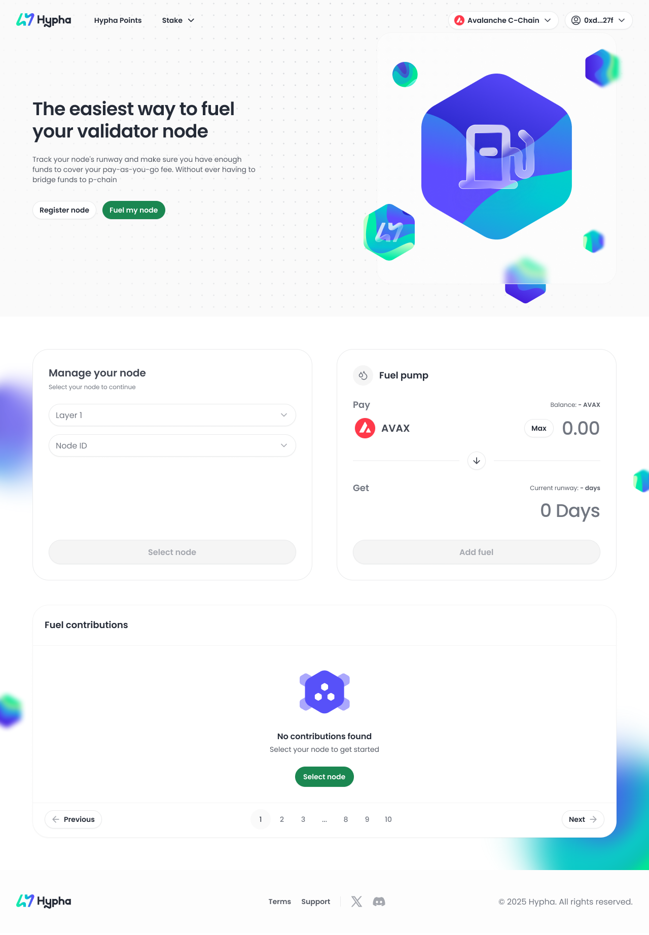
Outcome
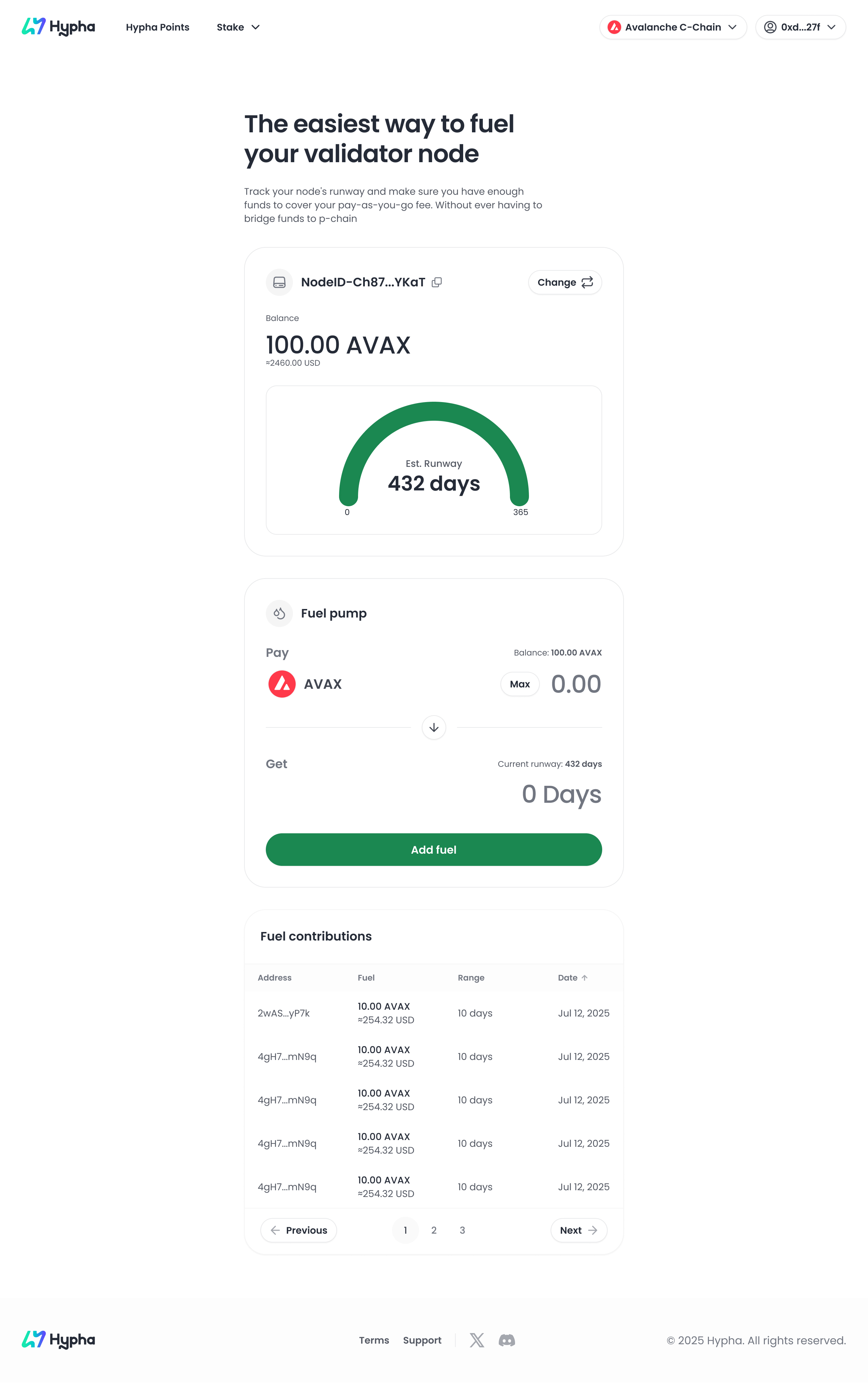
The redesign resulted in a cleaner, more user-friendly Depot that:
-
Makes contribution status and rewards immediately clear.
-
Reduces friction in navigation, guiding users smoothly through tasks.
-
Balances technical transparency with approachable design, strengthening user trust.
-
Sets a scalable design pattern for future Hypha products.
Key Takeaway
The new Depot design shows how thoughtful UI/UX can transform complex blockchain tools into approachable, engaging experiences. By focusing on hierarchy, clarity, and trust, I created a design system that not only looks cleaner but also improves how users interact with Hypha.