Planning Center People - Profile Page UX Redesign
UI & UX
01/16/2018

The Challenge
Planning Center People needed a UX refresh for profile pages across both mobile and desktop. The existing design had grown organically over time, leading to inconsistent patterns, unclear edit states, and information that wasn't optimally organized. The goal was to create a more intuitive, efficient, and visually cohesive experience for viewing and editing person profiles.
Understanding the User Needs
Before diving into design, we needed to understand how people actually use profile pages:
- Quick information access - Users need to find key details fast
- Easy editing - Making updates should be straightforward and clear
- Context awareness - The interface should adapt based on permissions and context
- Consistent patterns - Similar information should be presented similarly across the app
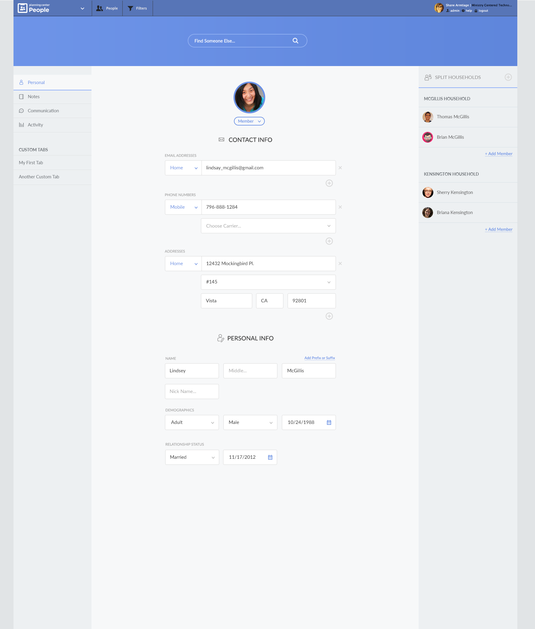
The Profile Page Redesign
The new profile design focuses on clear information hierarchy, intuitive edit states, and improved visual organization.
Key improvements:
- Clear visual hierarchy - Most important information is immediately visible
- Organized sections - Related information is grouped logically
- Improved spacing - Better use of whitespace for readability
- Consistent typography - Clear distinction between labels and values
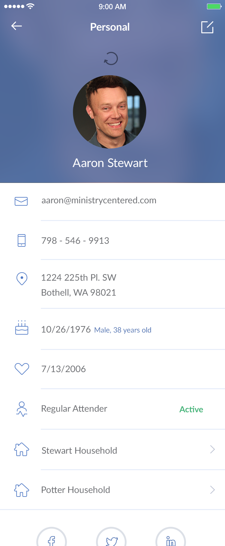
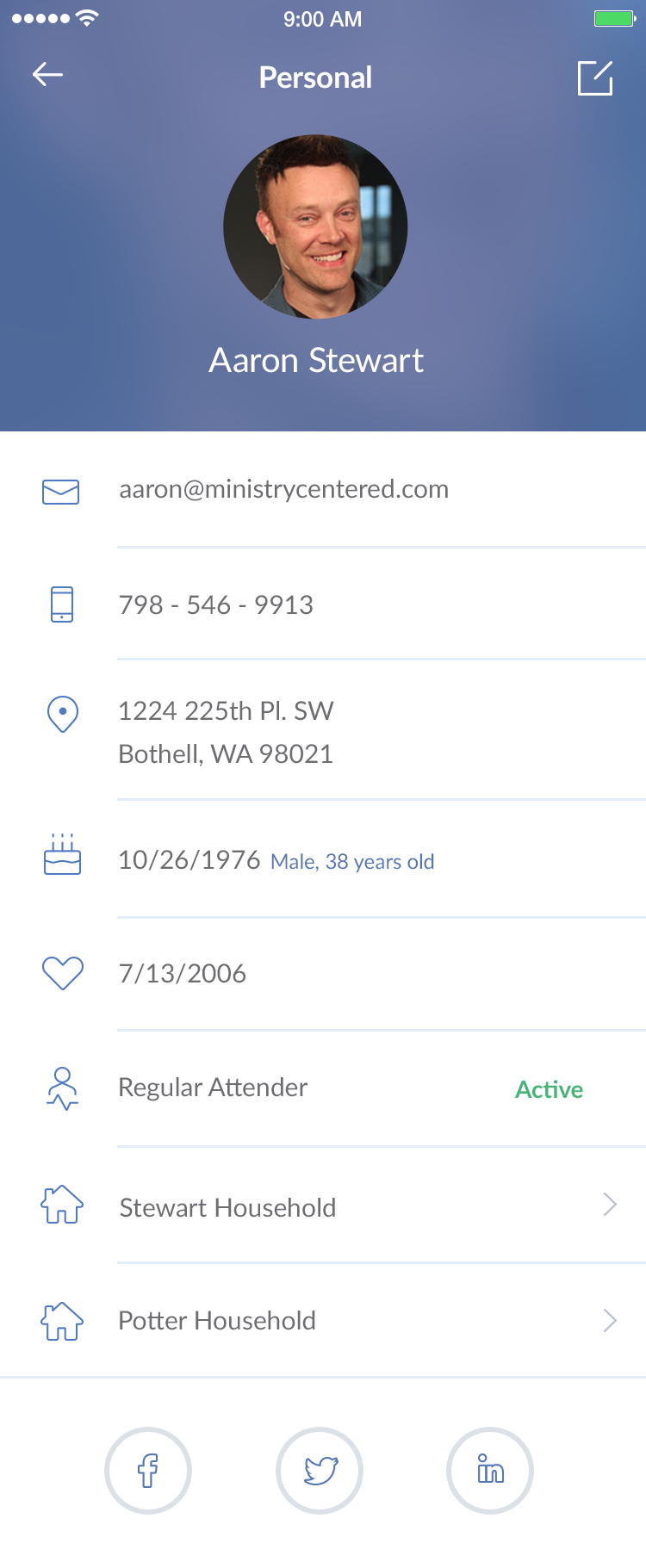
Mobile Profile Experience
Mobile profiles needed special attention due to limited screen space. The redesign prioritizes the most important information while maintaining easy access to details.
Mobile-specific enhancements:
- Pull-to-refresh - Natural gesture for updating profile information
- Optimized layout - Information organized for vertical scrolling
- Touch-friendly targets - Edit buttons and interactive elements sized appropriately
- Contextual actions - Quick actions available without navigation
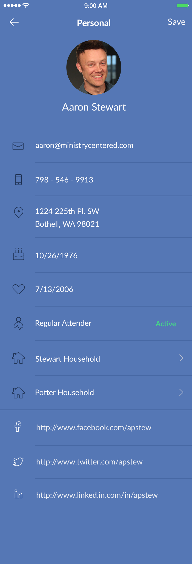
Edit States
One of the key challenges was making edit states clear and intuitive. Users need to know when they're in edit mode and what they can change.
The edit interface uses clear visual indicators:
- Distinct edit mode - Visual changes when entering edit mode
- Save/cancel actions - Clear paths for committing or discarding changes
- Field-level feedback - Immediate validation and error states
When edit mode is activated:
- Visual transformation - The interface clearly indicates edit state
- Focus on editable fields - Non-editable information is de-emphasized
- Clear action buttons - Save and cancel options are prominent
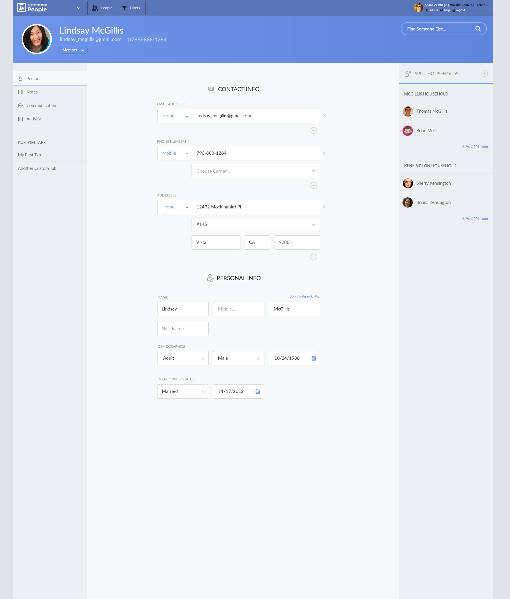
For users with edit permissions, some information can be edited inline without entering a dedicated edit mode. This reduces friction for quick updates while maintaining clear visual feedback.
Profile Editing Flow
The editing experience was redesigned to be more intuitive and less disruptive.
Improvements to the edit flow:
- Progressive disclosure - Only show relevant fields when editing
- Contextual help - Guidance appears when needed
- Validation feedback - Clear error messages and success states
- Efficient navigation - Easy to move between sections while editing
Design Principles Applied
1. Clarity Over Cleverness Every design decision prioritized making information easy to find and understand. We avoided unnecessary complexity in favor of straightforward patterns.
2. Progressive Disclosure Not all information needs to be visible at once. The design reveals details progressively, keeping the interface clean while maintaining access to everything.
3. Consistent Patterns Similar information is presented consistently across the app. Once users learn one pattern, they can apply that knowledge elsewhere.
4. Contextual Actions Actions are available when and where they make sense. Edit buttons appear when users have permission, and actions are grouped logically.
5. Mobile-First Thinking While the design works on all screen sizes, mobile constraints informed many decisions. This ensured the experience works well on the smallest screens.
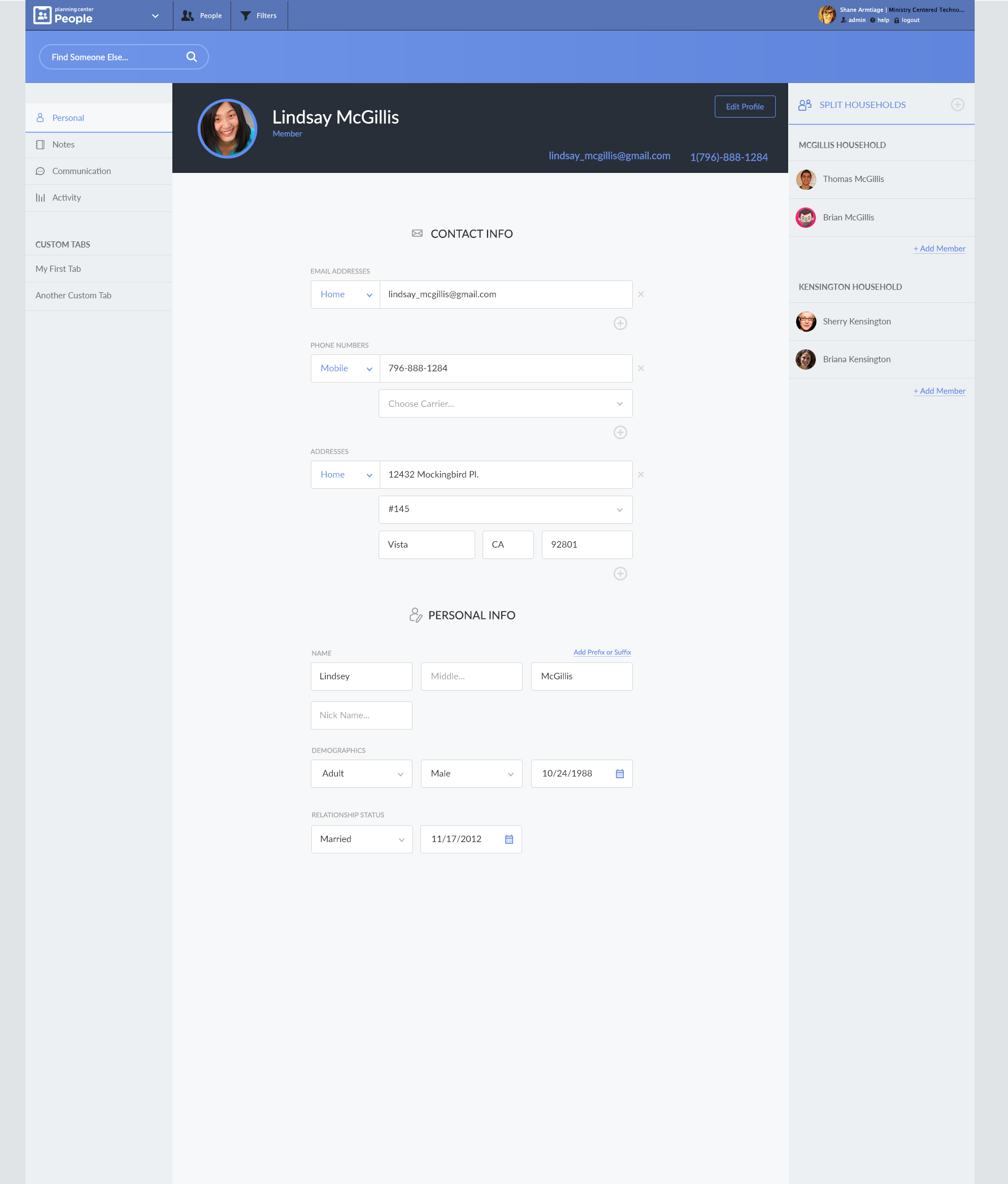
Information Architecture
The profile page was reorganized to group related information:
- Primary information - Name, photo, and key identifiers at the top
- Contact details - Phone, email, and address grouped together
- Personal information - Demographics and personal details in a dedicated section
- Activity and history - Recent changes and activity logs
- Permissions and settings - Access controls and preferences
Visual Design Updates
The visual design was refined to be more modern and consistent:
- Updated typography - Clear hierarchy with appropriate font sizes and weights
- Improved spacing - Better use of whitespace for breathing room
- Consistent colors - Color used purposefully for status, actions, and hierarchy
- Refined icons - Icons that are clear and consistent with the design system
User Testing & Iteration
Throughout the design process, we tested with real users:
- Task completion - Can users find and edit information quickly?
- Error recovery - What happens when users make mistakes?
- Permission clarity - Do users understand what they can and can't edit?
- Mobile usability - Does the mobile experience work well on real devices?
Feedback from testing informed multiple iterations, ensuring the final design met user needs effectively.
Implementation Considerations
The redesign needed to work within Planning Center's existing technical constraints:
- Backward compatibility - Existing data structures and APIs
- Performance - Fast loading and smooth interactions
- Accessibility - Support for screen readers and keyboard navigation
- Responsive design - Works across all device sizes
Results
The redesigned profile pages provide:
- Faster information access - Users find what they need more quickly
- Clearer edit states - No confusion about when and how to make changes
- Better mobile experience - Optimized for touch interactions
- Improved consistency - Patterns that work across the application
- Enhanced usability - Fewer clicks and less cognitive load
Lessons Learned
This redesign reinforced several important principles:
- Start with user needs - Understanding how people actually use the interface is crucial
- Test early and often - User feedback revealed issues we wouldn't have caught otherwise
- Balance consistency with context - Patterns should be consistent but adaptable
- Mobile constraints inform desktop - Designing for mobile first often improves desktop too
- Edit states are critical - Clear visual feedback prevents user errors
The Planning Center People profile page redesign demonstrates how thoughtful UX improvements can make complex interfaces feel simple and intuitive. By focusing on clarity, consistency, and user needs, we created an experience that's both more functional and more enjoyable to use.