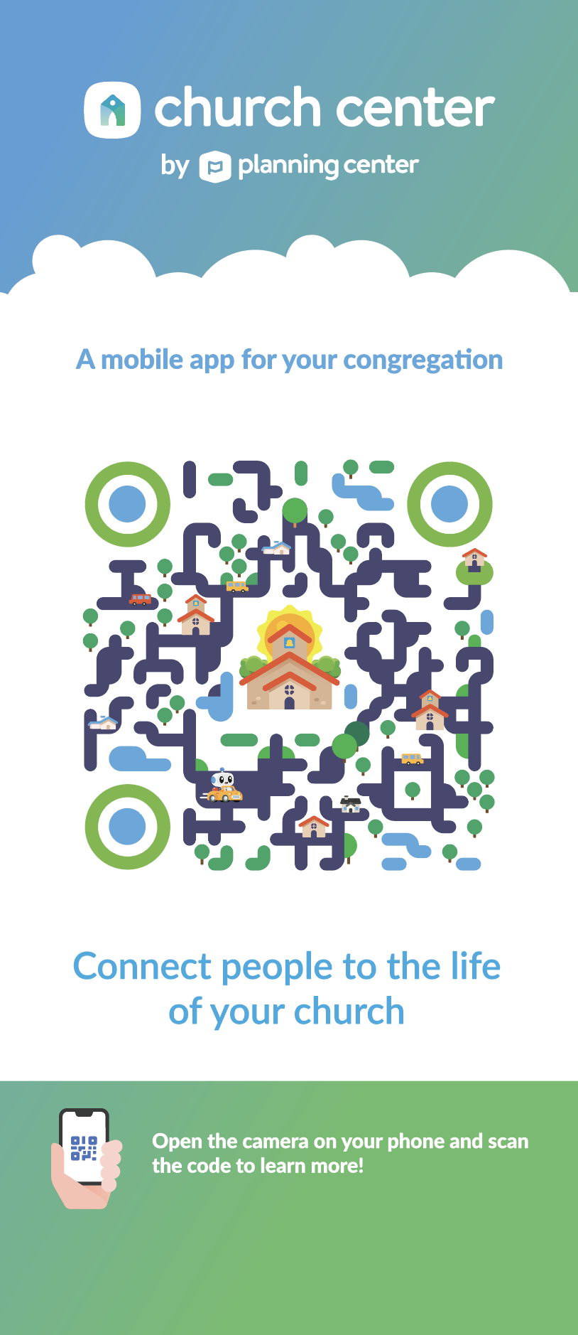
Designing QR Codes with Style (That Still Work)
UI & UX, design
01/16/2025

The QR Code Design Challenge
QR codes are everywhere—from restaurant menus to product packaging, event tickets to marketing materials. But let's be honest: the standard black-and-white checkerboard pattern isn't exactly inspiring. The challenge is creating QR codes that are both visually appealing and still scannable by any device.
The good news? You have more creative freedom than you might think. The key is understanding what you can modify without breaking functionality.

Understanding QR Code Structure
Before you start designing, it's important to understand how QR codes work:
Critical Elements (Don't Touch These)
- Position markers (the three corner squares) - These help scanners orient the code
- Timing patterns - Horizontal and vertical lines that help scanners align
- Alignment patterns - Smaller squares that assist with correction
- Quiet zone - The white border around the code (minimum 4 modules)
What You CAN Modify
- Colors (as long as there's sufficient contrast)
- Corner marker styling (rounded corners, gradients, etc.)
- Background patterns and textures
- Logo placement in the center
- Overall shape and styling
Design Principles for Functional QR Codes
1. Maintain High Contrast The most important rule: ensure your QR code has enough contrast between light and dark areas. Most scanners need at least a 60% contrast ratio. Black on white is safest, but dark colors on light backgrounds work too.
2. Preserve the Quiet Zone Always maintain a minimum 4-module quiet zone around your QR code. This white space is essential for scanners to detect the code's boundaries.
3. Don't Over-Modify Position Markers The three corner squares are critical for orientation. You can round their corners slightly or add gradients, but don't obscure their basic square shape or the 7x7 module pattern inside them.
4. Error Correction is Your Friend Use a higher error correction level (H or Q) when adding logos or styling. This gives scanners more data redundancy to work with if some modules are obscured.
5. Test, Test, Test Always test your styled QR code with multiple devices and scanning apps. What works on one phone might not work on another.

Styling Techniques That Work
Color Variations
- Use brand colors instead of pure black and white
- Ensure dark colors are dark enough and light colors are light enough
- Consider using gradients, but maintain clear distinction between light and dark areas
Rounded Corners
- You can round the corners of individual modules slightly
- Round the outer corners of position markers
- Don't round so much that modules become circles—they need to remain recognizable as squares
Logo Integration
- Place logos in the center (where error correction helps)
- Keep logos small (typically 15-30% of the QR code size)
- Ensure the logo doesn't interfere with critical alignment patterns
- Use high error correction levels when adding logos
Background Patterns
- Subtle textures or patterns can work if they don't interfere with scanning
- Avoid patterns that create false module detection
- Keep backgrounds light if the code is dark, or dark if the code is light
Common Mistakes to Avoid
1. Too Much Styling Over-styling can break functionality. If scanners can't read it, the design doesn't matter.
2. Insufficient Contrast Low contrast makes scanning difficult or impossible. Always prioritize readability.
3. Obscuring Critical Elements Don't cover position markers, timing patterns, or alignment patterns with logos or graphics.
4. Ignoring the Quiet Zone Cramming the QR code too close to other elements makes it harder to scan.
5. Not Testing What looks good in design software might not scan in real life. Always test with actual devices.
Best Practices
- Start with a standard QR code - Generate a clean, functional code first
- Apply styling incrementally - Add one design element at a time and test
- Use appropriate error correction - Higher levels (H or Q) for more styling
- Maintain module clarity - Each square should be clearly identifiable
- Consider context - Design for where the QR code will be used (print, screen, etc.)
Tools and Resources
Several tools can help you create styled QR codes:
- QR code generators with styling options
- Design software (Figma, Illustrator) for manual styling
- Online QR code testers to verify functionality
The Bottom Line
Designing stylish QR codes is absolutely possible, but functionality must come first. The best styled QR codes are those that enhance your brand while remaining instantly scannable. When in doubt, test with real devices and real users. A beautiful QR code that doesn't scan is worse than a plain one that works perfectly.
Remember: the goal is to make QR codes that people want to scan, not just ones that look good in a design portfolio. Balance aesthetics with functionality, and you'll create QR codes that are both beautiful and effective.