Planning Center Services - 2014 Mobile UI Reflection
UI & UX
06/15/2014
Reflecting on 2014 Mobile Design
Looking back at work from over a decade ago is always an interesting exercise. This is a reflection on the mobile UI designs I created for Planning Center Services in 2014—a time when mobile design patterns were still being established, iOS 7 had just introduced flat design, and responsive design was becoming the standard.
The Context of 2014
In 2014, mobile app design was in a fascinating transitional period. Apple had just released iOS 7 the previous year, completely overhauling their visual language from skeuomorphic to flat design. The industry was still figuring out what "modern" mobile UI meant, and we were all learning together.
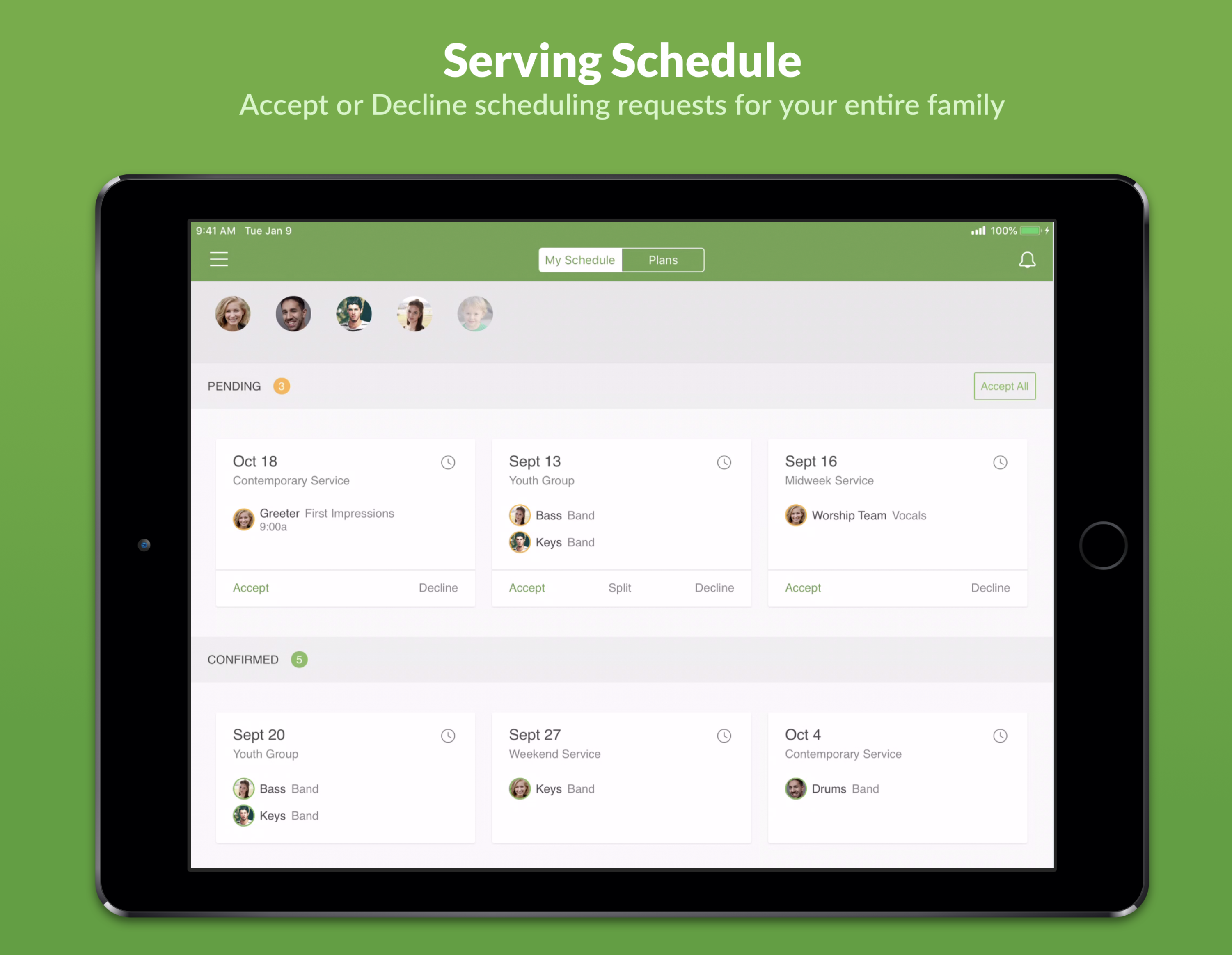
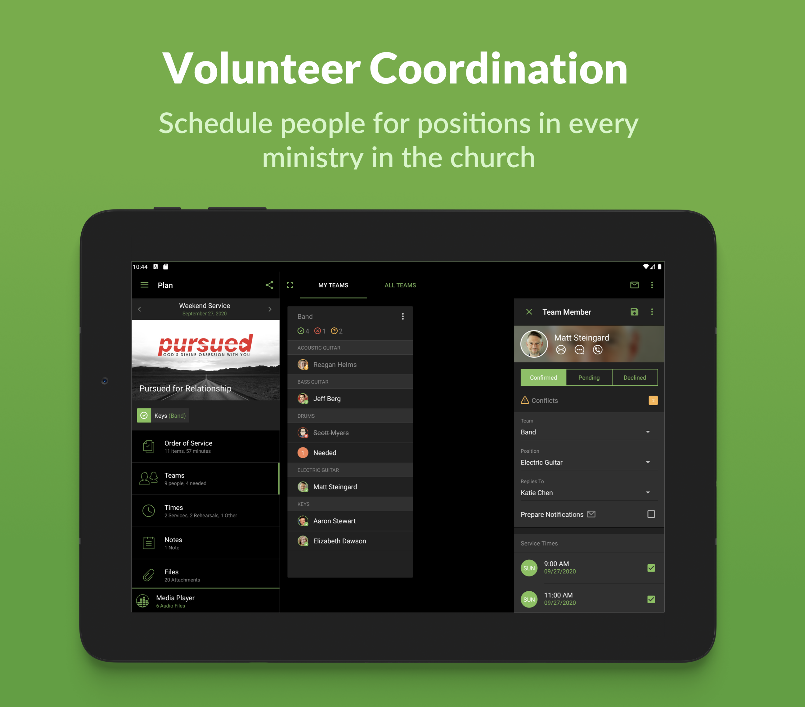
Planning Center Services was already a mature web product at this point, but the mobile experience needed constant refinement. Users—church volunteers, worship leaders, and ministry coordinators—needed to access their schedules, plans, and resources on the go, and the experience had to be both beautiful and functional.
Design Approach
My approach to these designs focused on clarity and hierarchy. The mobile screen real estate was precious, and every pixel had to earn its place. I worked to create interfaces that were:
- Clean and minimal: Following the flat design trends of the era while maintaining usability
- Information-dense but scannable: Volunteers needed to quickly find their assignments and schedules
- Touch-friendly: Designing for fingers, not cursors
- Consistent with Planning Center's brand: Maintaining the friendly, approachable feel the product was known for
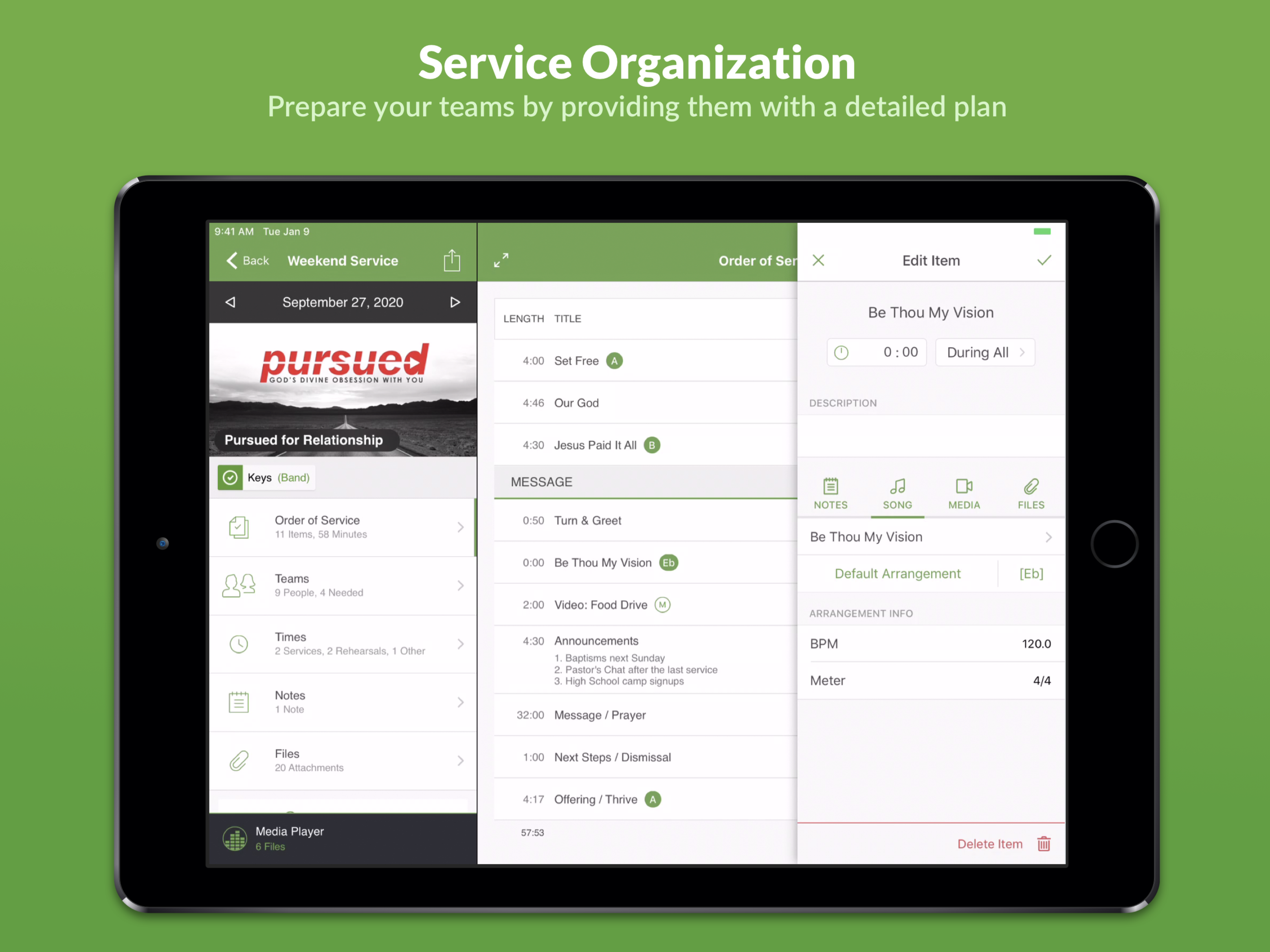
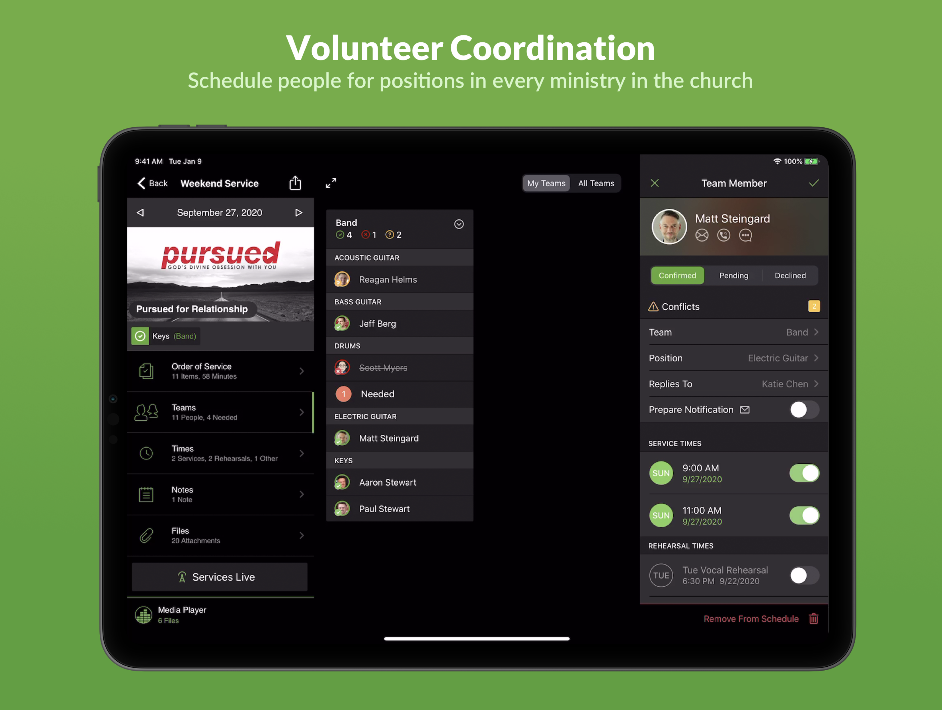
Key Screens and Flows
These designs covered essential mobile flows including schedule views, plan details, and team coordination interfaces. Each screen was carefully considered to show the right amount of information at the right time.
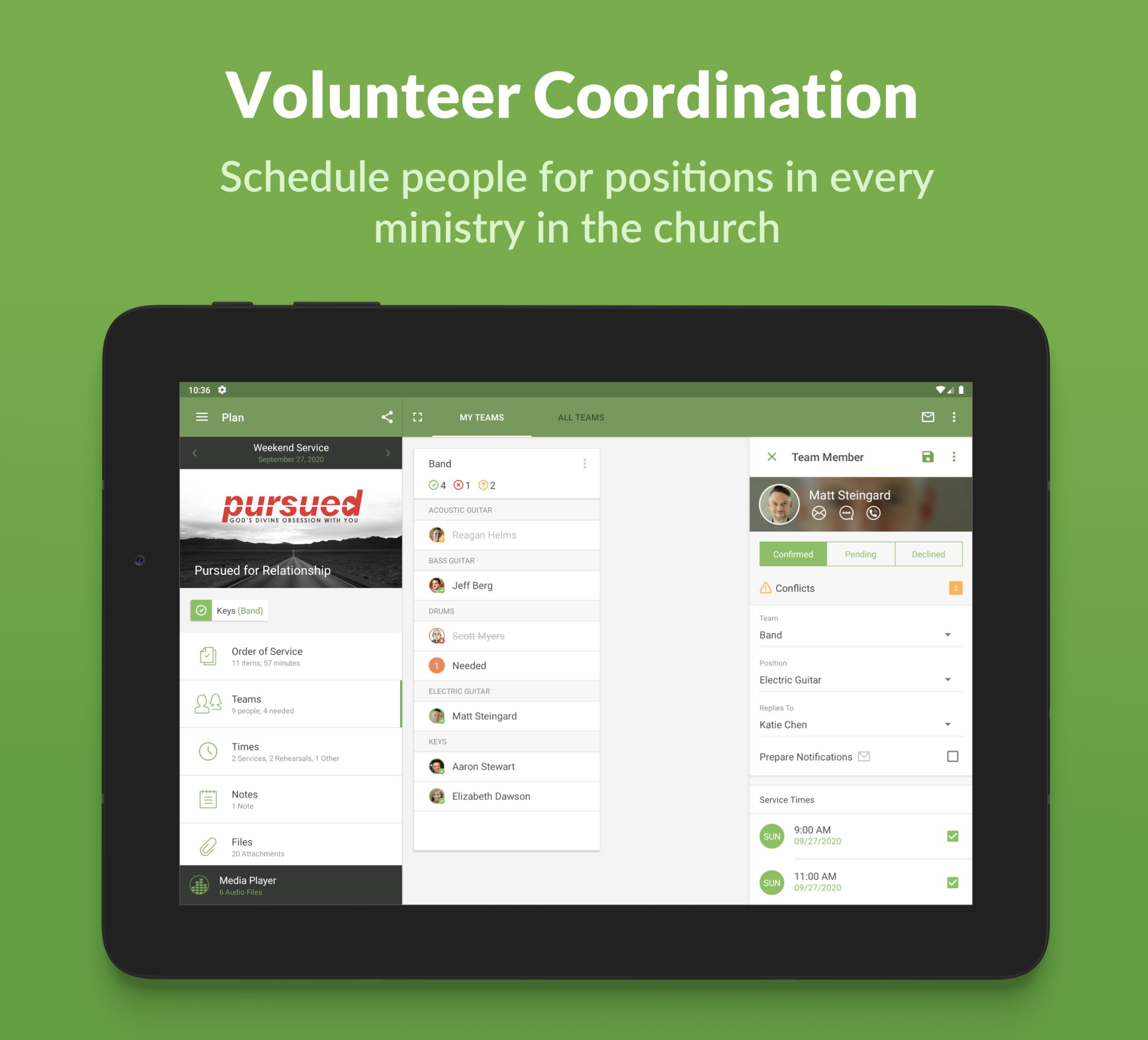
The navigation patterns I used here reflect what was working well in 2014—tab bars for primary navigation, clear back buttons, and modal presentations for focused tasks. These conventions have largely stood the test of time.
What I'd Do Differently Today
Looking back with the benefit of over 10 years of experience and evolution in mobile design:
- Better use of white space: I was probably cramming a bit too much information in some views
- More thoughtful typography hierarchy: The type scales could have been bolder in places
- Enhanced accessibility: We didn't talk about accessibility as much in 2014 as we do now
- Dark mode consideration: Something we weren't thinking about at all back then
That said, I'm proud of these designs. They solved real problems for real users and represented thoughtful, careful work.
The Value of Reflection
There's tremendous value in looking back at past work. It's easy to be critical of older designs, but it's more valuable to appreciate the context in which they were created and to recognize the growth that's happened since.
These 2014 designs represent a snapshot of mobile design at a specific moment in time—both for the industry and for me personally. They capture the challenges we were solving, the constraints we were working within, and the care we put into creating tools that served church communities around the world.
The best part? Many of the core principles I applied then—clarity, hierarchy, user-centered thinking—are still at the heart of how I approach design today.