Logo Branding - ShareLogic
case studies
07/20/2025

Overview
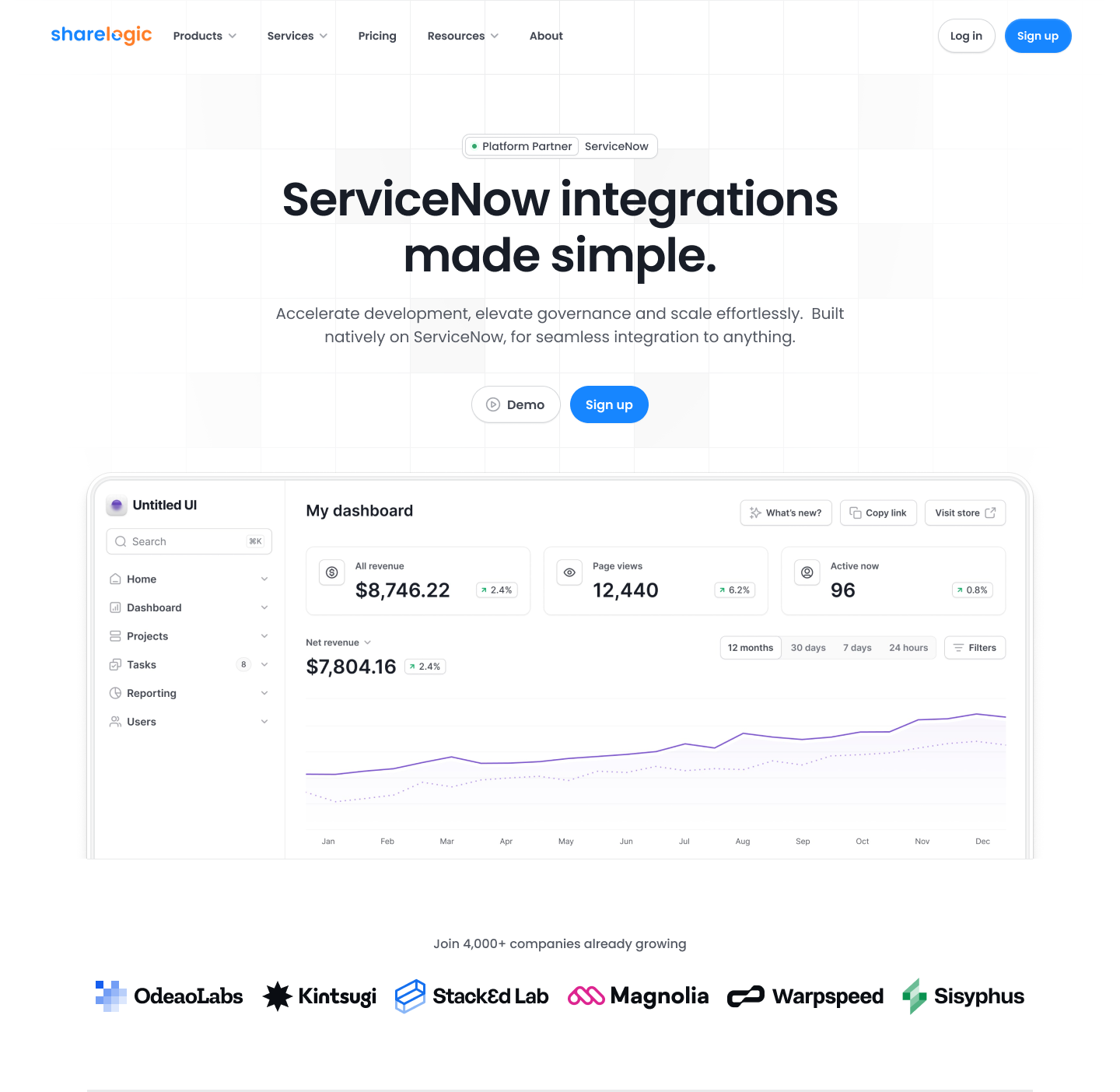
ShareLogic is a data-sharing platform focused on syncing, collaboration, and seamless information flow. When I partnered with CEO James Neale, the company needed a refreshed brand identity that modernized the look while staying true to its established reputation. The goal was to refine—not reinvent—the ShareLogic logo, creating a mark that felt cleaner, sharper, and more aligned with the company’s evolving mission.
Challenge
The existing logo had recognition and equity, so a full redesign risked alienating long-time users and partners. The challenge was to:
-
Retain the core essence of the logo.
-
Subtly improve the geometry, legibility, and symbolism.
-
Highlight ShareLogic’s focus on movement, connection, and data flow.
-
Create a modernized look that works well across digital platforms.
Design Approach
- Logo Refinement
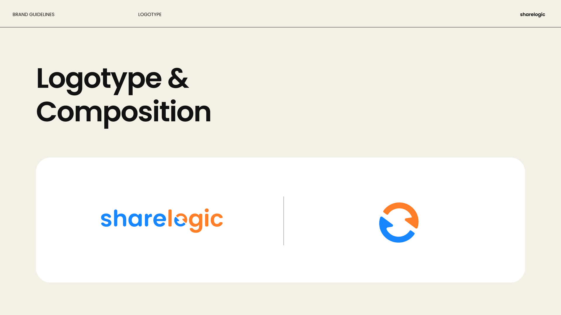
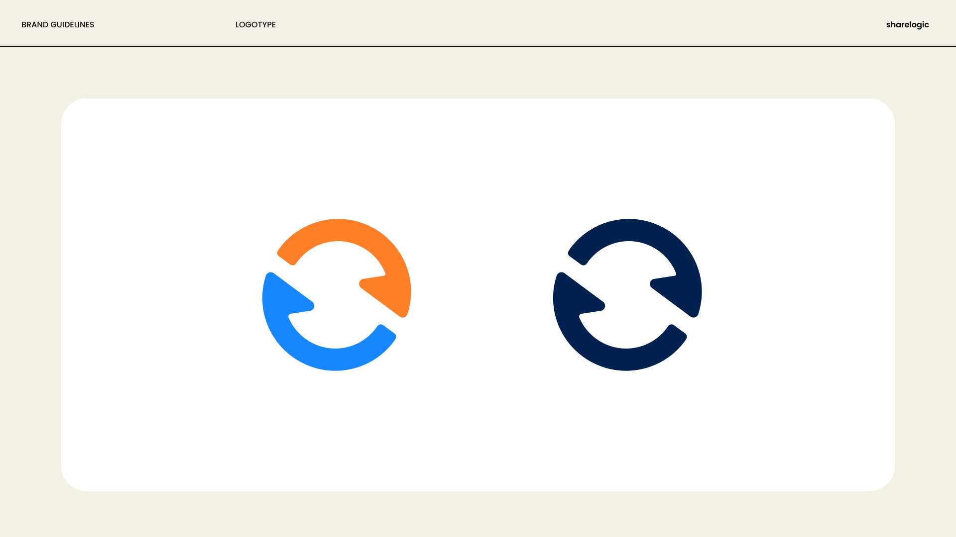
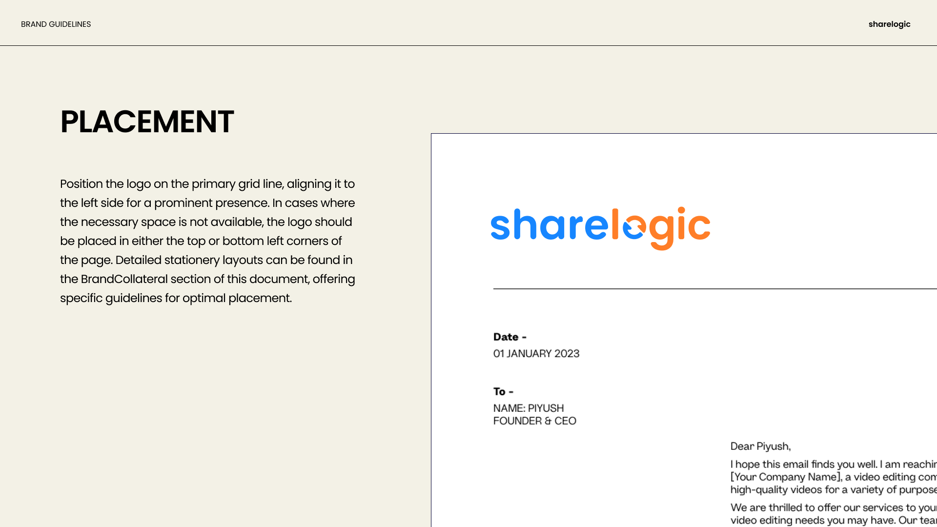
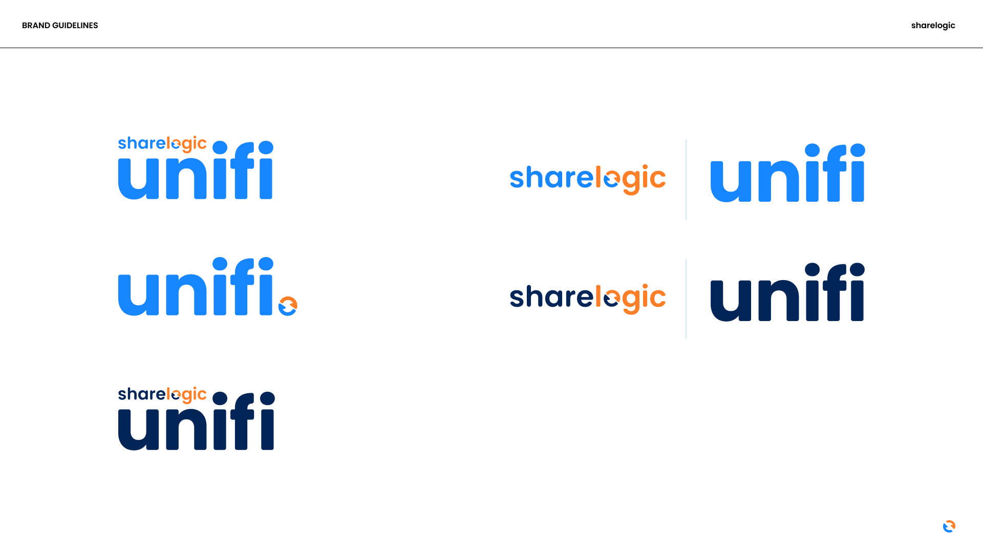
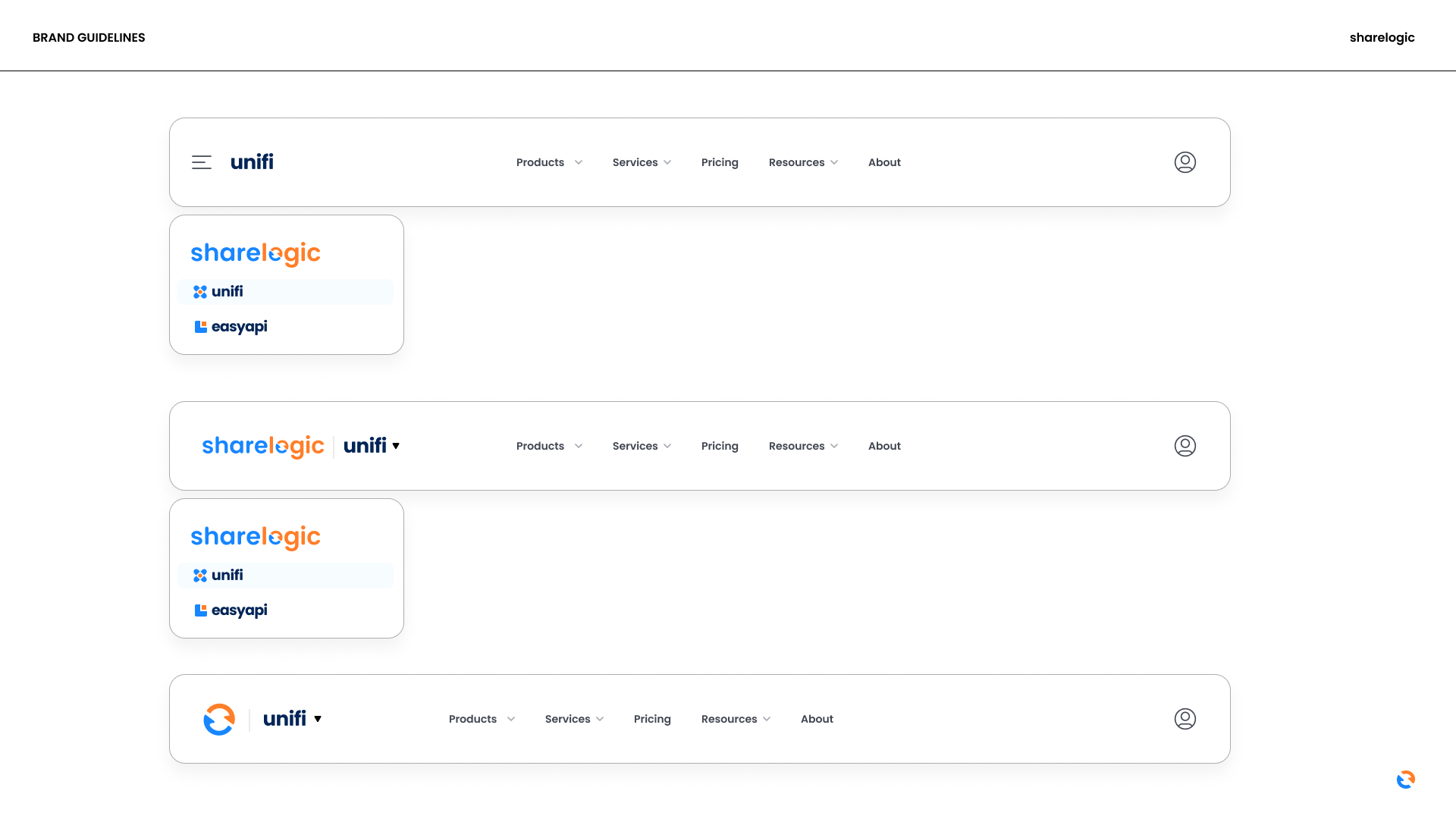
We kept the original refresh-style arrows but streamlined their form for a sleeker, more geometric balance. By tightening proportions and refining curves, the updated logo feels more modern while still recognizable.
- Symbolic Enhancement
The redesign leaned into hidden symbolism within the mark:
-
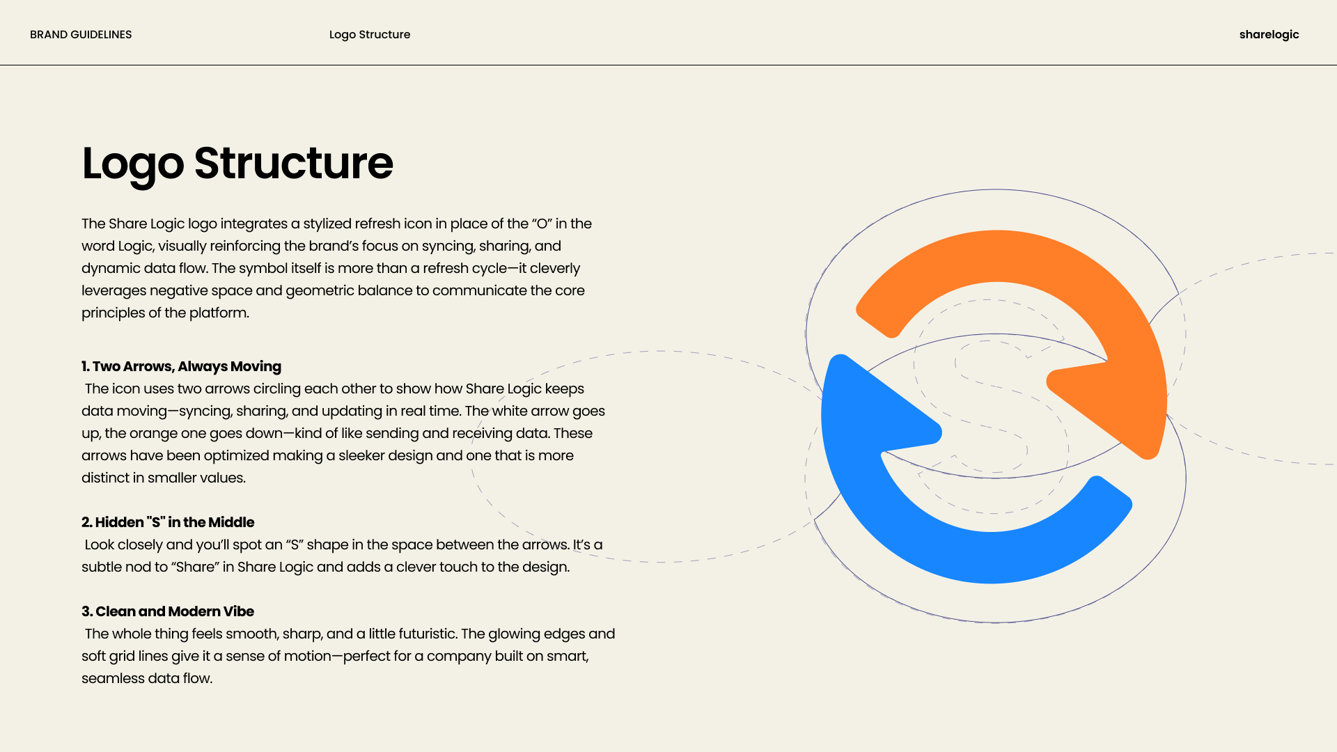
Two Arrows, Always Moving → Representing data sharing, syncing, and continuous flow.
-
Hidden “S” Shape → Formed in the negative space between the arrows, tying directly to “Share” in ShareLogic and giving the logo an extra layer of meaning.
- Modern Vibe
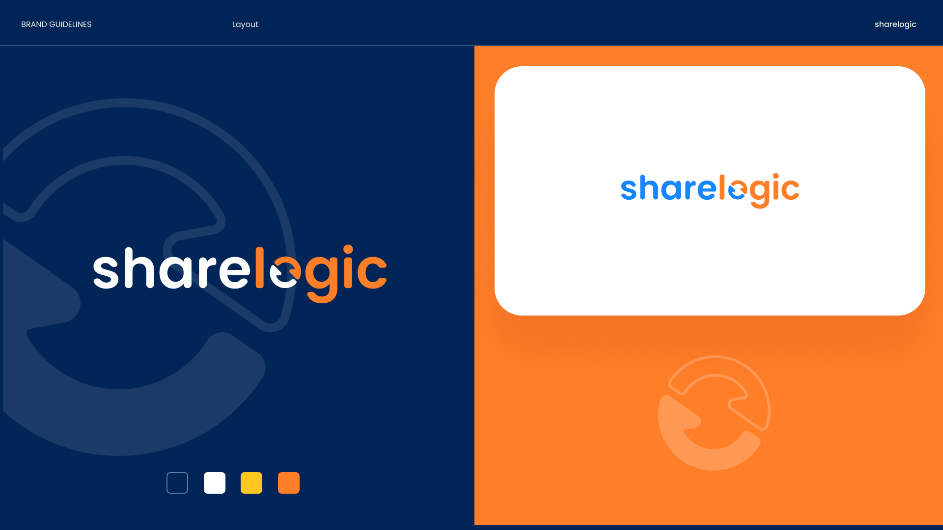
Clean edges, balanced shapes, and a slightly futuristic feel were introduced to create a brand identity that feels both trustworthy and innovative. The updated logo conveys momentum, aligning with ShareLogic’s role as a driver of smart, seamless data exchange.
Outcome
The refreshed brand identity:
Preserves the heritage of the original logo while elevating it for modern use.
Introduces subtle but powerful symbolism that reinforces ShareLogic’s mission.
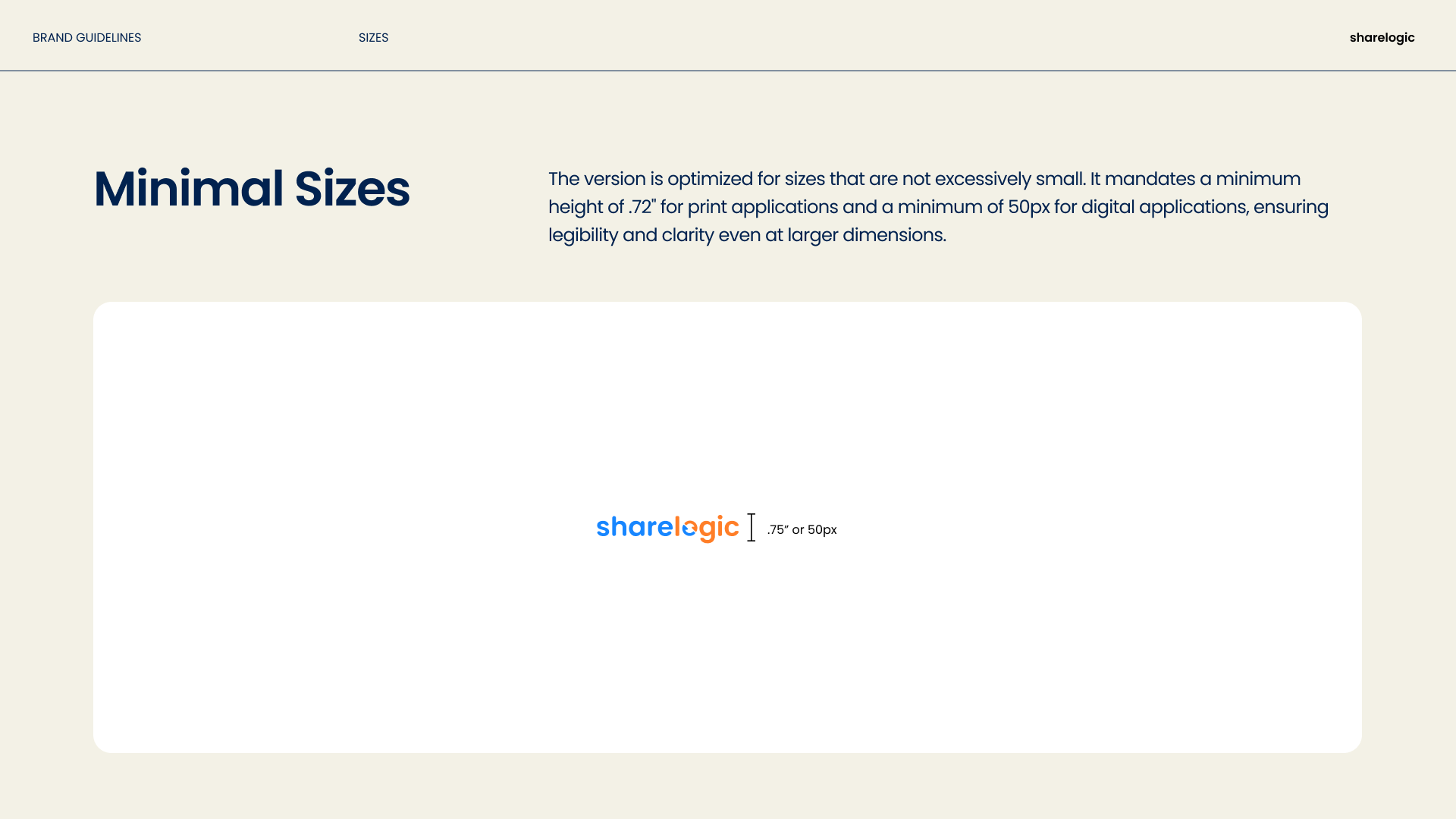
Works more effectively across digital environments, scaling cleanly and staying distinct at small sizes.
Strengthens the company’s positioning as a modern, data-driven partner.
Key Takeaway
The ShareLogic rebrand shows the power of evolution over revolution. By working closely with James Neale to refine the logo, we maintained brand recognition while enhancing clarity, symbolism, and modern appeal. The result is a refreshed identity that communicates ShareLogic’s core values — syncing, sharing, and seamless data flow — in a bold yet familiar way.