UI Design: Layer 1 Marketplace v1.0
UI & UX
01/16/2025

From Wireframes to Visual Design
After establishing the UX flows and wireframes for the Layer 1 Marketplace, the next step was bringing those wireframes to life with a complete visual design system. This first version of the UI needed to establish the visual language for a product category that didn't exist before—a marketplace where validators could discover and join subnets on the Avalanche C-Chain.
The design challenge was creating an interface that felt trustworthy, modern, and approachable while handling complex blockchain concepts. We needed to make validator management and subnet discovery feel as intuitive as any traditional marketplace, despite the technical complexity underlying every interaction.
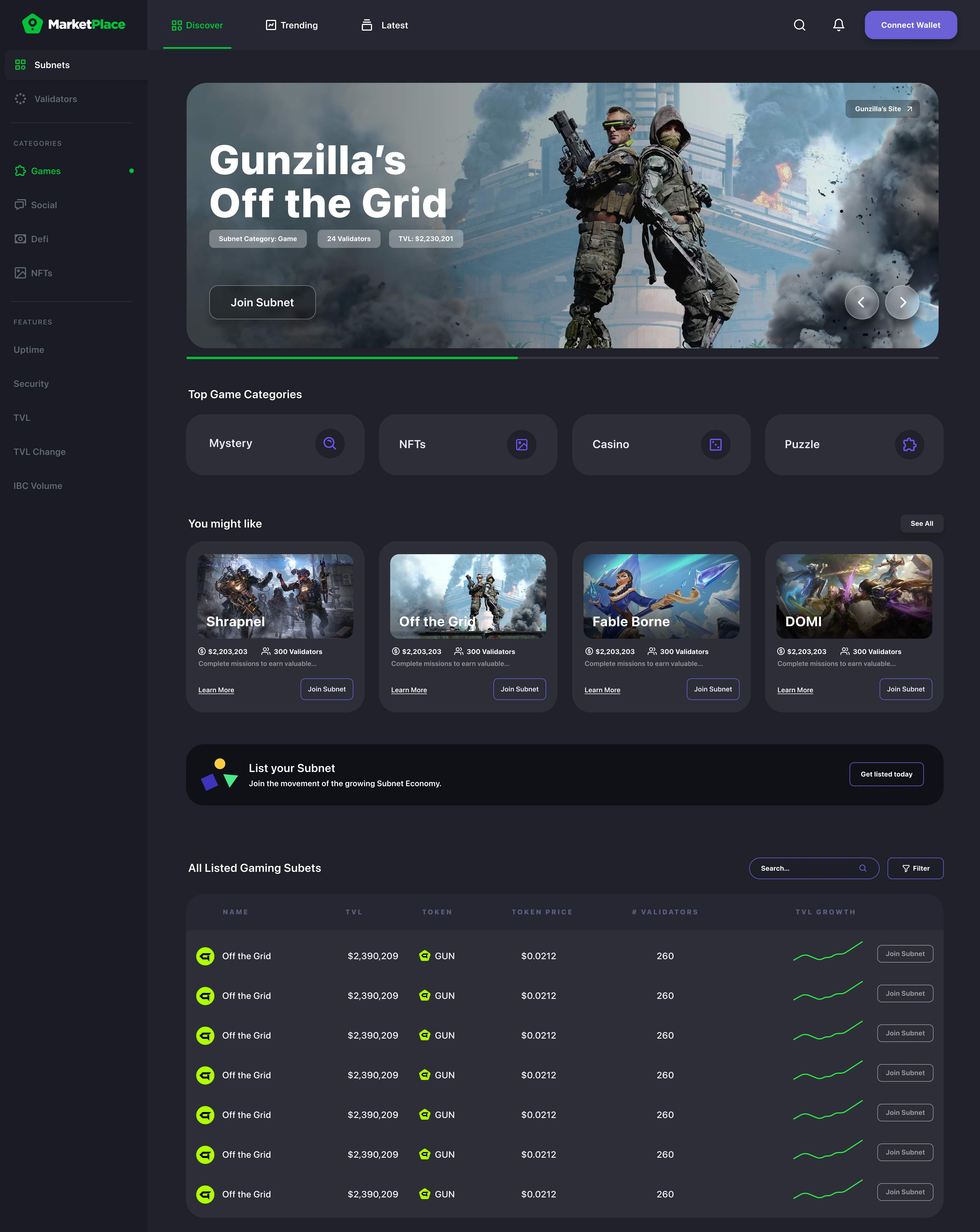
The Marketplace Homepage
The homepage serves as the entry point for both validators and subnet creators. It needed to immediately communicate the value proposition while providing clear paths to discovery and action.
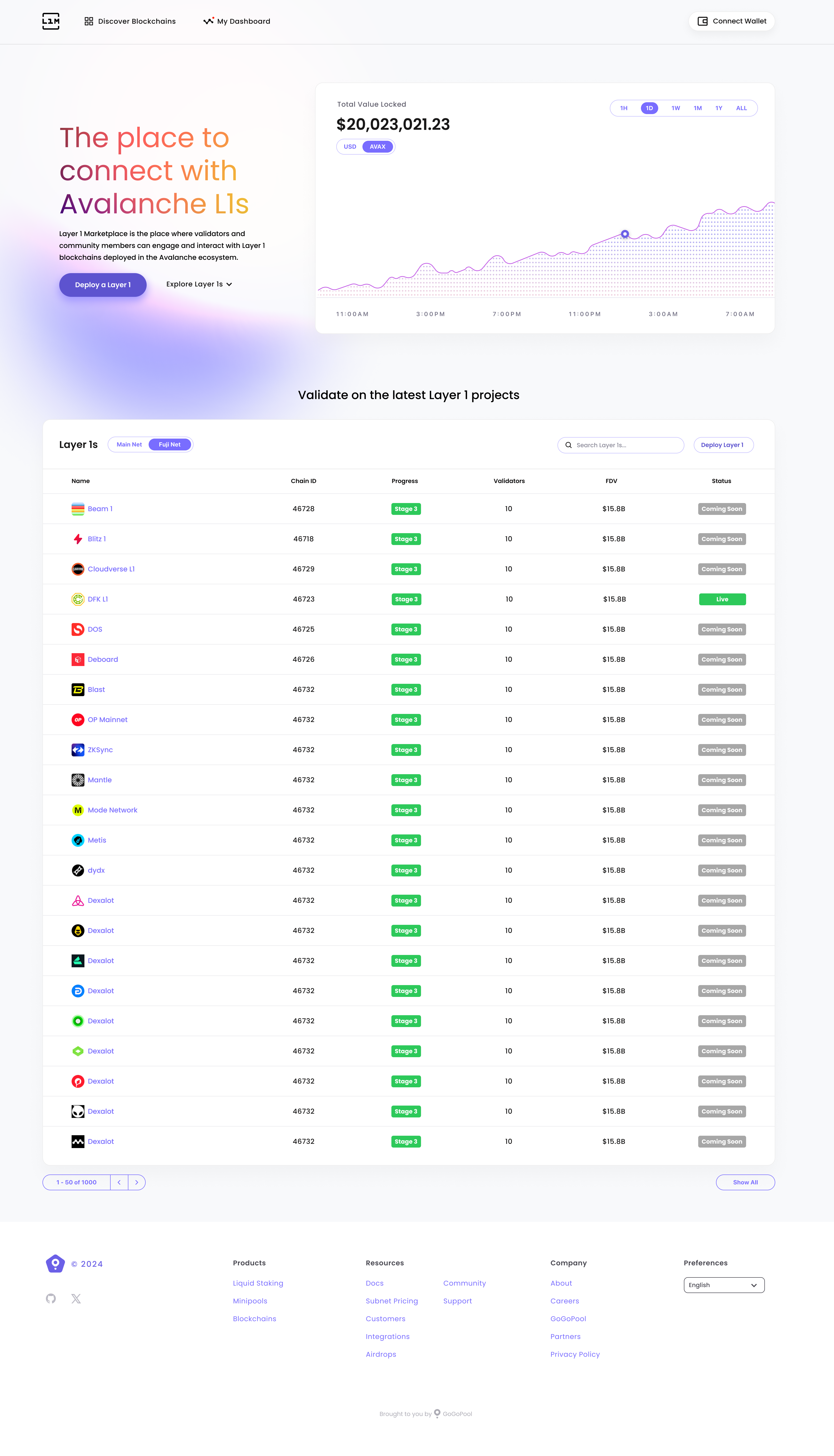
Key design elements:
- Clear value proposition - Immediately communicates what the marketplace offers
- Dual user paths - Separate entry points for validators and subnet creators
- Trust indicators - Visual elements that reinforce security and reliability
- Action-oriented layout - Prominent CTAs guiding users to their next step
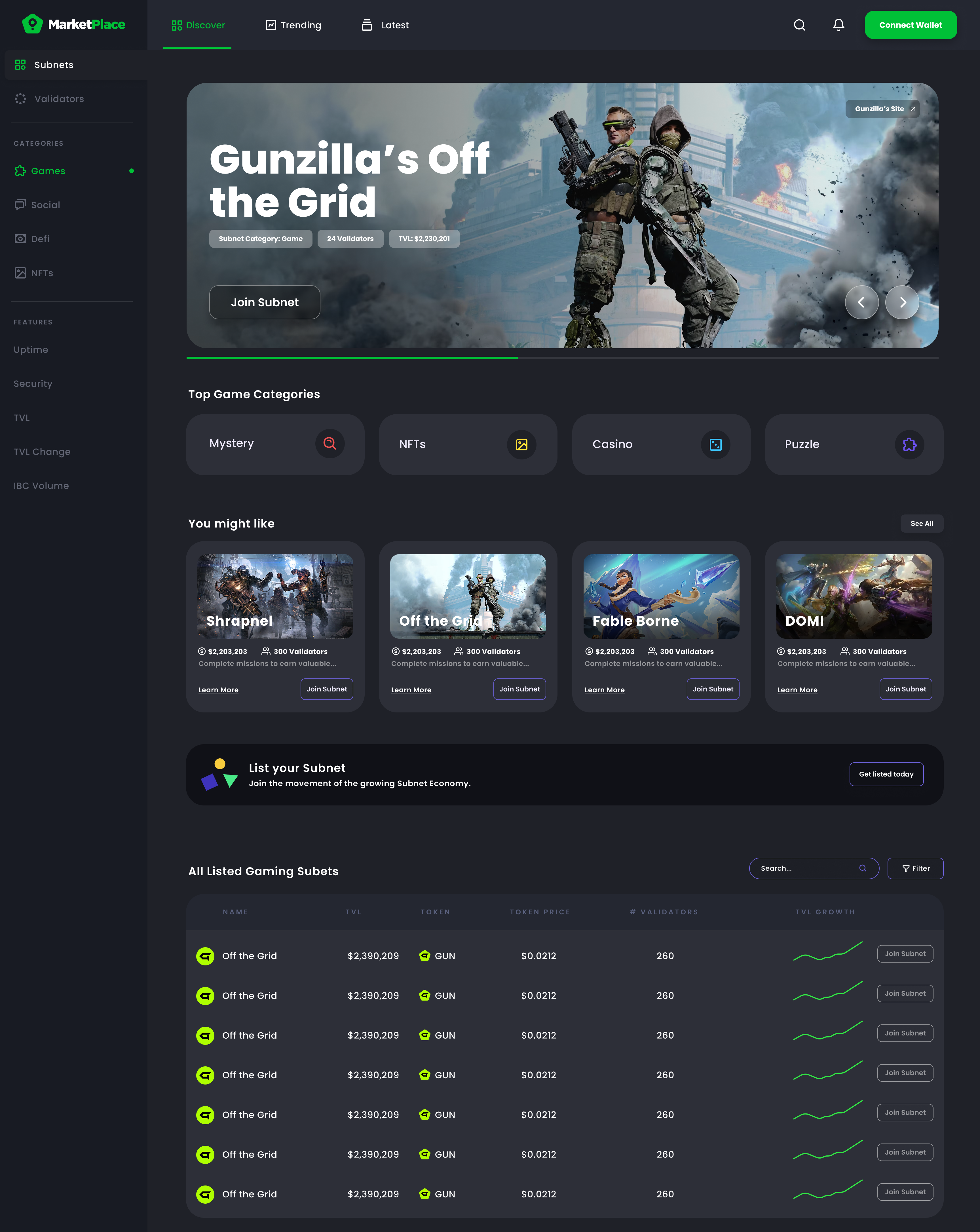
Main Marketplace Interface
The core marketplace view needed to balance information density with clarity, allowing validators to quickly scan available subnets while providing enough detail to make informed decisions.
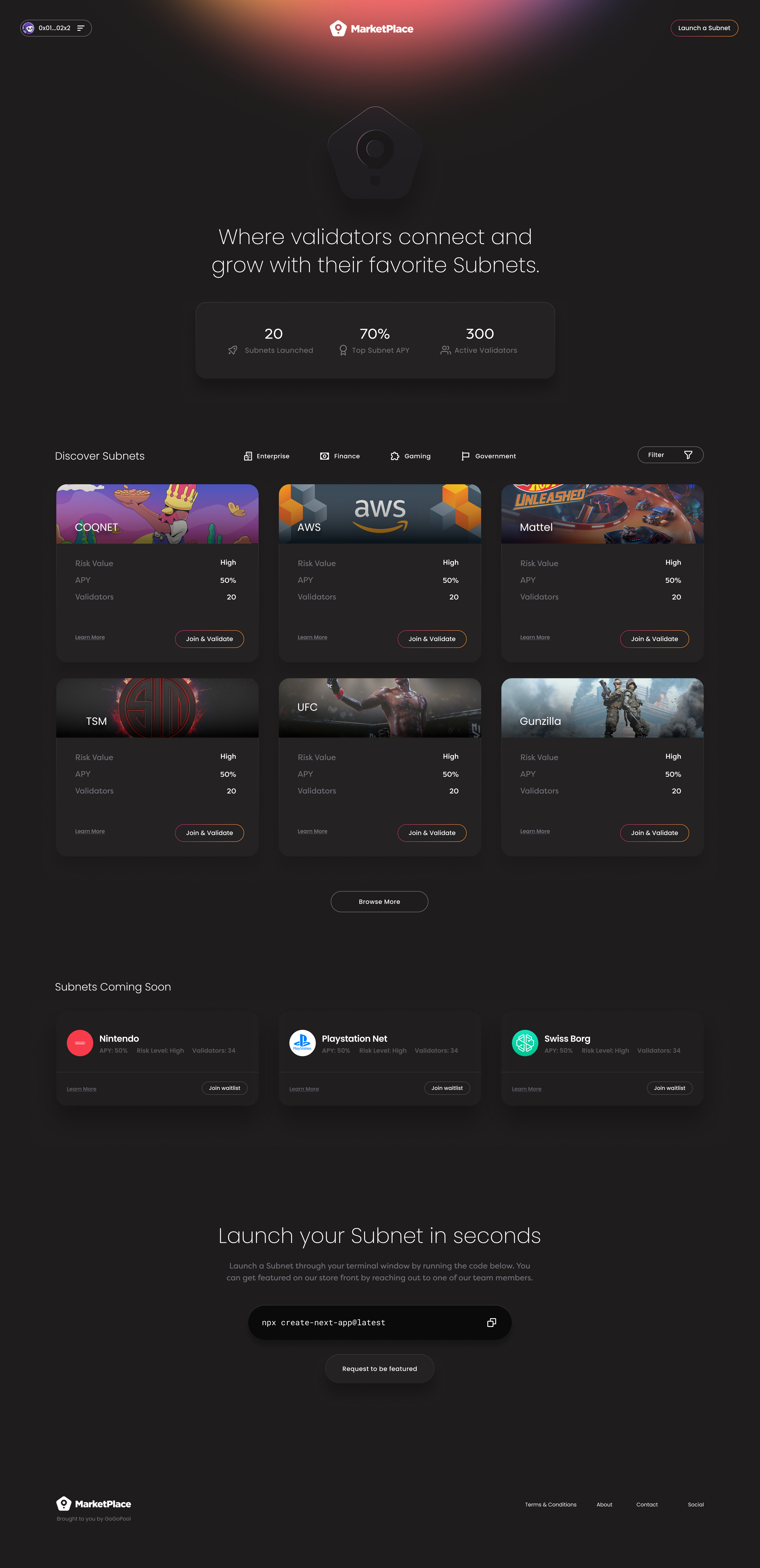
Design decisions:
- Card-based subnet listings - Easy to scan and compare
- Visual hierarchy - Important metrics stand out without overwhelming
- Filter and search - Prominent tools for narrowing down options
- Status indicators - Clear visual cues for availability and requirements
Comprehensive Marketplace View
A more detailed view showing the full marketplace experience with multiple subnets visible, demonstrating how the interface scales with content.
This view showcases:
- Grid layout - Efficient use of space for multiple subnet cards
- Consistent card design - Uniform presentation for easy comparison
- Progressive disclosure - Summary information visible, details on click
- Visual rhythm - Balanced spacing and typography creating flow
Alternative Marketplace Layout
Exploring different approaches to presenting subnet information, this version tested alternative card layouts and information architecture.
This exploration helped validate:
- Information priority - What metrics matter most at first glance
- Card density - How much information can fit without feeling cluttered
- Visual balance - Ensuring the interface feels organized, not chaotic
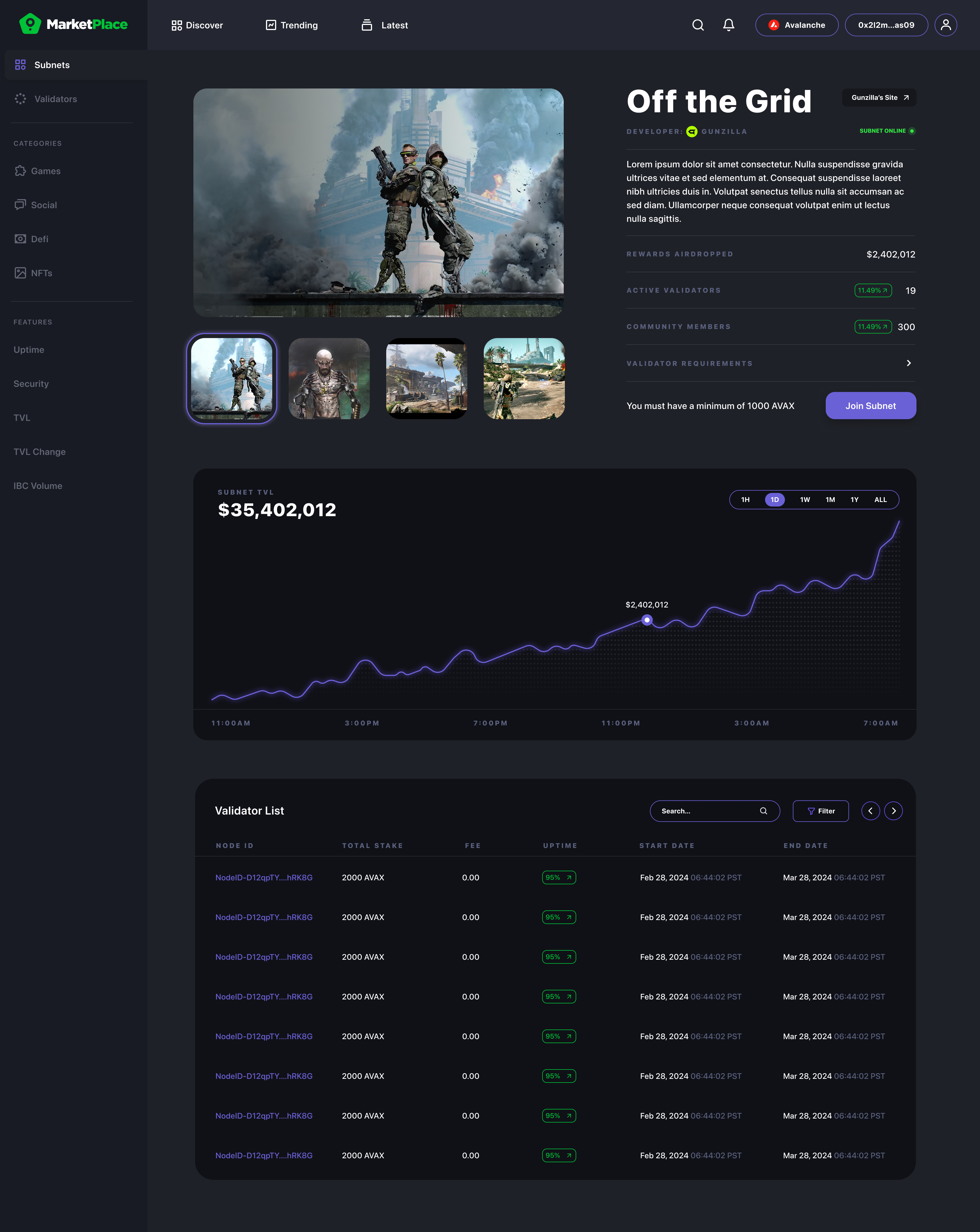
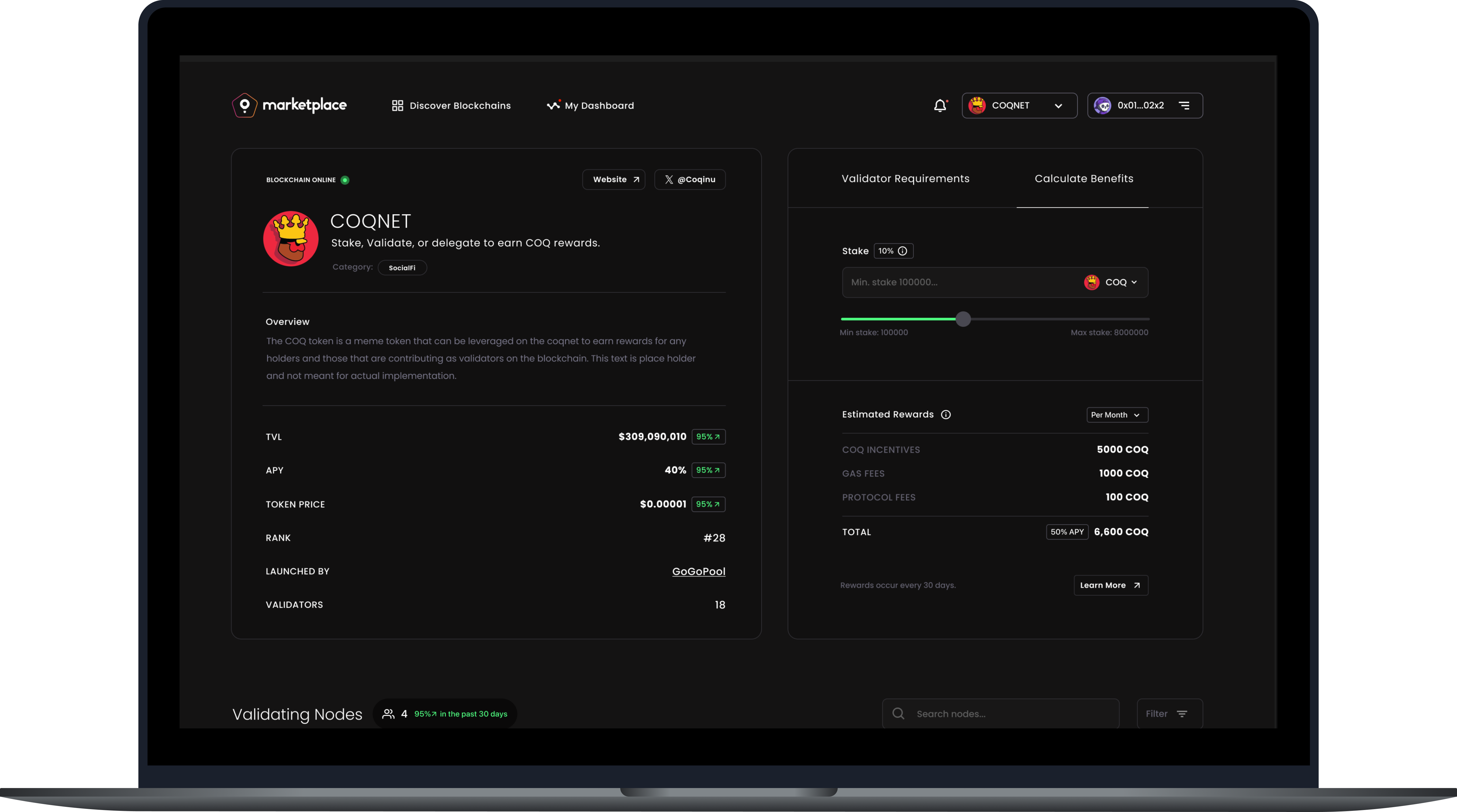
Subnet Detail View
When validators find a subnet they're interested in, the detail page provides comprehensive information needed to make a decision.
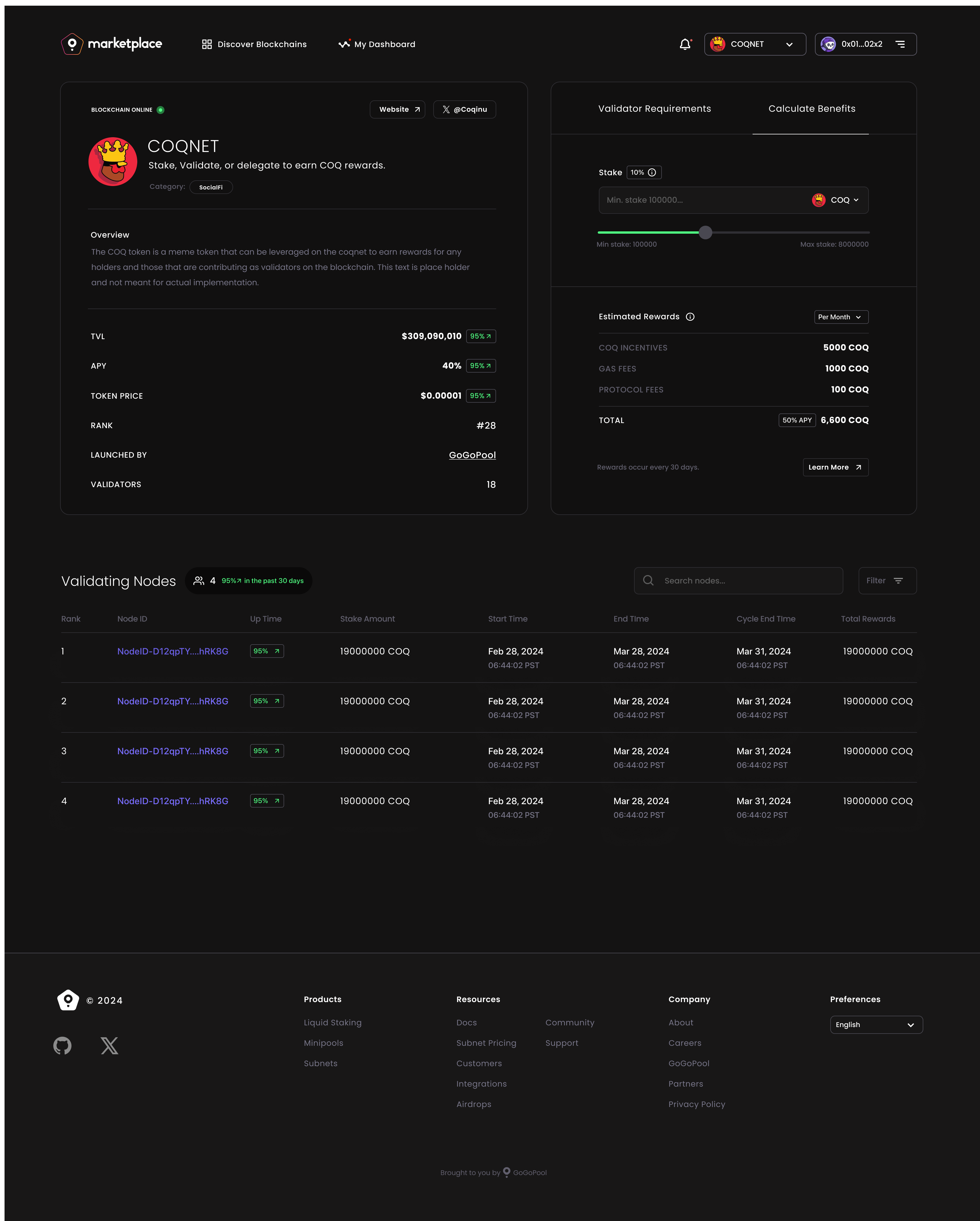
The detail page includes:
- Hero section - Key metrics and quick join action
- Detailed requirements - What validators need to participate
- Reward breakdown - Clear explanation of earnings potential
- Network information - Technical specifications and subnet details
- Trust elements - Security indicators and validator testimonials
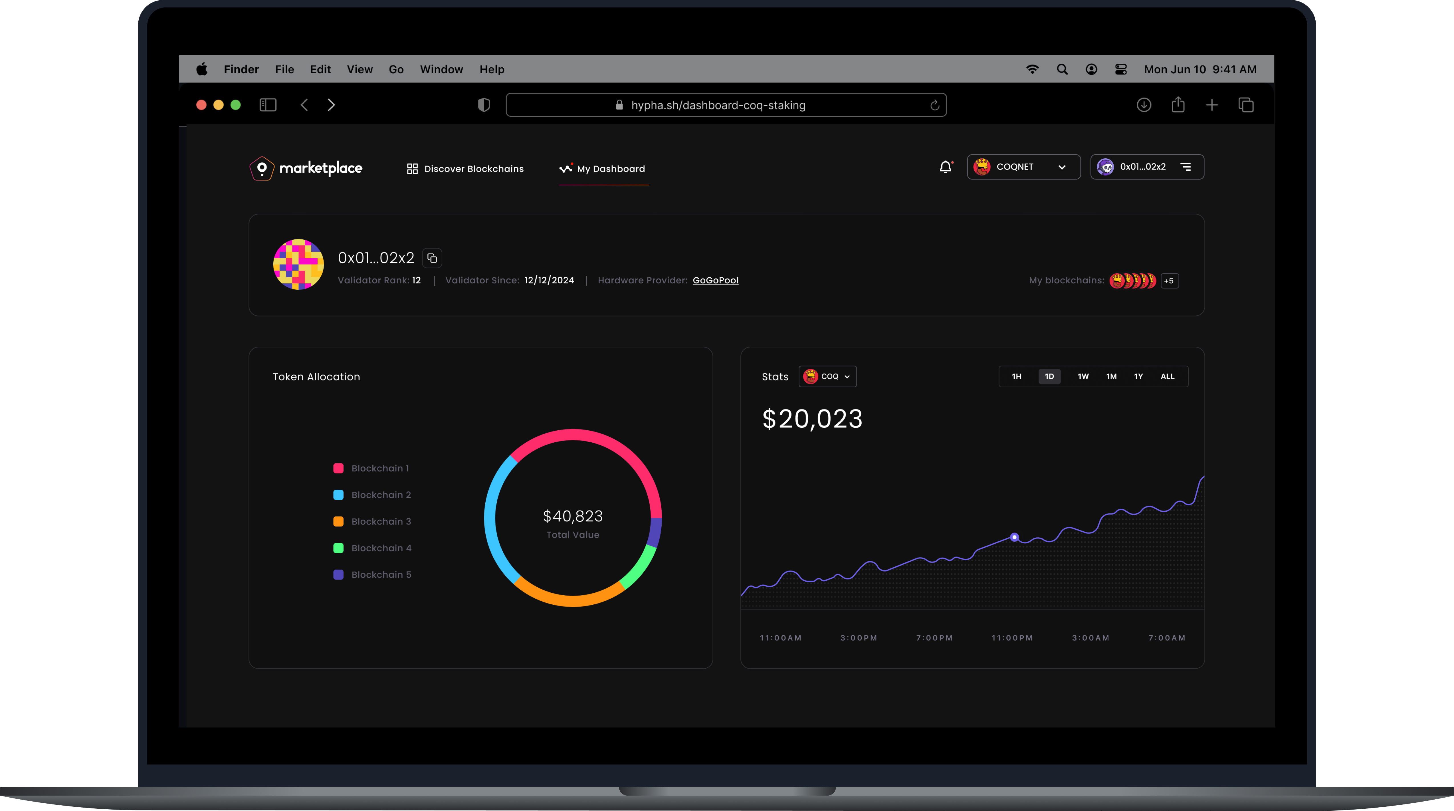
Profile & Validator Management
For validators actively participating in subnets, the profile page provides a dashboard view of their commitments, performance, and opportunities.
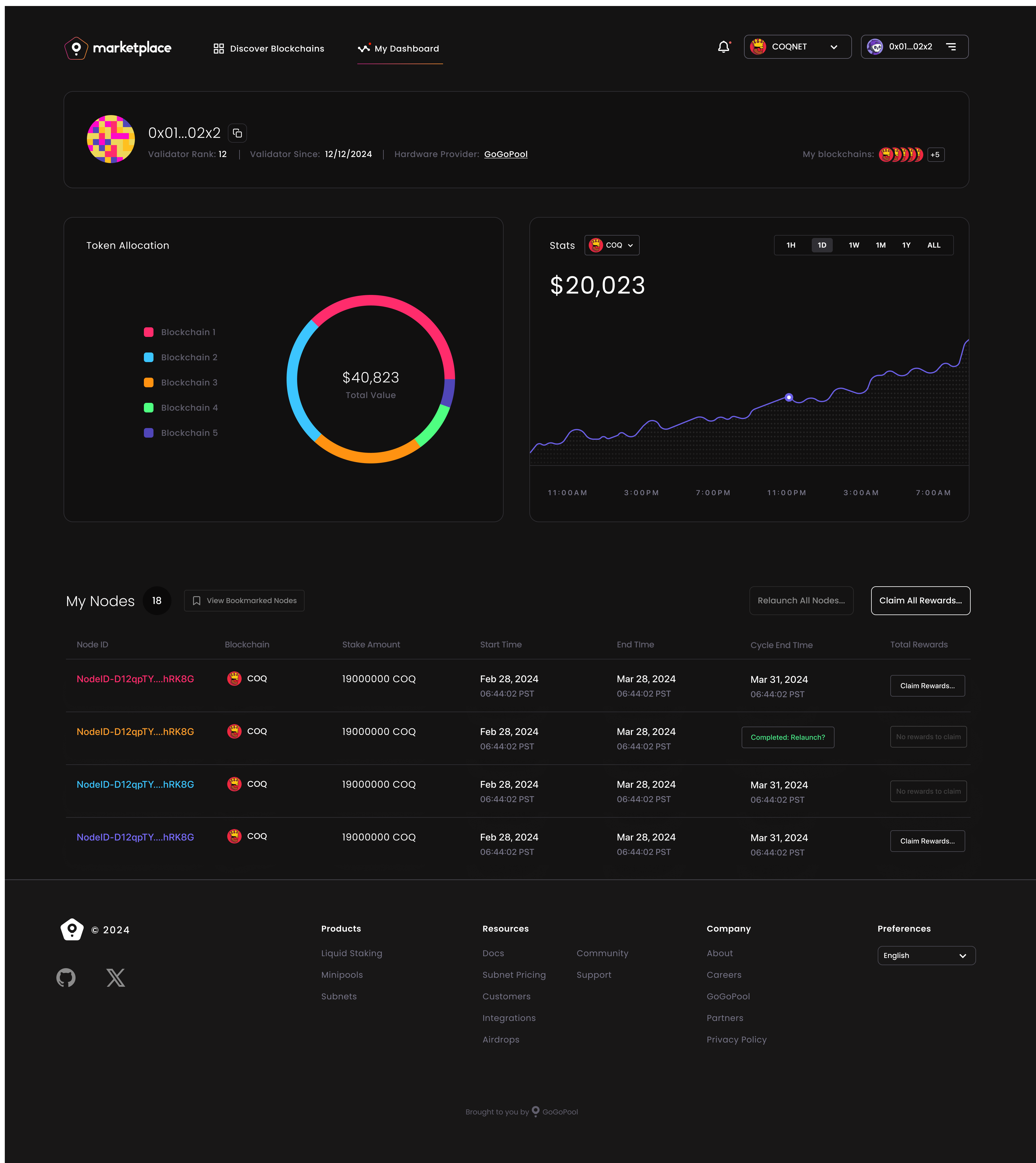
Profile features:
- Active subnet overview - Current validator commitments
- Performance metrics - Rewards earned and validator status
- Available opportunities - New subnets matching their profile
- Quick actions - Easy access to join new subnets or manage existing ones
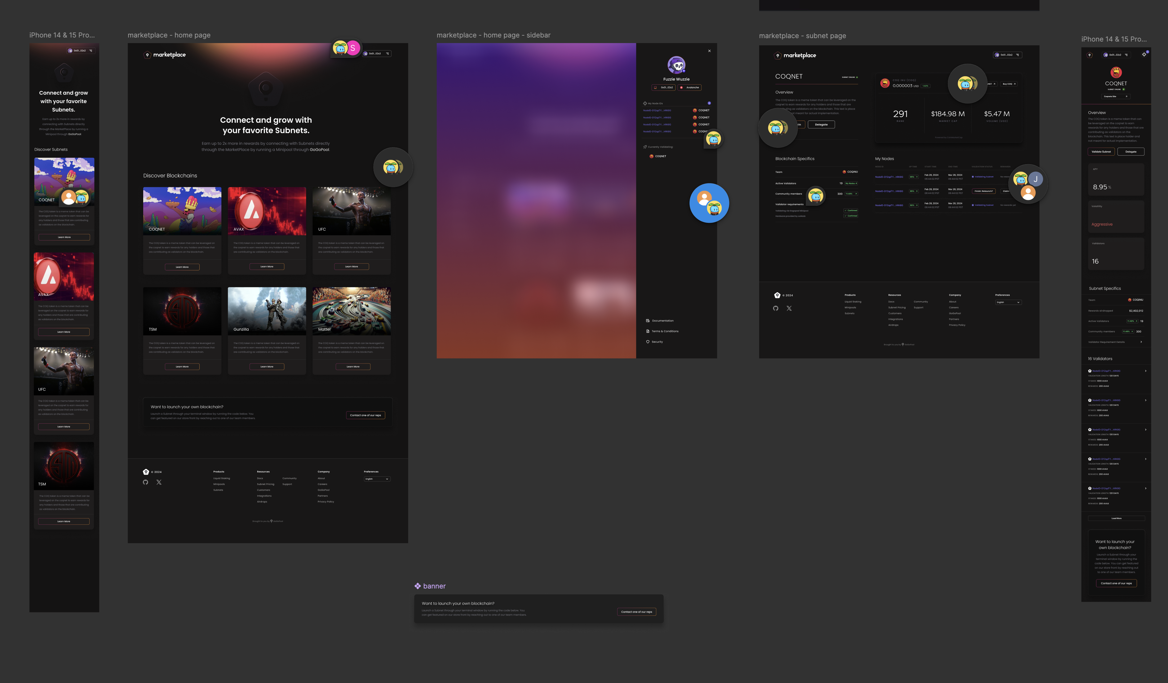
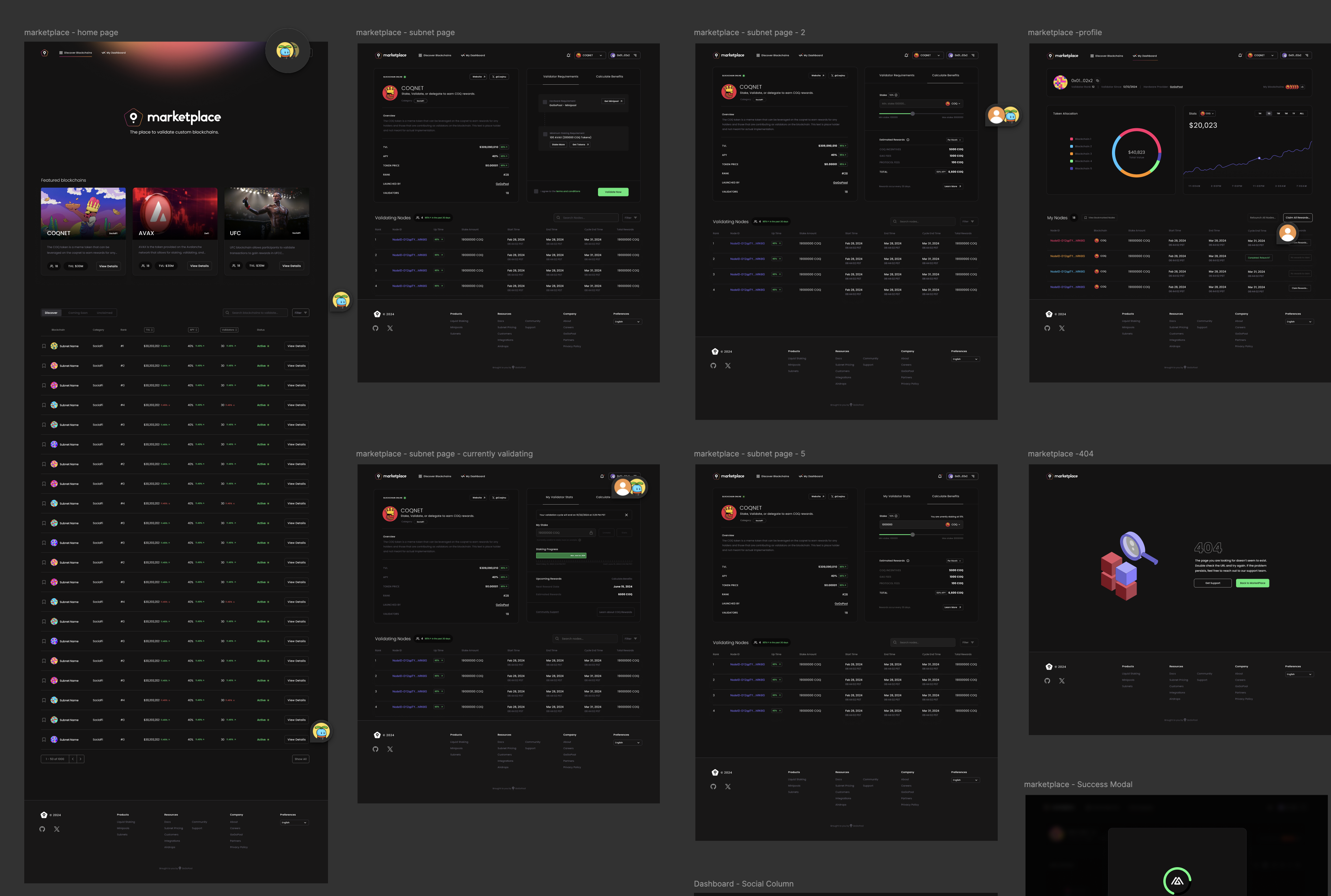
Design Compositions
These comprehensive compositions show how all the interface elements work together in complete user flows.
These compositions demonstrate:
- Complete user journeys - From discovery to commitment
- Consistent design system - Unified visual language across all screens
- Responsive considerations - How layouts adapt to different screen sizes
- Interaction states - Hover, active, and selected states
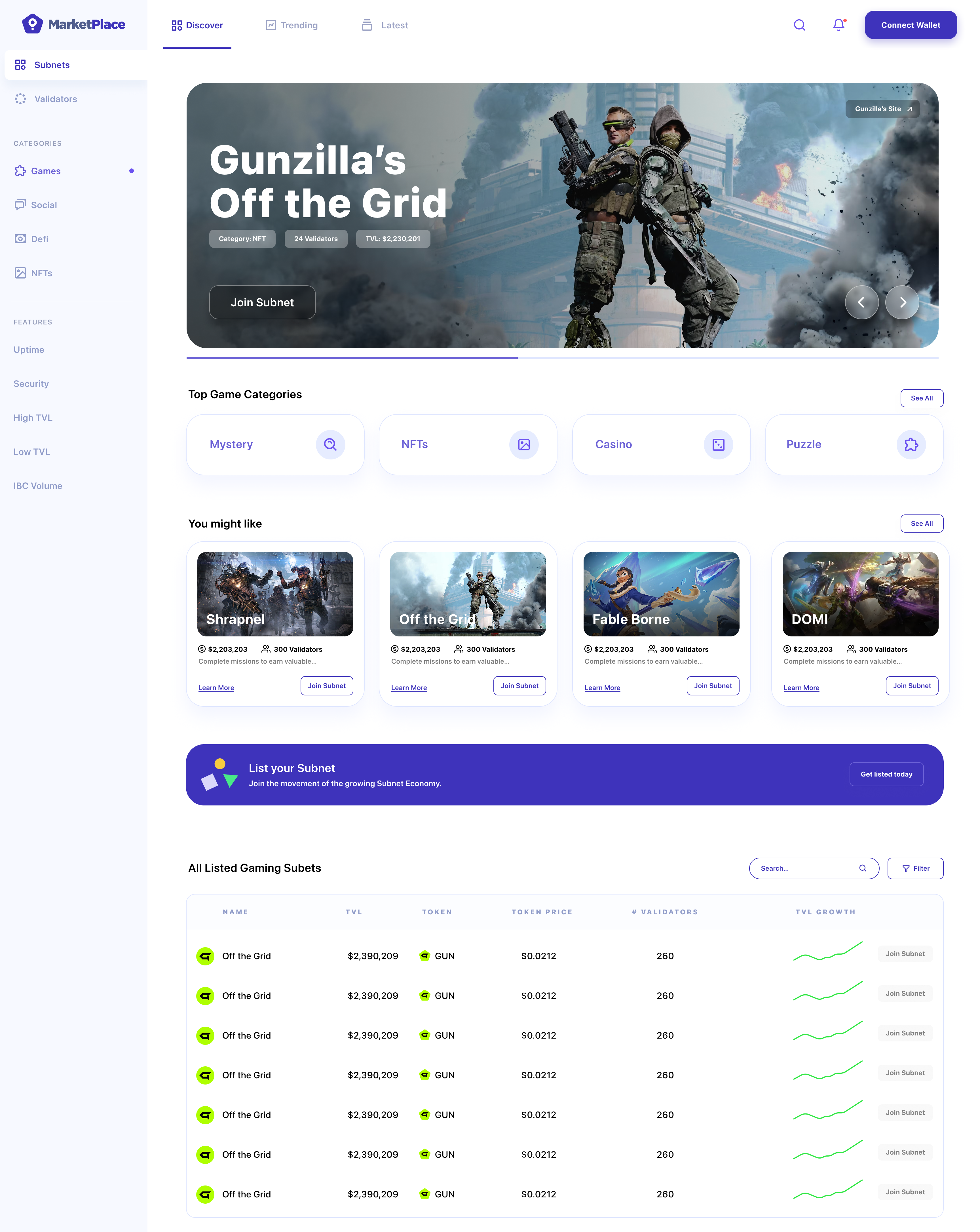
Dark Mode Variations
Exploring dark mode versions ensured the marketplace would work well in different viewing contexts and user preferences.
Dark mode considerations:
- Contrast ratios - Ensuring readability in low-light conditions
- Visual hierarchy - Maintaining information priority in dark theme
- Brand consistency - Keeping the visual identity intact across themes
- Accessibility - Meeting WCAG contrast requirements
Design System Foundations
This first version established the foundational design system that would evolve with the product:
Color Palette
- Primary colors that convey trust and professionalism
- Accent colors for important actions and status indicators
- Neutral grays for text and backgrounds
- Semantic colors for success, warning, and error states
Typography
- Clear hierarchy with distinct heading and body styles
- Readable font sizes optimized for scanning and reading
- Consistent line heights and spacing
- Support for both light and dark themes
Components
- Reusable card components for subnet listings
- Consistent button styles and interaction states
- Form elements designed for clarity and usability
- Navigation patterns that work across all screens
Spacing & Layout
- Consistent grid system for alignment
- Predictable spacing scale for rhythm
- Responsive breakpoints for different screen sizes
- Clear content hierarchy through spacing
Key Design Decisions
1. Trust Through Clarity Every design decision prioritized making complex information understandable. We avoided jargon-heavy interfaces in favor of clear, plain language supported by helpful visualizations.
2. Action-Oriented Interface The UI guides users toward action—whether that's joining a subnet, managing validators, or exploring opportunities. CTAs are prominent but not aggressive, and the path forward is always clear.
3. Progressive Disclosure Not all information is needed at once. The interface reveals details progressively, allowing validators to quickly scan and dive deeper when interested.
4. Visual Consistency A unified design system ensures that once users learn one part of the interface, they can navigate the rest intuitively. Patterns repeat predictably.
5. Mobile-First Thinking While the primary use case assumed desktop interaction, the design system was built to work responsively, ensuring the marketplace is accessible on all devices.
The Evolution
This first version of the UI established the visual foundation for the Layer 1 Marketplace. It proved that complex blockchain concepts could be presented in an approachable, trustworthy interface. The design system created here would evolve based on user feedback and usage patterns, but the core principles—clarity, trust, and action-orientation—remained constant.
The marketplace UI needed to feel familiar enough that validators could use it without extensive learning, yet innovative enough to represent the cutting-edge nature of the technology. This first version struck that balance, creating a visual language that others in the space would eventually follow.
Lessons from v1.0
Designing the first version taught us:
- Start with the user journey - Understanding flows before visual design prevents rework
- Test assumptions early - Every design decision is a hypothesis that needs validation
- Build systems, not screens - A strong design system scales better than individual designs
- Prioritize clarity over cleverness - When introducing new concepts, clarity wins
- Document everything - When creating new patterns, thorough documentation helps the team and future iterations
This first version of the marketplace UI set the stage for what would become a comprehensive platform for validator-subnet interactions. The visual design brought the wireframes to life and proved that even the most complex blockchain interactions could be made intuitive and approachable.