UX Flows & Wireframes: Layer 1 Marketplace for Validators
case studies
01/16/2025
The Challenge: Building Something That Doesn't Exist
Creating a Layer 1 Marketplace for validators on the Avalanche C-Chain presented a unique challenge: there was no existing pattern to follow. This wasn't just another marketplace or dashboard—it was an entirely new category of interface that needed to bridge the gap between validators and subnet creators in a way that had never been done before.
The core problem was simple to understand but complex to solve: How do you create an intuitive interface that allows validators to discover, evaluate, and join subnets while providing subnet creators with a platform to attract and manage validators? The answer required rethinking traditional marketplace patterns and creating a new UX paradigm from scratch.
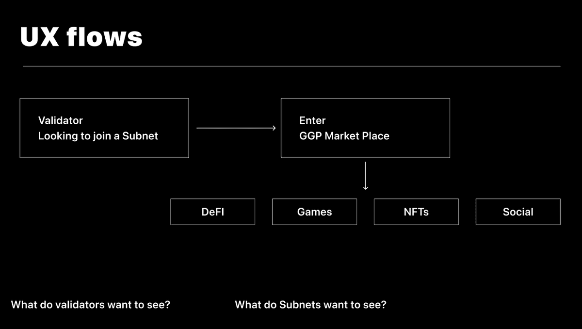
Understanding the User Flows
Before diving into wireframes, we needed to map out the complete user journey. The marketplace needed to serve two primary user types: validators looking for opportunities and subnet creators managing their networks.
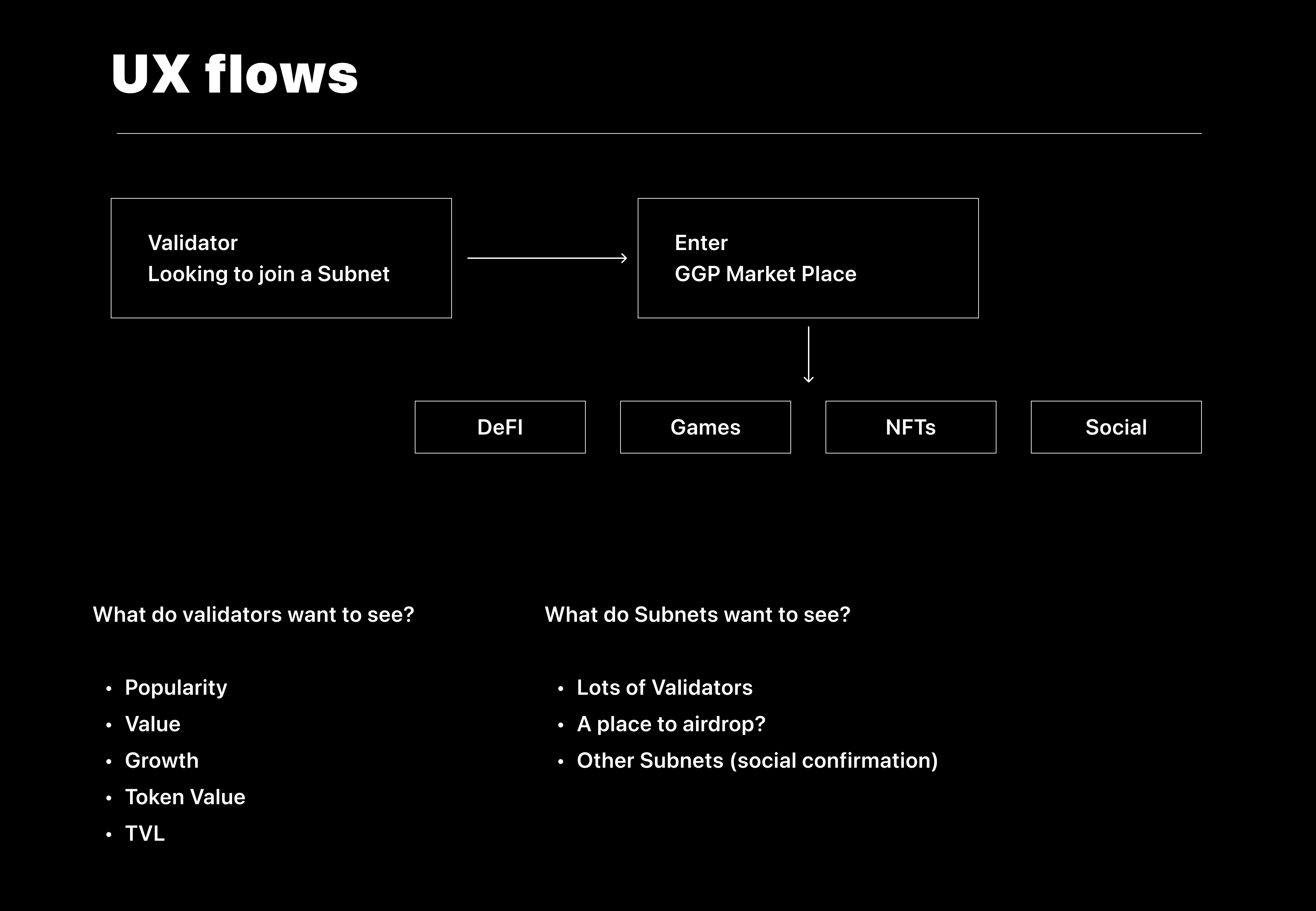
The primary flow for validators follows a discovery-to-commitment path:
- Discovery - Browse available subnets and filter by criteria
- Evaluation - Review subnet details, requirements, and rewards
- Decision - Compare options and understand commitment
- Action - Join a subnet and manage validator status
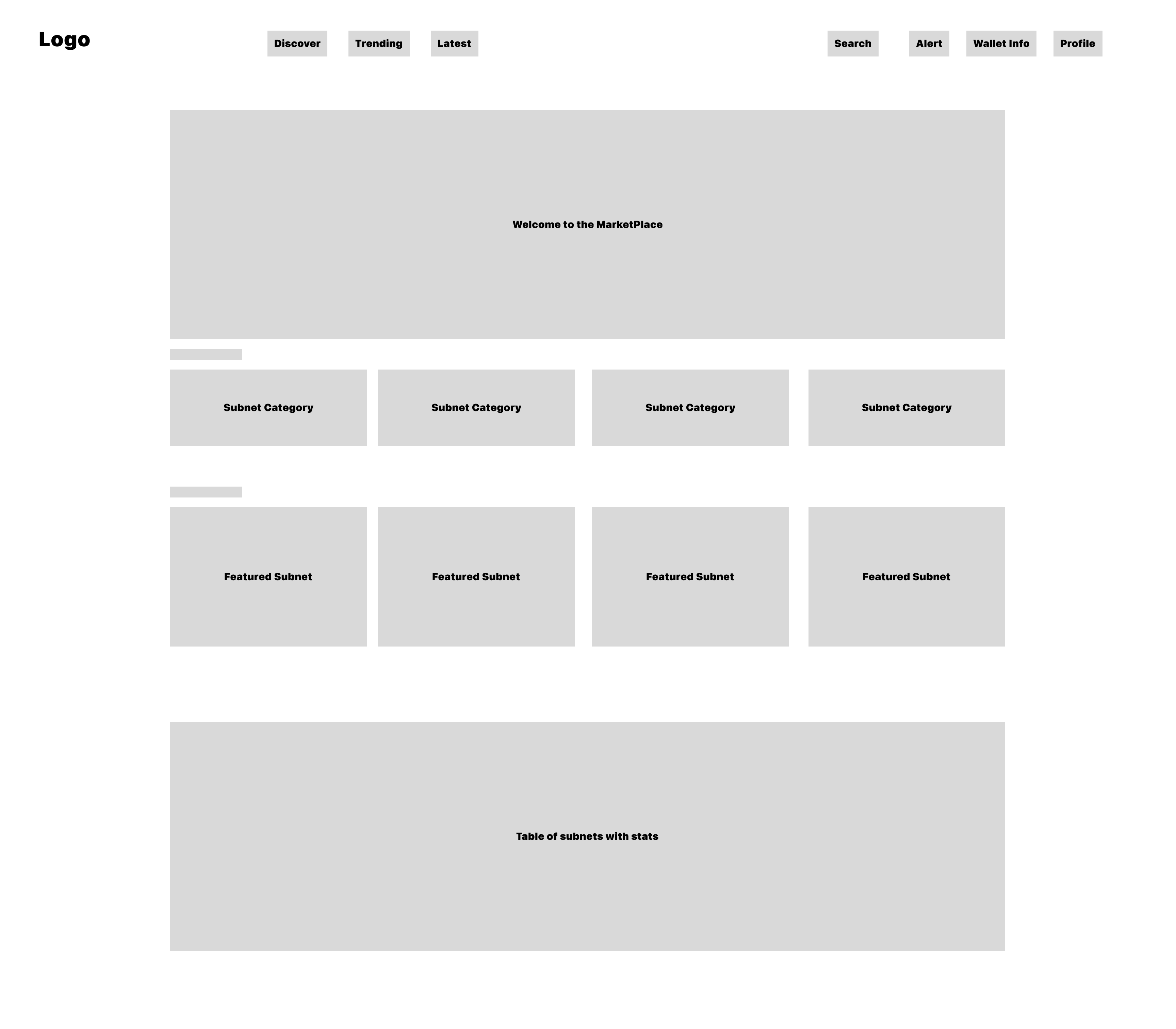
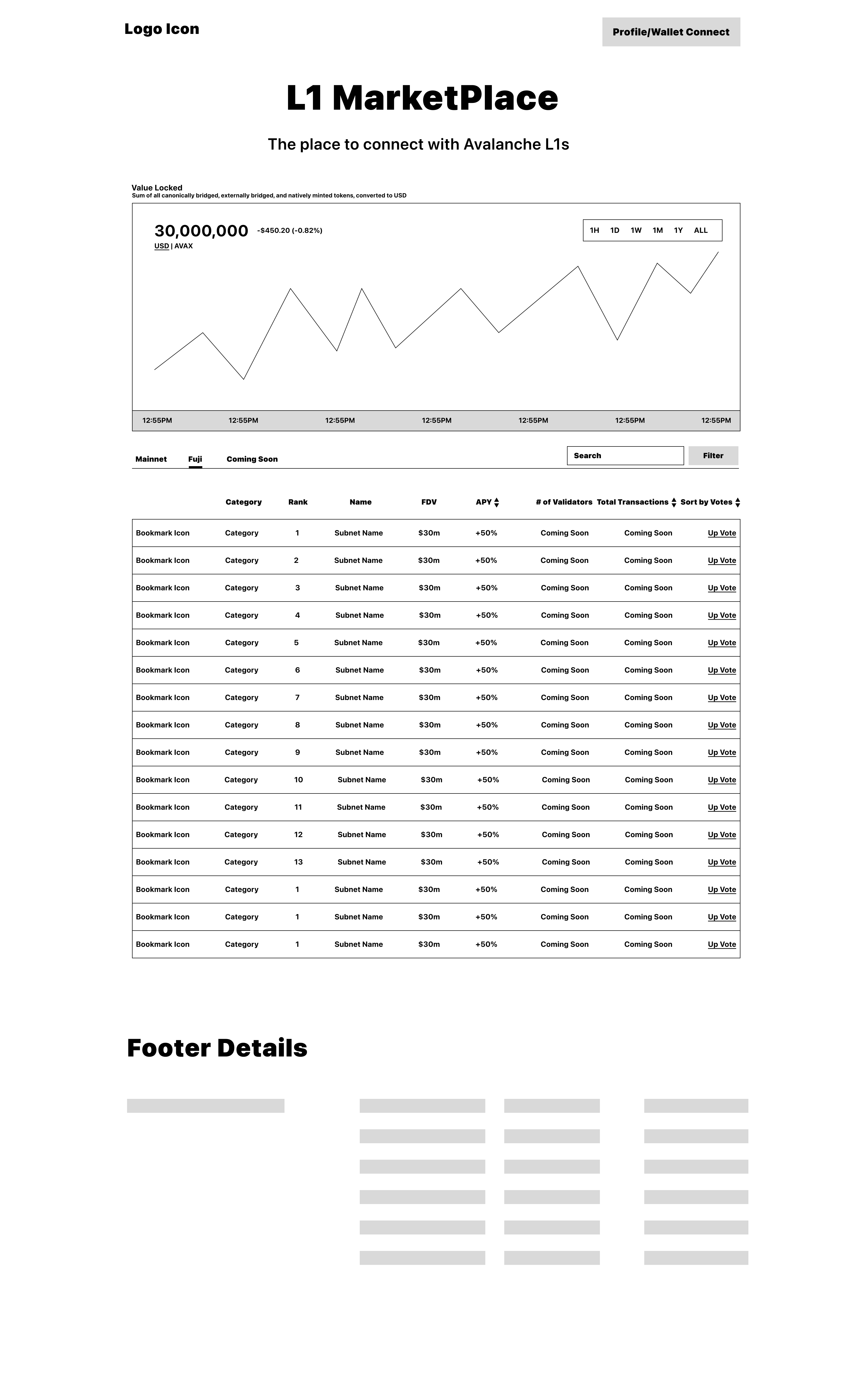
The Discovery Experience
The discovery page needed to balance information density with clarity. Validators need to quickly scan multiple subnets, understand key metrics, and identify opportunities that match their criteria.
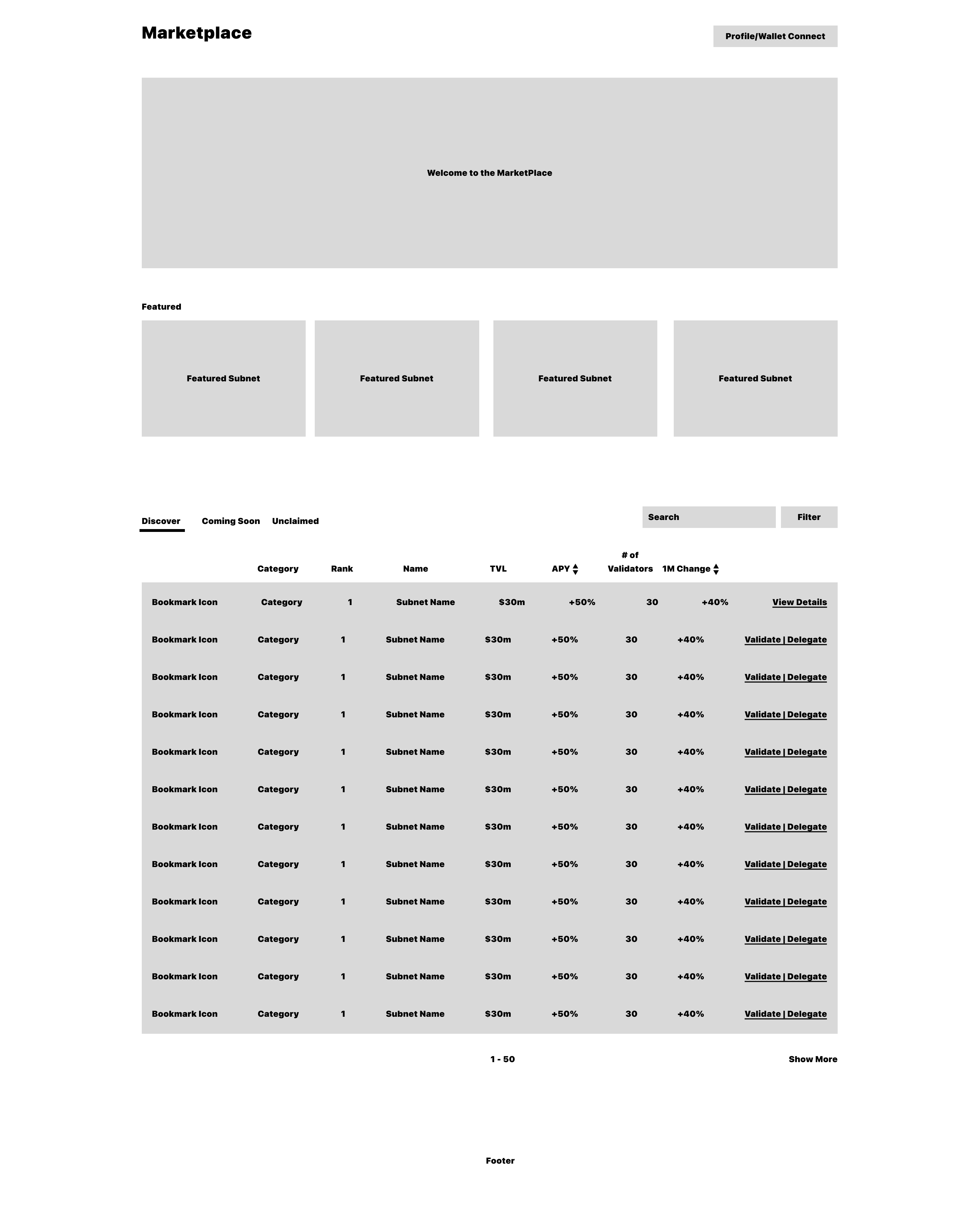
Key design decisions for discovery:
- Card-based layout for easy scanning of multiple subnets
- Prominent metrics showing rewards, requirements, and status
- Filter system allowing validators to narrow down by criteria
- Visual hierarchy that guides attention to actionable information
Subnet Listings & Organization
Organizing subnet information required careful consideration of what validators need to know at a glance versus what they need to dig deeper to find.

The list view provides:
- Quick comparison of multiple subnets
- Essential metrics visible without clicking
- Status indicators for availability and requirements
- Clear visual distinction between different subnet types
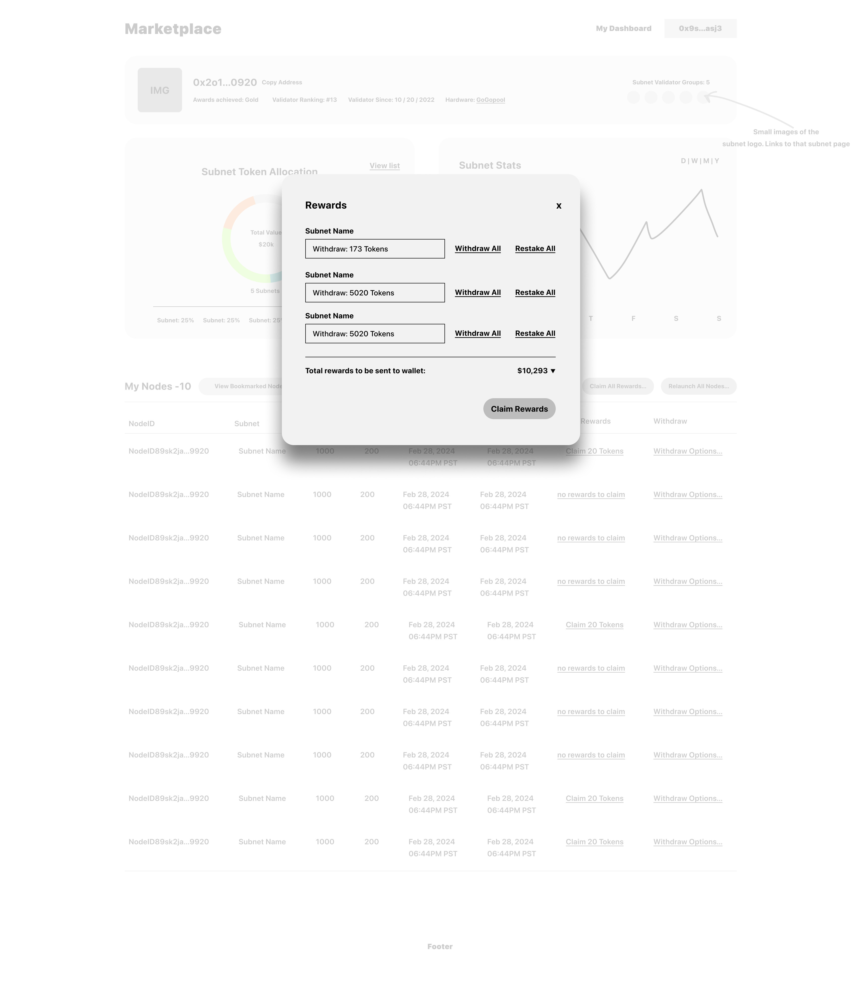
Validator Management Interface
For validators already participating in subnets, we needed a dashboard that provides clear visibility into their current commitments, rewards, and opportunities.
The validator interface focuses on:
- Current commitments - Active subnet participations
- Performance metrics - Rewards earned and validator status
- Available opportunities - New subnets that match their profile
- Quick actions - Easy access to join new subnets or manage existing ones
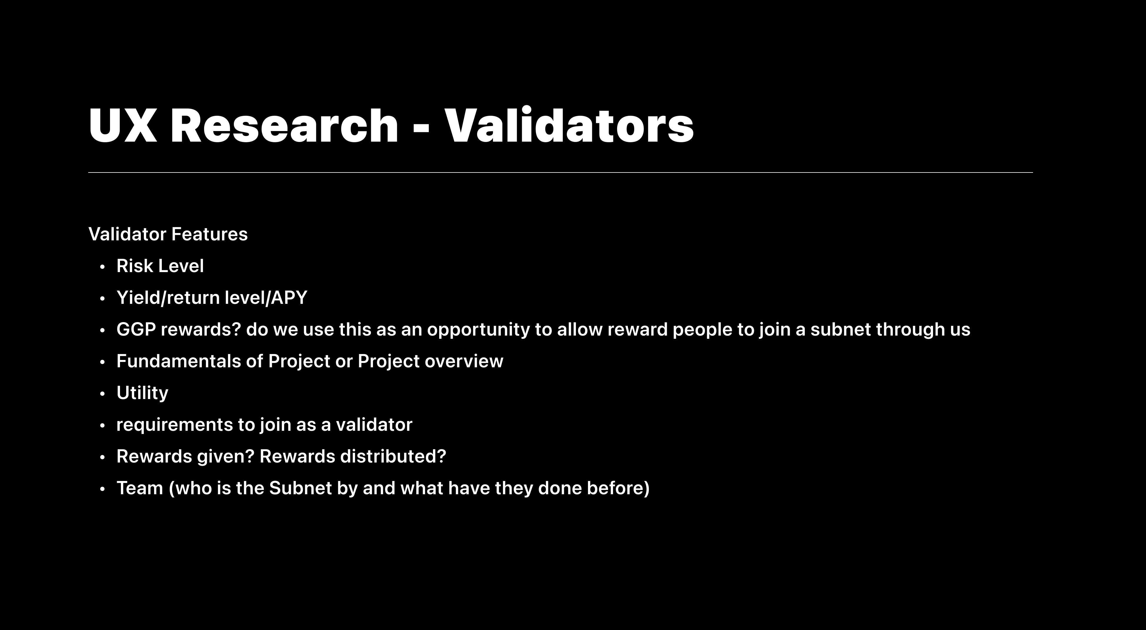
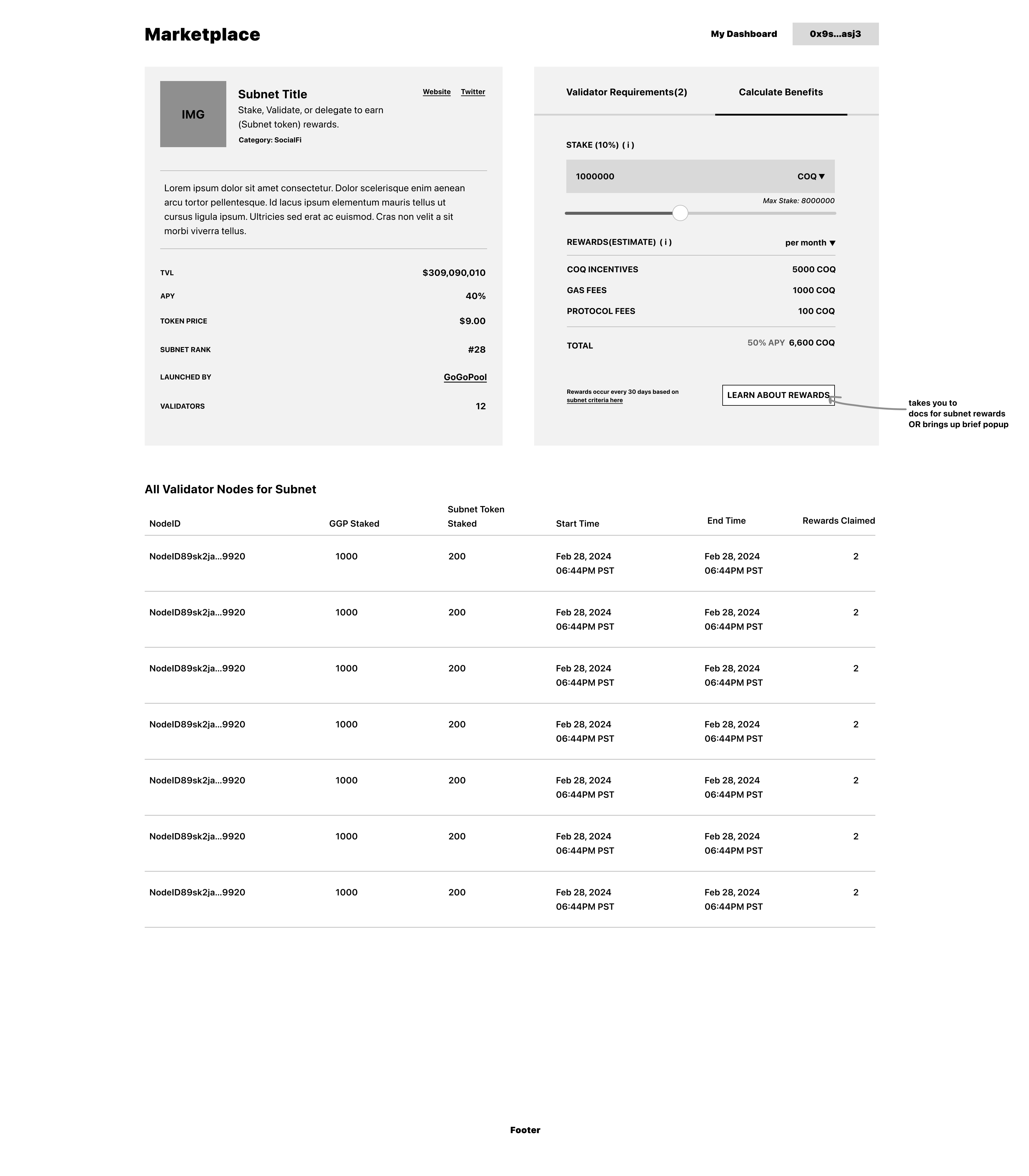
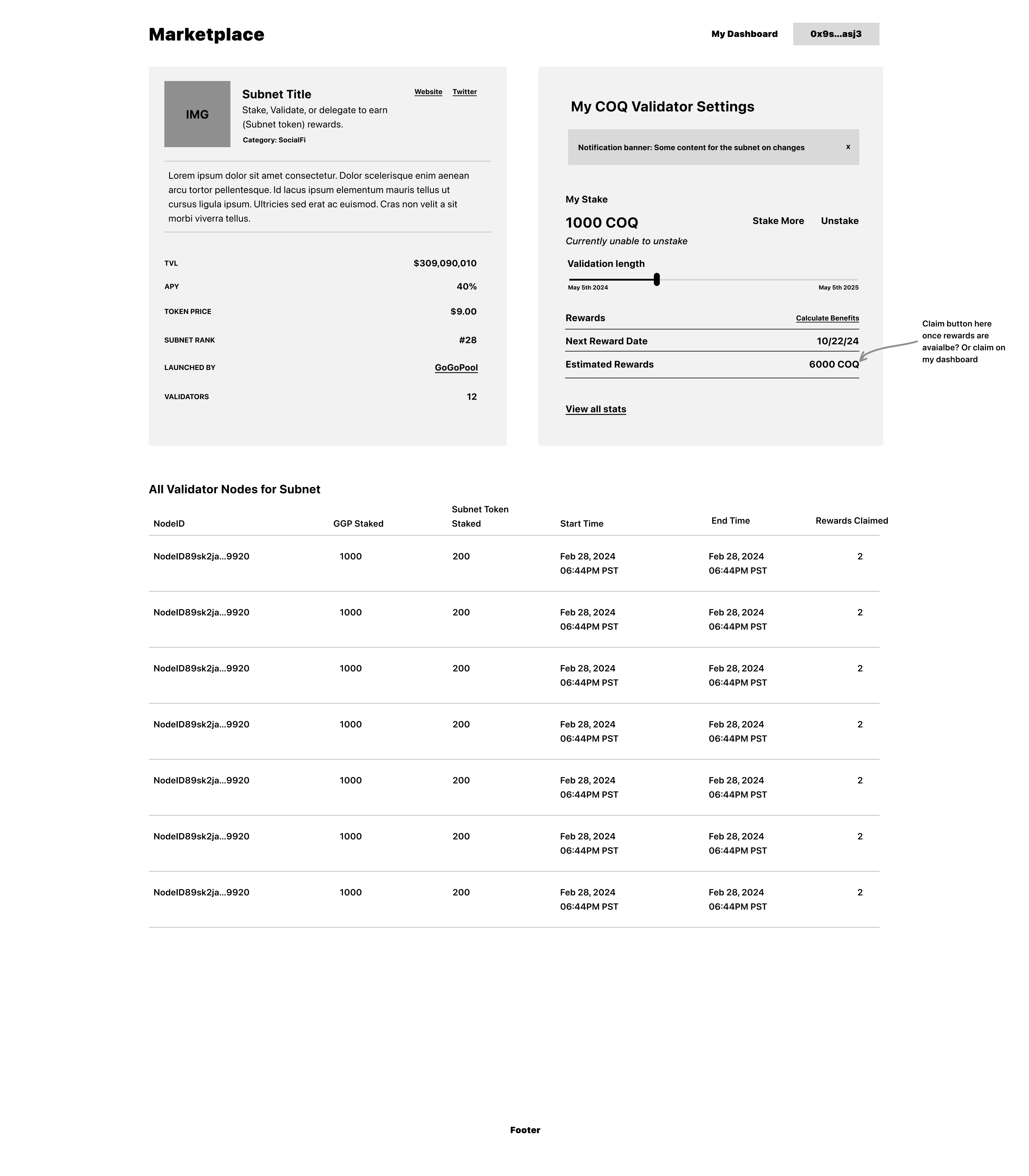
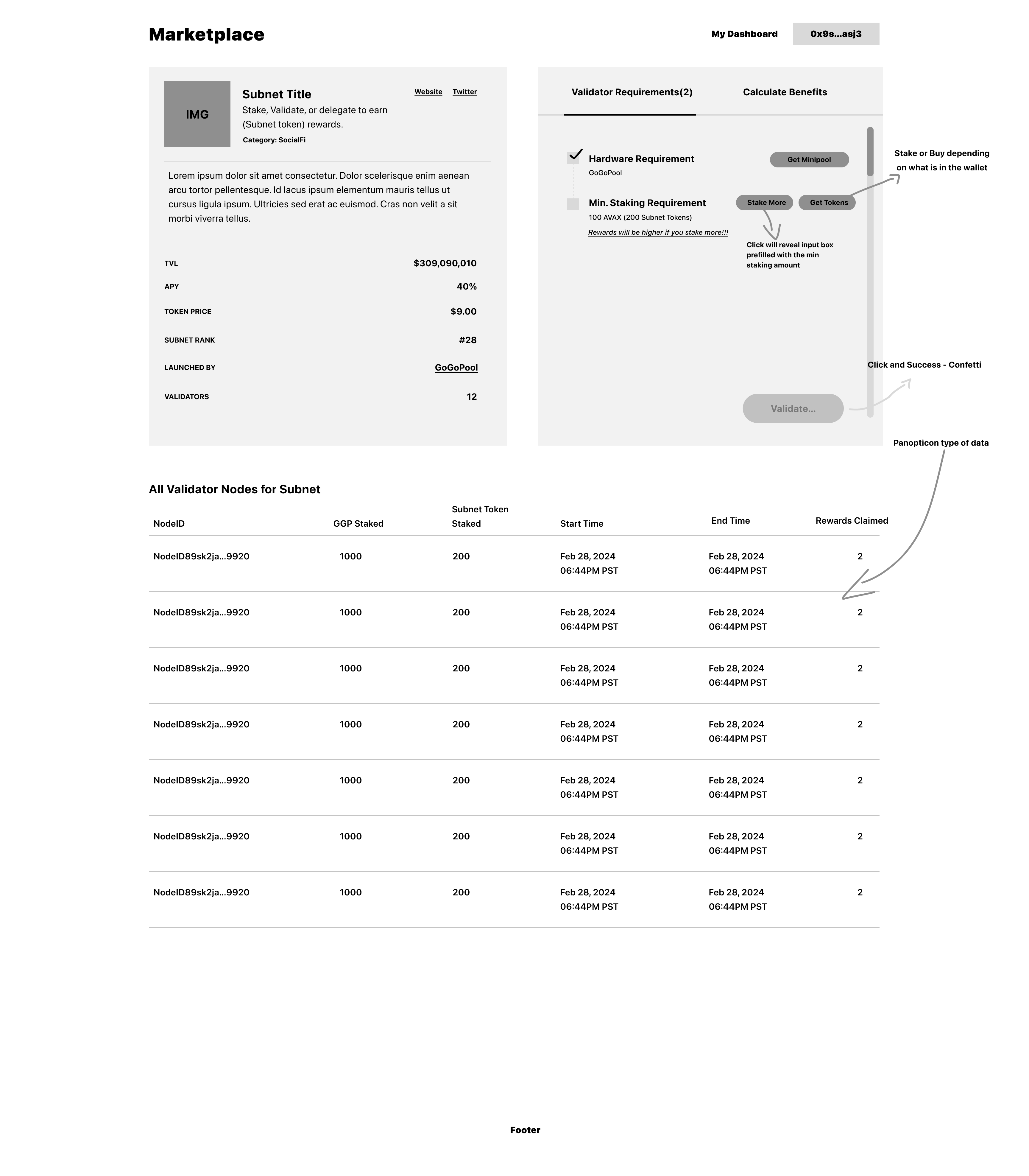
Subnet Detail Pages
When a validator finds a subnet they're interested in, the detail page becomes critical. This is where they make their final decision, so every piece of information needs to be clear and actionable.
The detail page structure includes:
- Hero section with key metrics and quick join action
- Requirements breakdown - What validators need to participate
- Reward structure - How earnings are calculated and distributed
- Network information - Technical details and subnet specifications

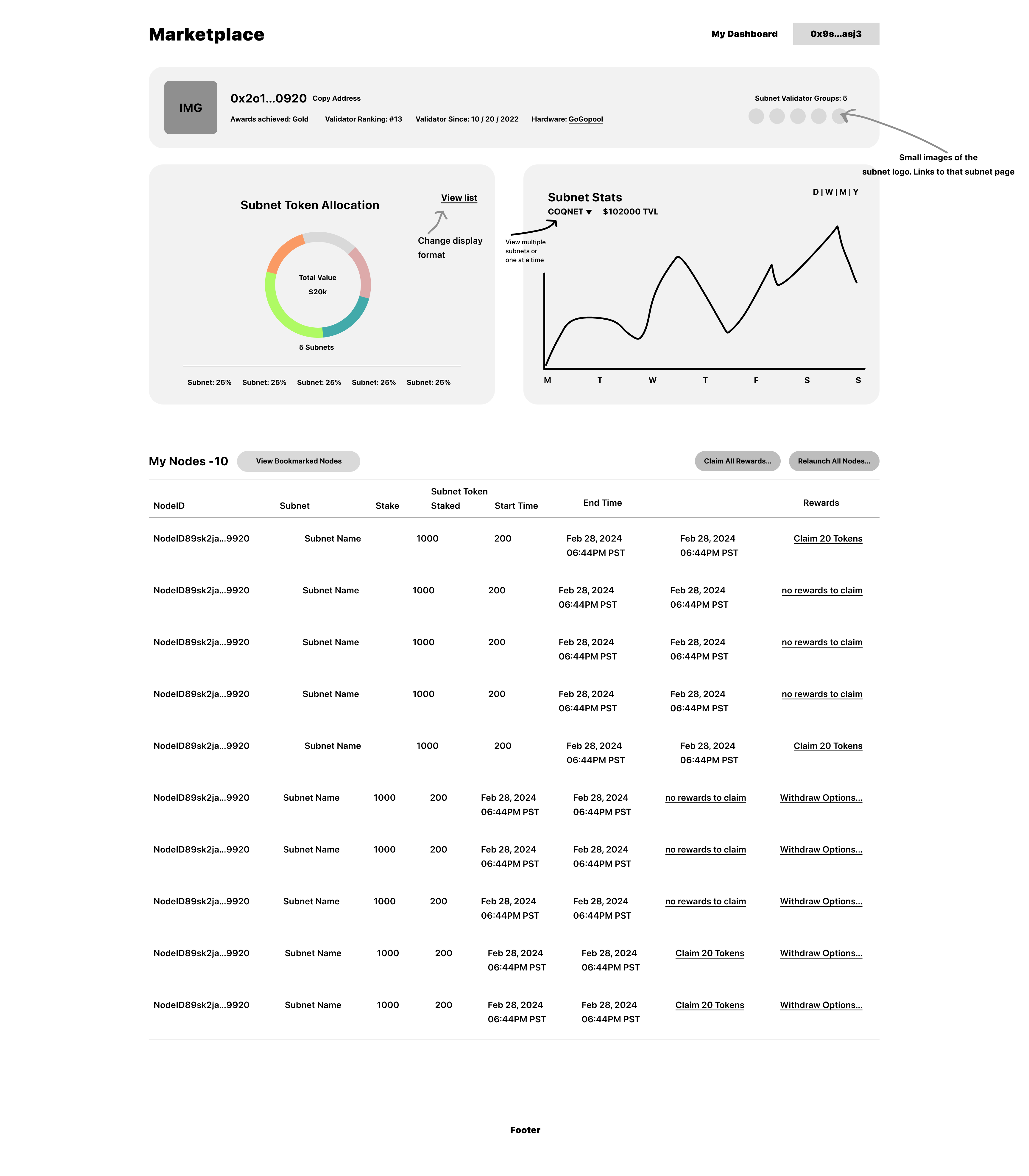
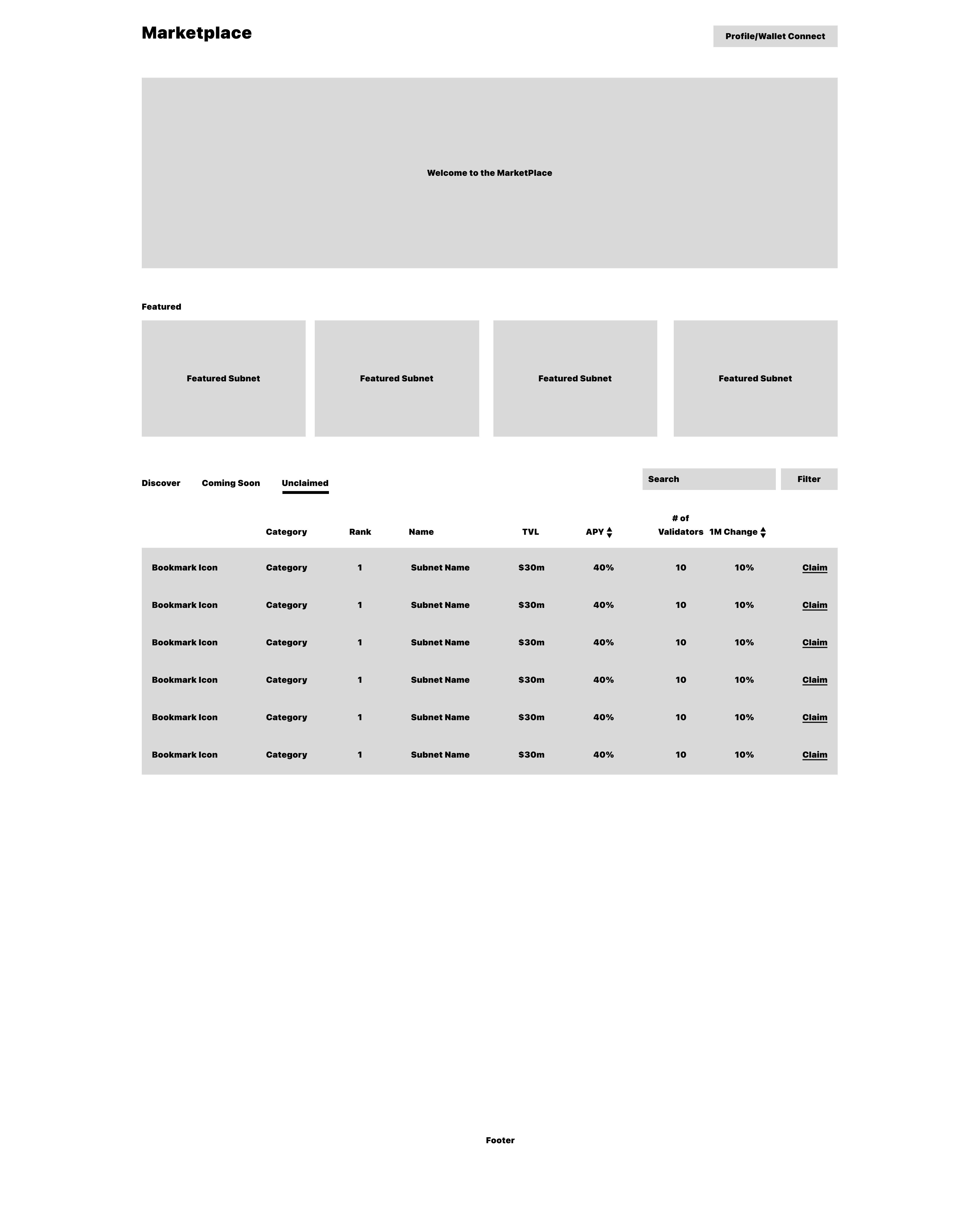
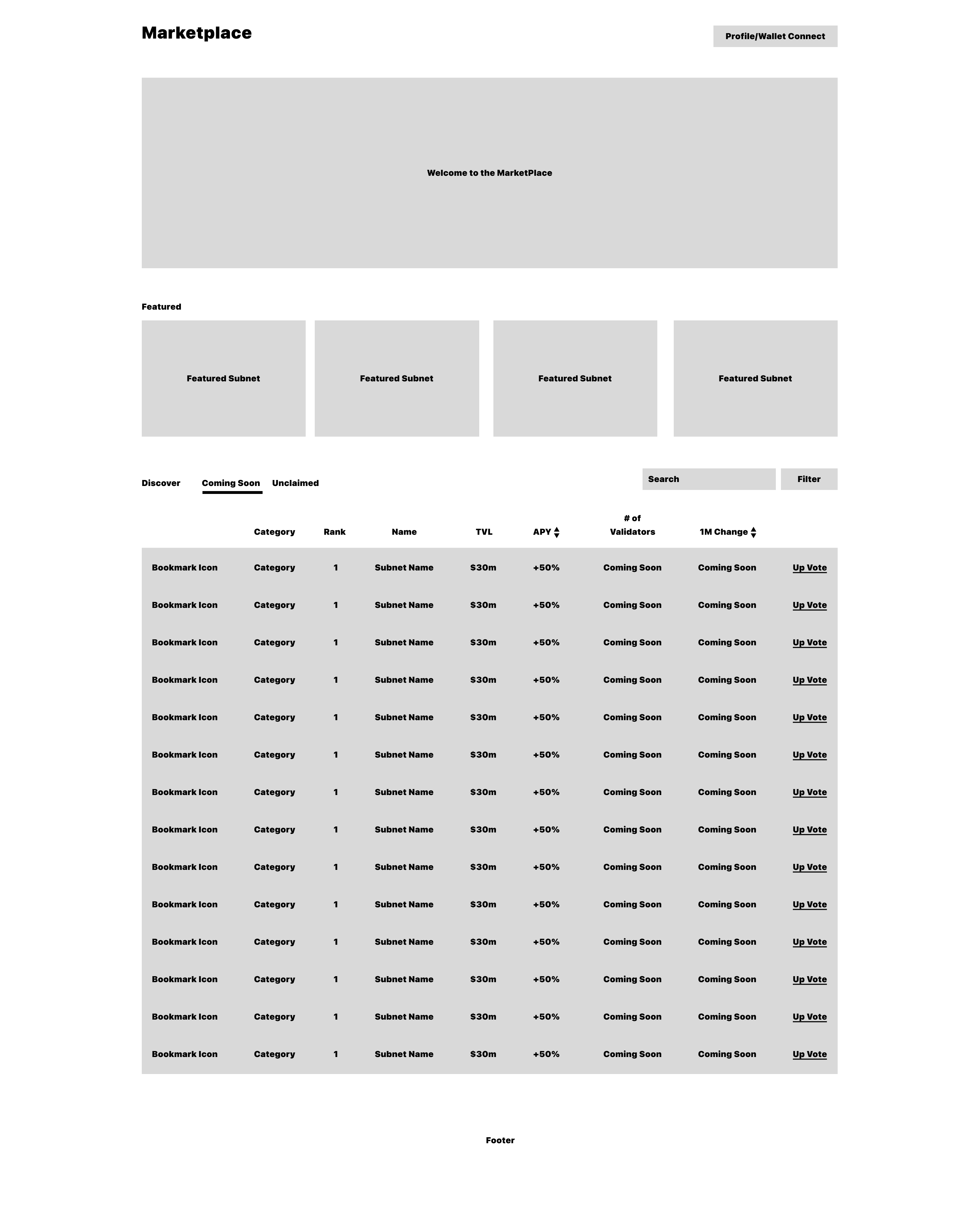
Dashboard Wireframes
The main dashboard serves as the central hub, providing validators with an overview of their entire marketplace experience.
The dashboard consolidates:
- Active subnet participations
- Pending opportunities
- Reward summaries
- Quick actions for common tasks
Subnet Management Views
For subnet creators, the interface needed to show their subnet's performance and validator status.
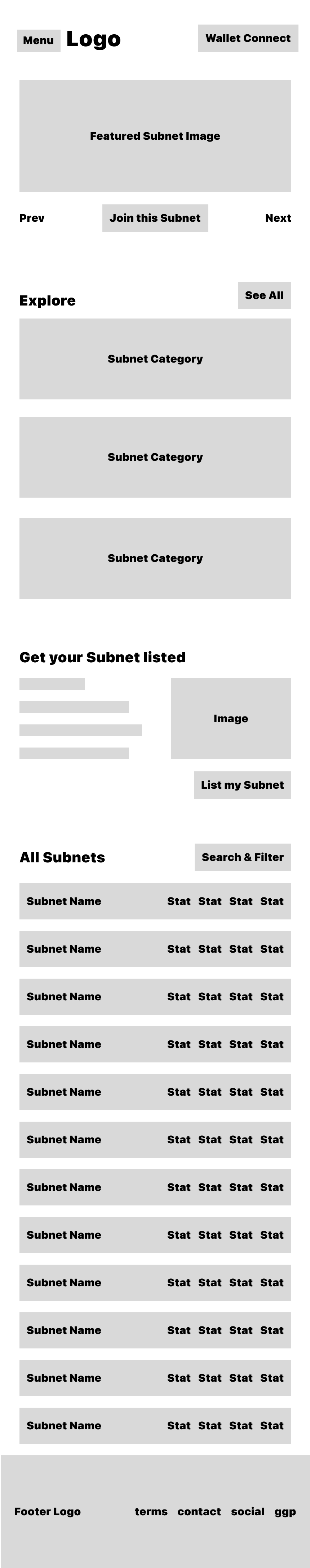
Layout Exploration
Early wireframes explored different layout approaches, testing how information hierarchy could guide users through the marketplace experience.
This layout emphasized a sidebar navigation with main content area, providing persistent access to key sections while allowing focused content viewing.
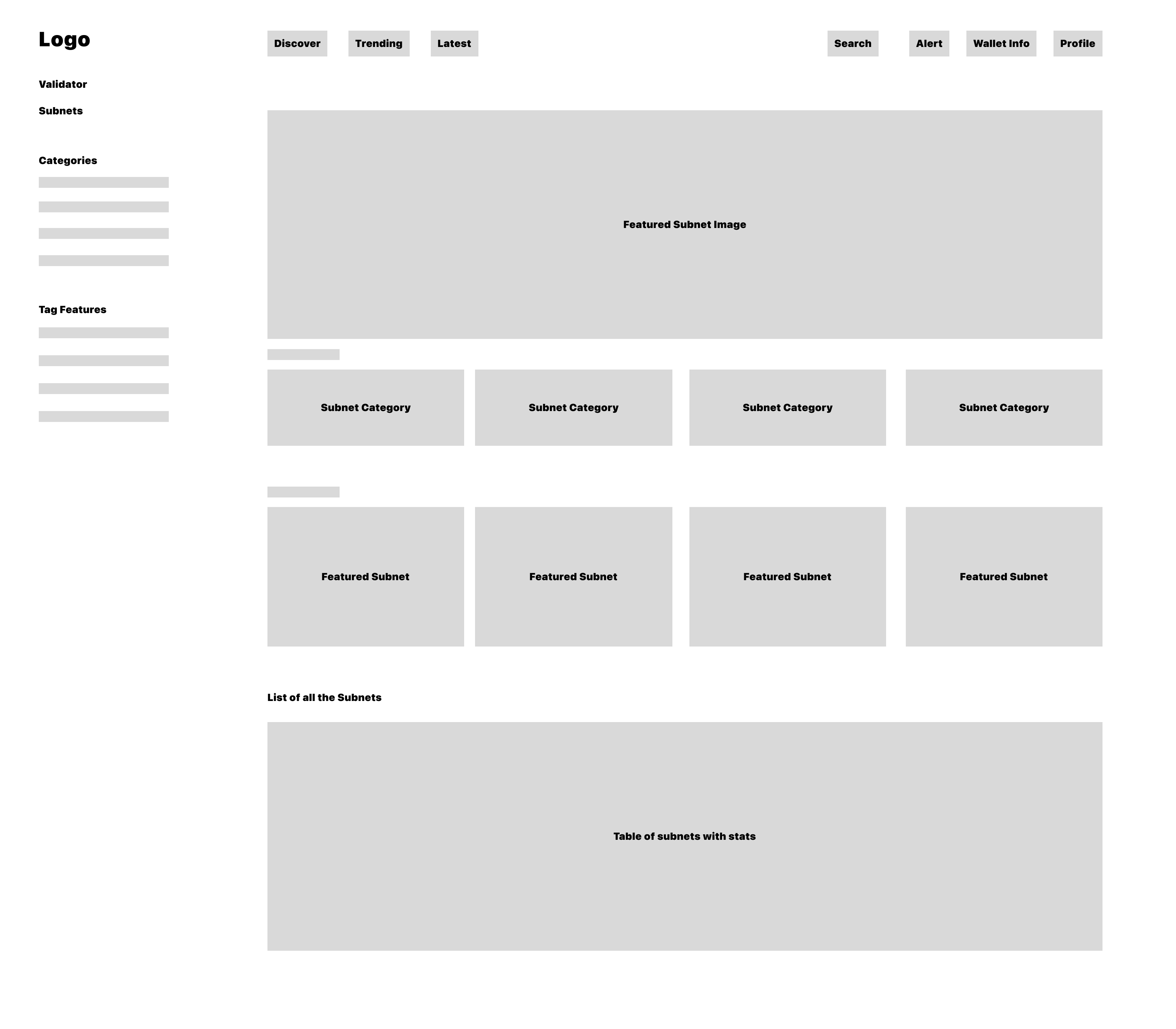
The second layout explored a top navigation approach with more horizontal space for content, better suited for comparing multiple subnets side-by-side.
Mobile Considerations
Mobile wireframes ensured the marketplace would be accessible on all devices, though the primary use case assumed desktop interaction.
Mobile design considerations:
- Simplified navigation for smaller screens
- Stacked card layouts for subnet listings
- Touch-friendly interaction targets
- Essential information prioritized
DApp Integration Views
The marketplace needed to integrate seamlessly with Web3 wallet interactions and on-chain operations.

These views handle:
- Wallet connection flows
- Transaction confirmation
- On-chain action status
- Error handling for failed transactions
Edge Cases & Special States
Designing for edge cases is crucial when building something new. We needed to handle states like unclaimed rewards, coming soon features, and empty states.
Design Principles
Throughout the design process, we adhered to several key principles:
1. Clarity Over Cleverness With no existing patterns to follow, we prioritized making the interface immediately understandable over innovative but confusing interactions.
2. Information Hierarchy Validators need to make important financial decisions. The interface guides them through information in order of importance: opportunity → requirements → rewards → commitment.
3. Progressive Disclosure Not all information is needed at once. We revealed details progressively, allowing validators to quickly scan and dive deeper when interested.
4. Trust & Transparency Given the financial implications, every design decision reinforced trust through clear communication of requirements, risks, and rewards.
5. Action-Oriented The interface is designed to guide validators toward action—whether that's joining a subnet, managing their validators, or exploring opportunities.
The Result
This marketplace represents a new category of Web3 interface—one that didn't exist before. By starting with user flows and wireframes, we were able to build a foundation that serves both validators and subnet creators effectively.
The wireframes shown here represent the foundational thinking that went into creating this first-of-its-kind marketplace. Every screen was designed with the understanding that we were creating patterns that others would eventually follow, making it crucial to get the fundamentals right.
Lessons Learned
Designing something completely new taught us several valuable lessons:
- Start with flows, not screens - Understanding the complete user journey before designing individual screens prevents gaps and inconsistencies
- Test assumptions early - Without existing patterns, every design decision is an assumption that needs validation
- Document everything - When creating new patterns, thorough documentation helps both the team and future users understand the system
- Embrace iteration - The first wireframes were far from perfect, but they provided a foundation for continuous improvement
The Layer 1 Marketplace for validators is now live, and these wireframes represent the thinking that made it possible. As the first interface of its kind, it sets a precedent for how validators and subnet creators can interact in the Avalanche ecosystem.