Hypha - Validator Registration UI
UI & UX
08/20/2025

Designing the Future of Validator Registration on Hypha
Check out the progress at Hypha
Running a validator should be empowering, not intimidating. At Hypha, we’ve been rethinking how users register and manage validators, focusing on clarity, accessibility, and a seamless staking experience.
This update brings a redesigned flow for registering a validator, with a sharper interface, streamlined decision points, and a design system that ties into the larger Hypha brand.
Starting with the Wireframe
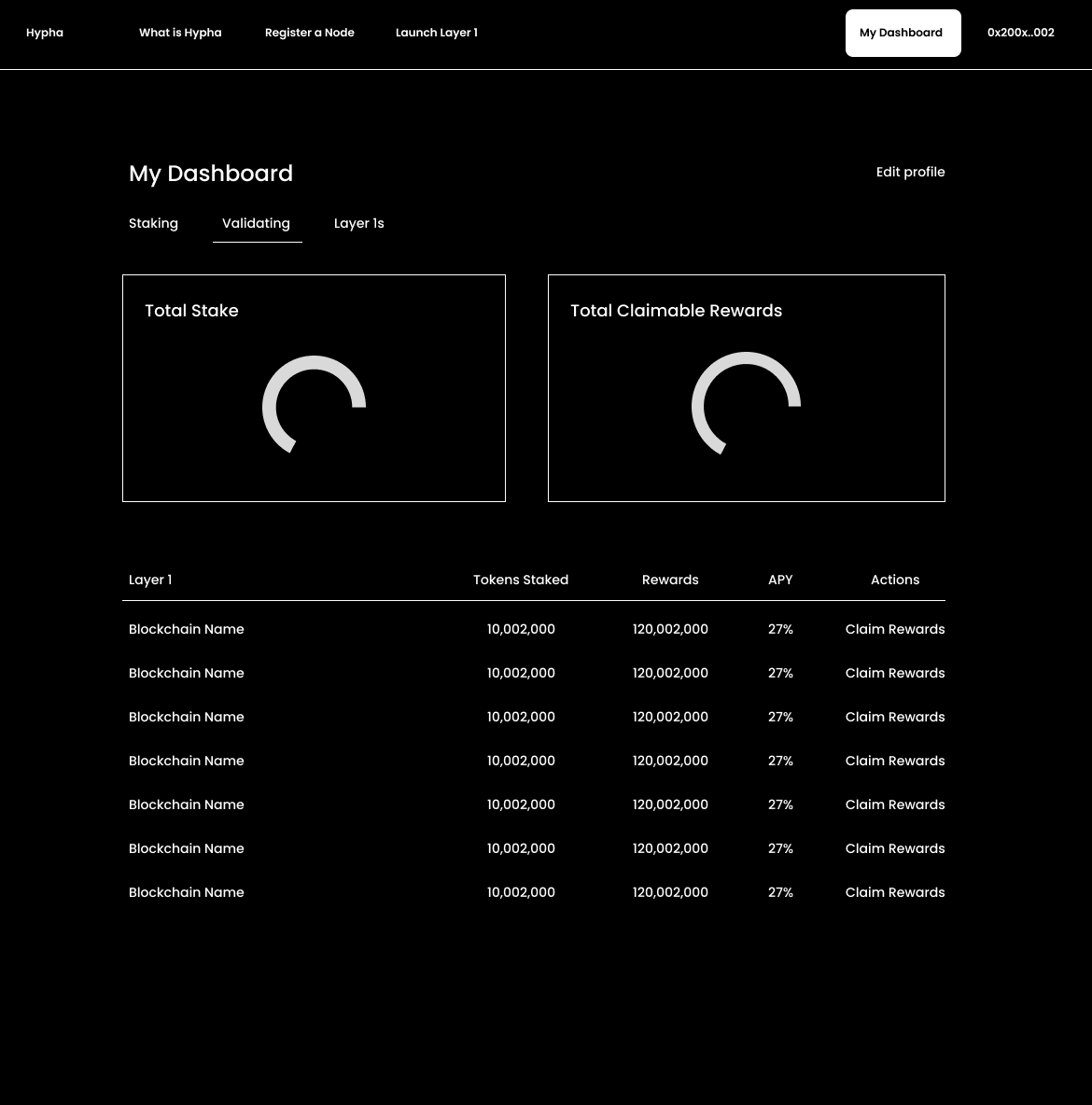
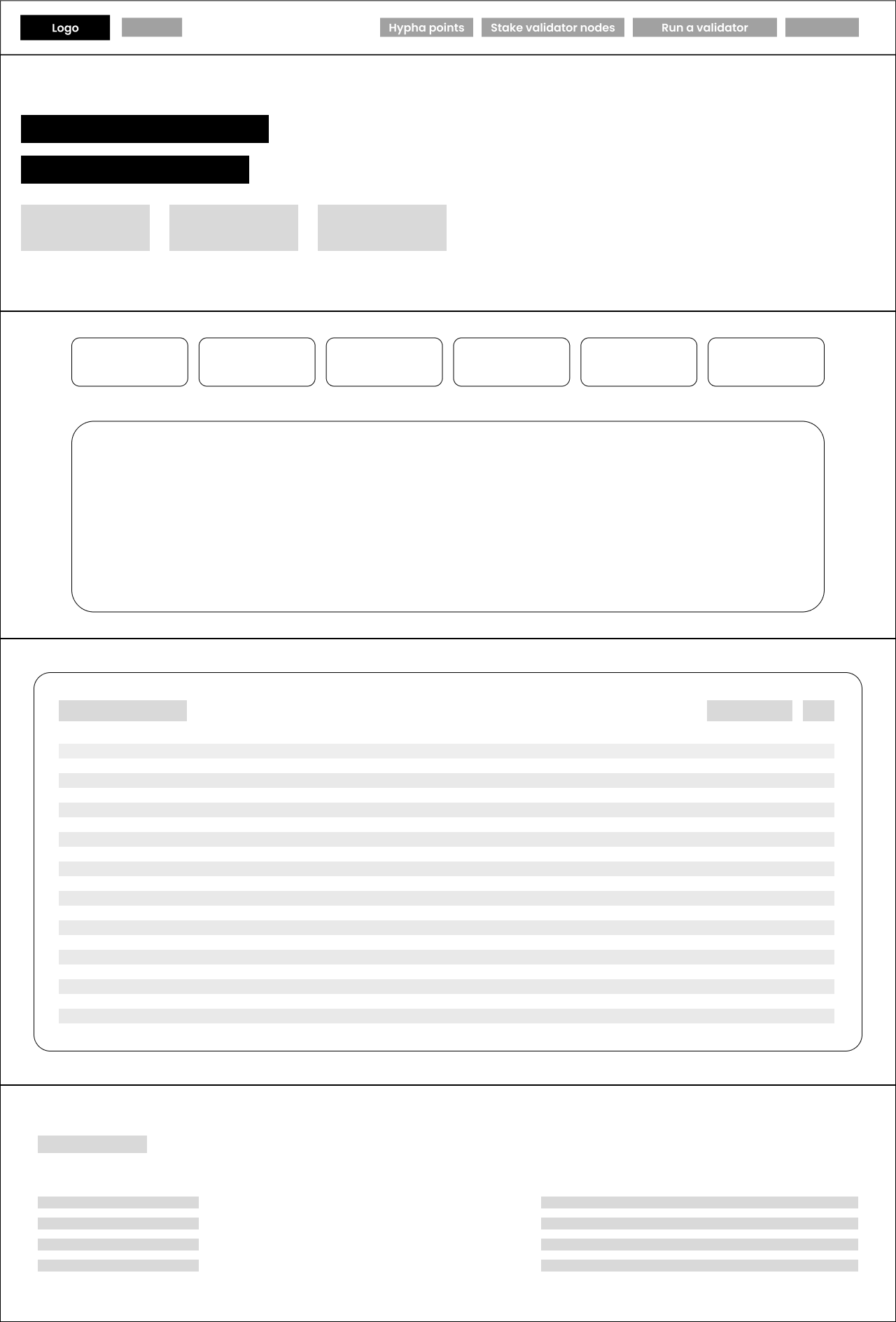
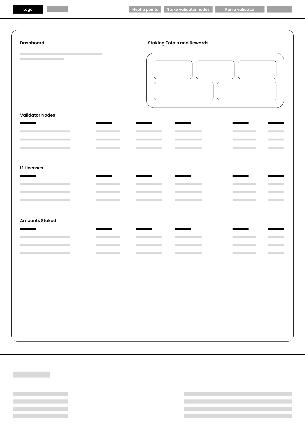
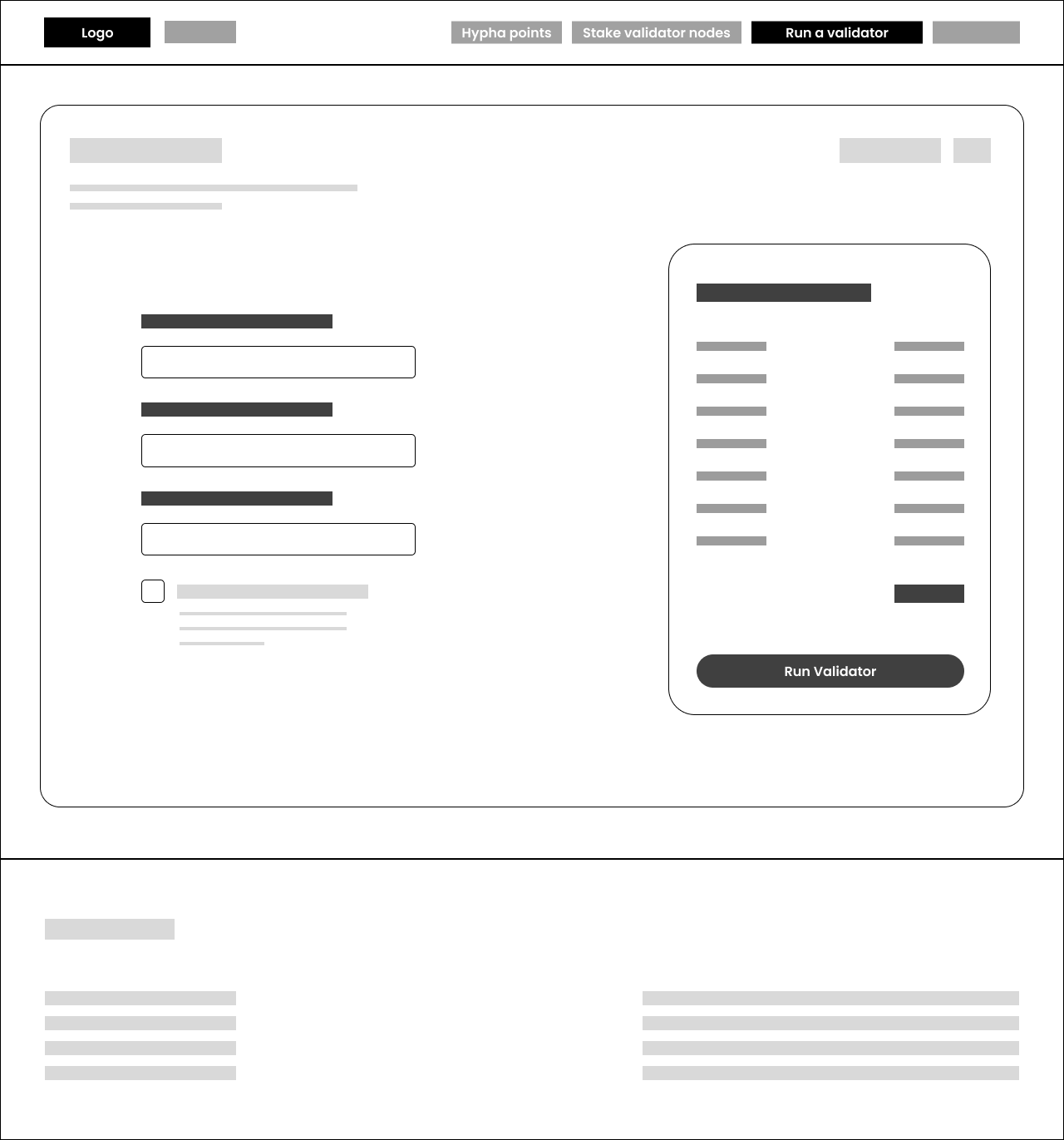
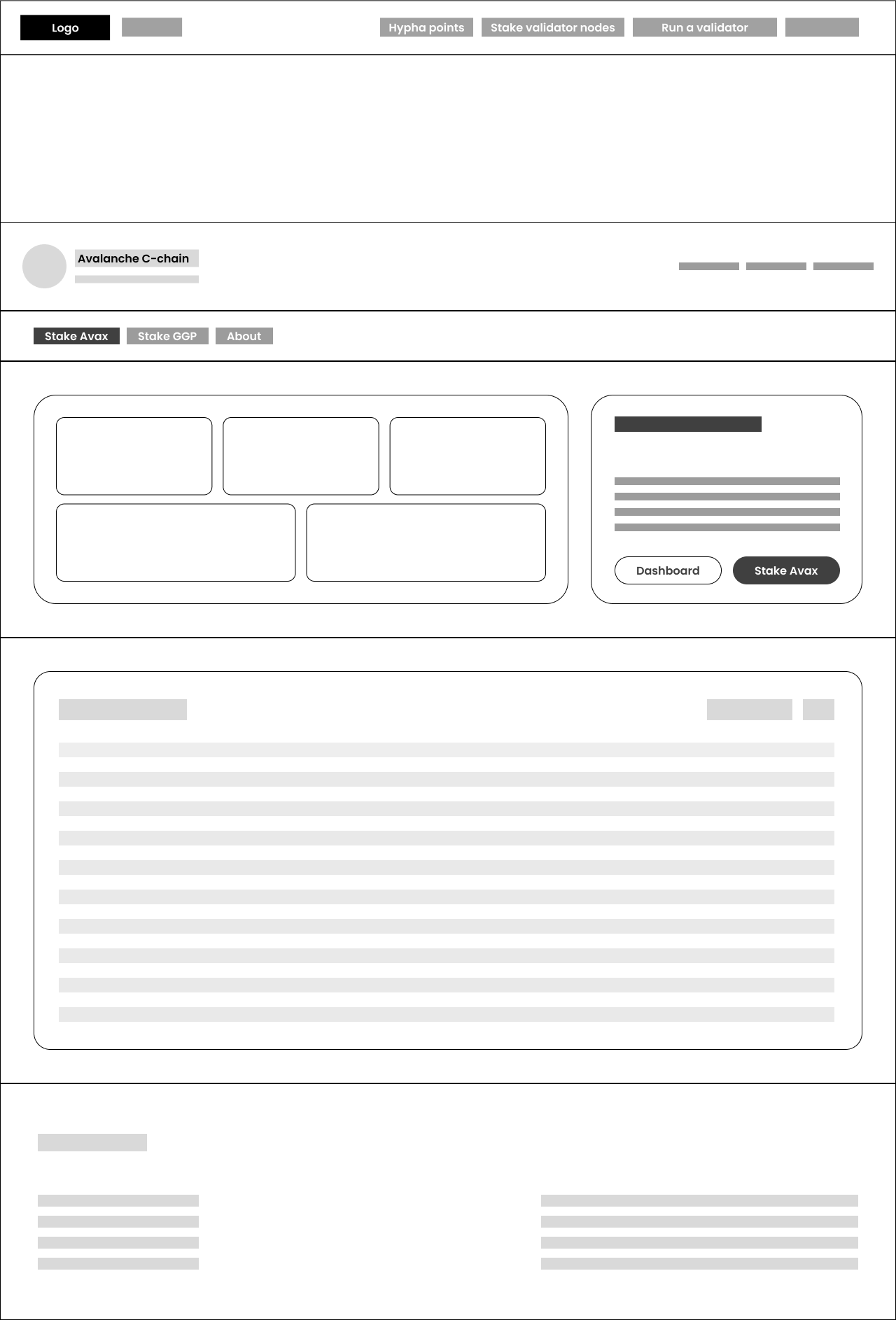
We began with a wireframe exploration (see image above). The goal at this stage wasn’t polish, but flow:
-
Navigation clarity – placing "Hypha Points," "Stake Validator Nodes," and "Run a Validator" in the top navigation so they’re always accessible.
-
Step simplification – breaking down the registration journey into distinct sections: stake amount, validation length, and summary.
-
Content hierarchy – ensuring the essentials (stake input, duration choice, cost summary) are never hidden behind secondary interactions.
Wireframing gave us the blueprint for where information should live, and how to minimize user hesitation.
Moving into Comps
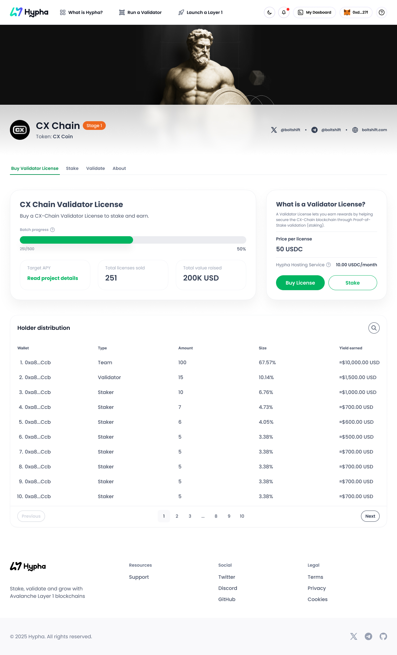
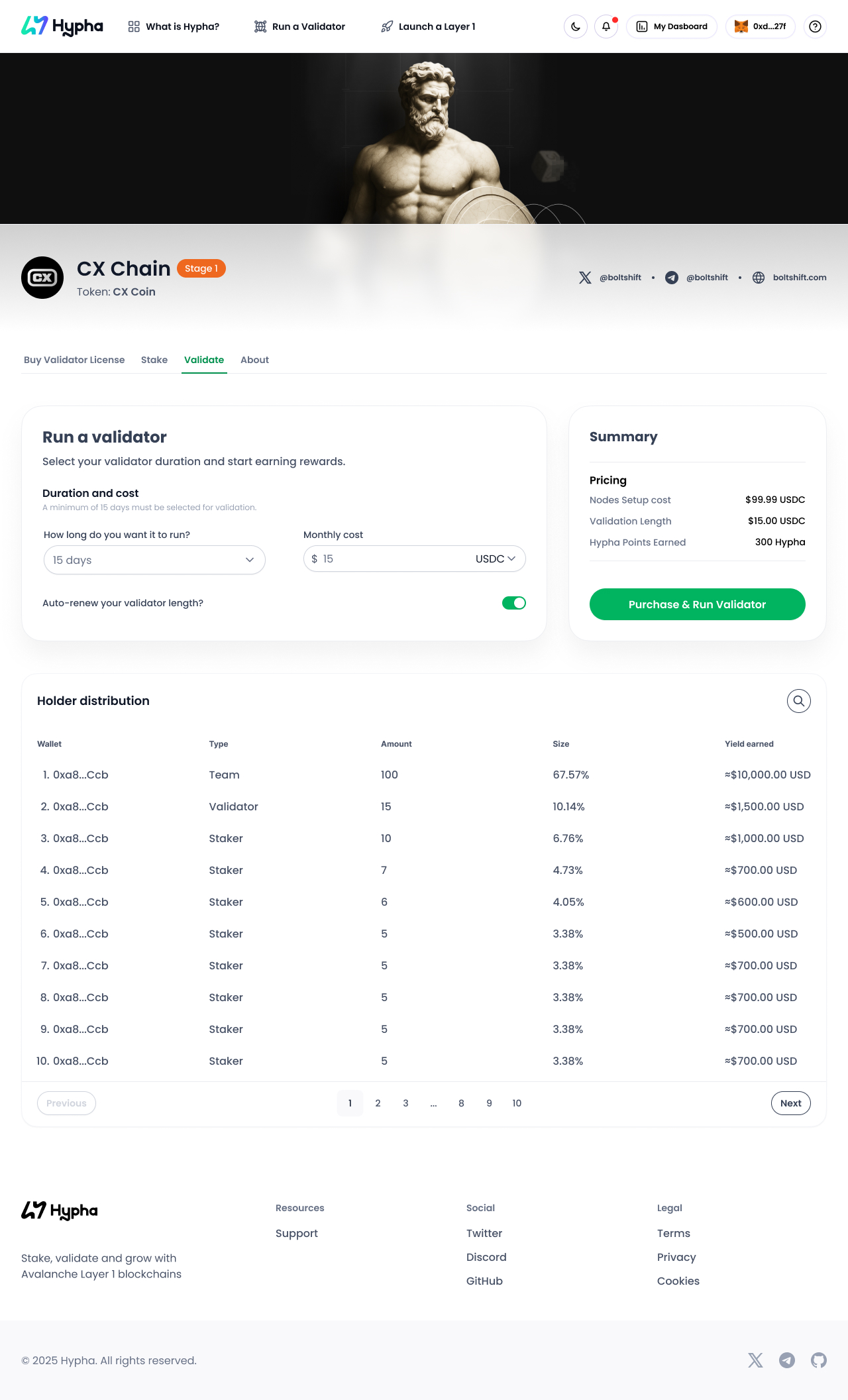
Next, we translated those sketches into high-fidelity comps. The design started to take on the Hypha identity — clean typography, rounded modular containers, and a balance of light neutrals with bold green CTAs for emphasis.
Some design priorities that shaped the comps:
-
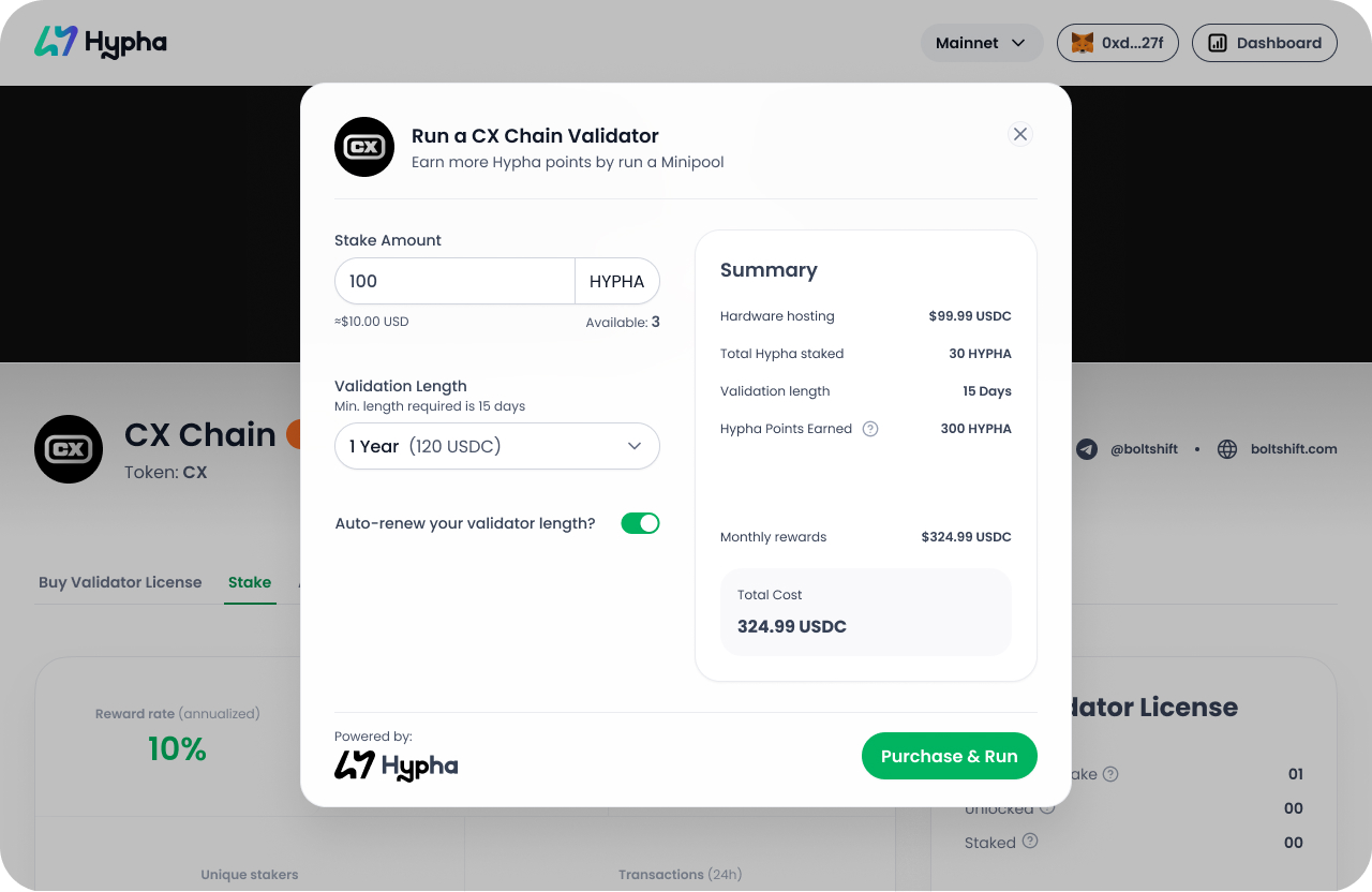
Transparency: Costs, rewards, and earned points are clearly surfaced in a “Summary” card so users don’t need to do mental math.
-
Guidance: Inputs like “Validation Length” come with constraints (e.g., minimum 15 days) and friendly defaults to guide user choices.
-
Trust cues: Powered-by-Hypha branding, familiar wallet integrations, and consistent button styles reinforce reliability.
The comps help visualize what the real experience feels like, turning abstract flow into tangible usability.
