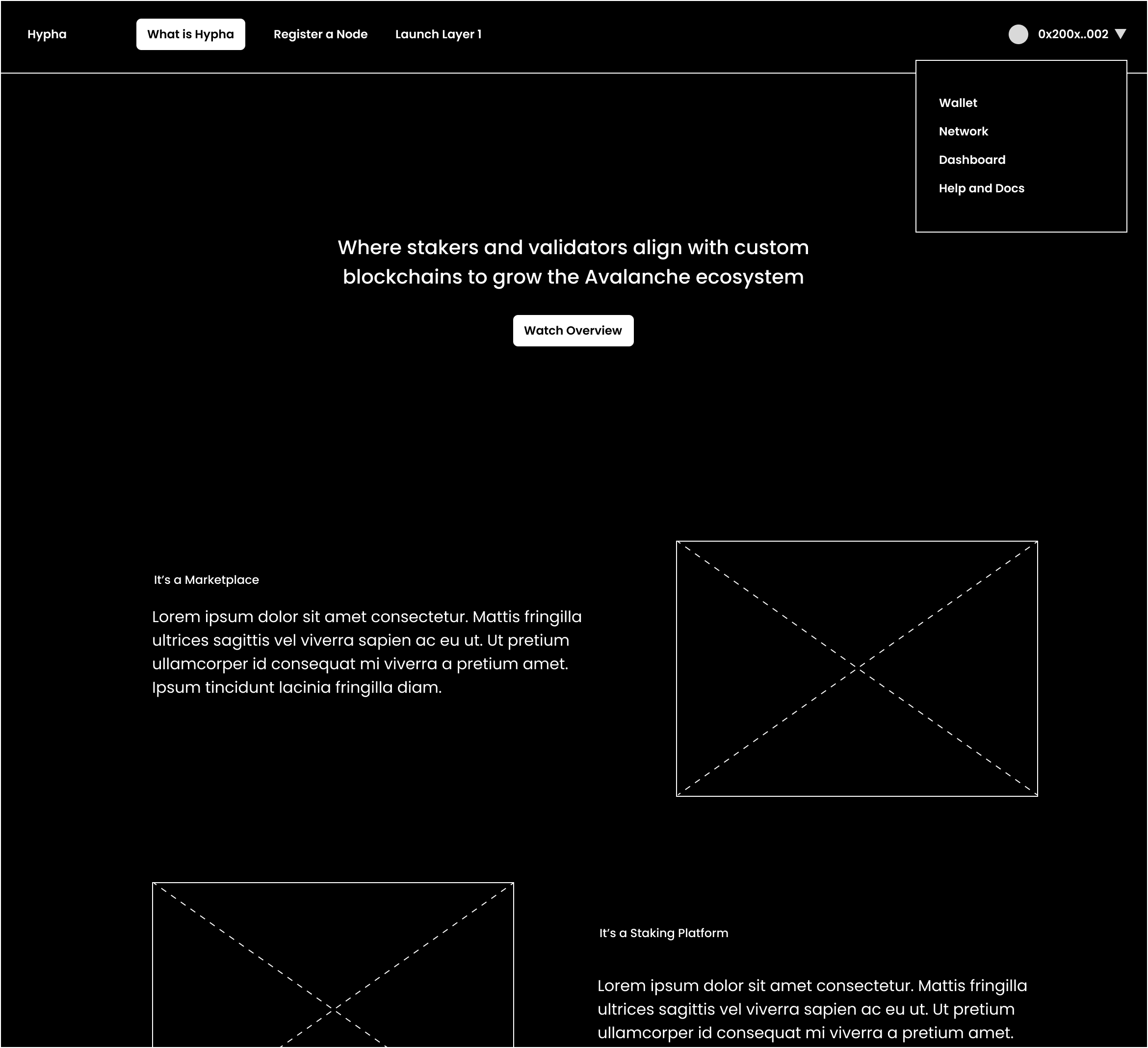
Landing Page Design - What is Hypha
case studies
03/02/2025

Overview
Hypha’s mission is to make Layer 1 blockchains permissionless and accessible. The landing page needed to not only explain a highly technical product but also build trust, inspire adoption, and visually capture the momentum of growth in the blockchain ecosystem.
My role as Lead & Founding Designer was to translate this complex story into a landing page that clearly communicates value, differentiates Hypha, and guides users toward action.
Challenge
Blockchain infrastructure is inherently technical and can be difficult for newcomers to understand. The landing page had to:
-
Explain Hypha’s purpose in plain language.
-
Show credibility by aligning with recognizable global brands.
-
Demonstrate token utility and its role in the ecosystem.
-
Convert visitors into engaged users, whether by reading the whitepaper, registering a node, or contacting sales.

Process
- Information Hierarchy
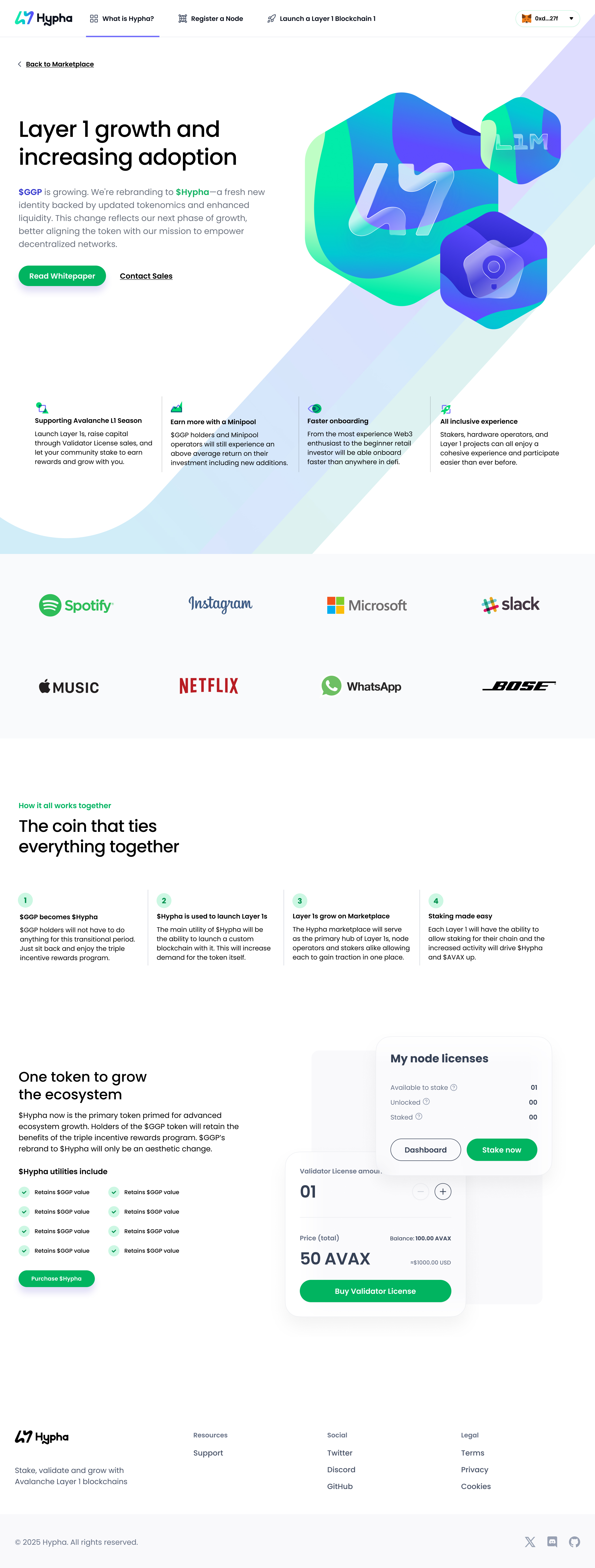
I structured the page with a clear storytelling flow:
-
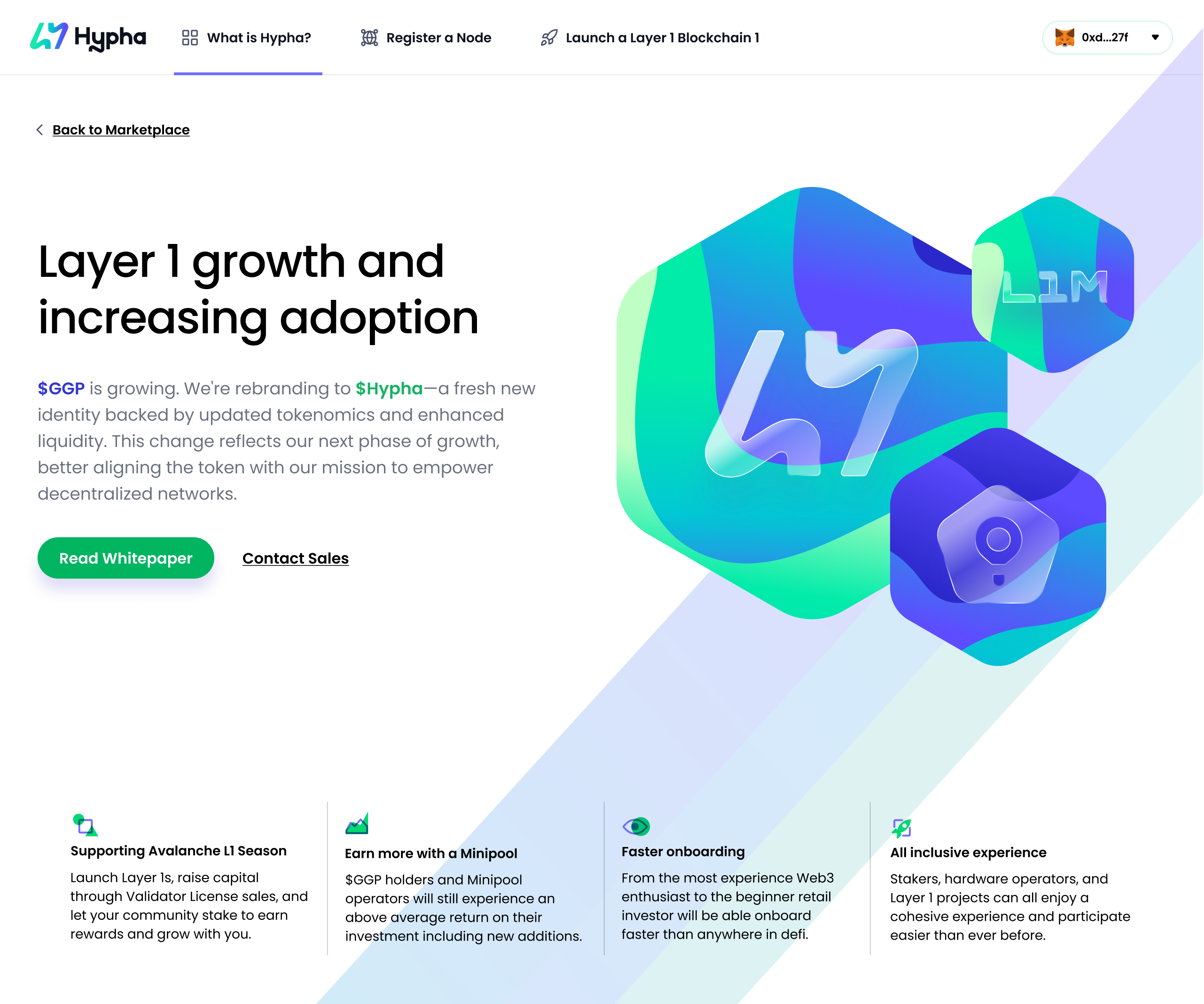
Hero Section – Bold headline (“Layer 1 growth and increasing adoption”) and visual 3D assets set the stage for innovation and growth. Clear CTAs (“Read Whitepaper” / “Contact Sales”) drive action.
-
Feature Highlights – A row of benefit cards explains Hypha’s key advantages: supporting Avalanche L1 Season, earning more with Minipools, faster onboarding, and an all-inclusive experience.
-
Social Proof – Logos from major tech companies (Spotify, Microsoft, Netflix, etc.) build trust and show ecosystem relevance.
-
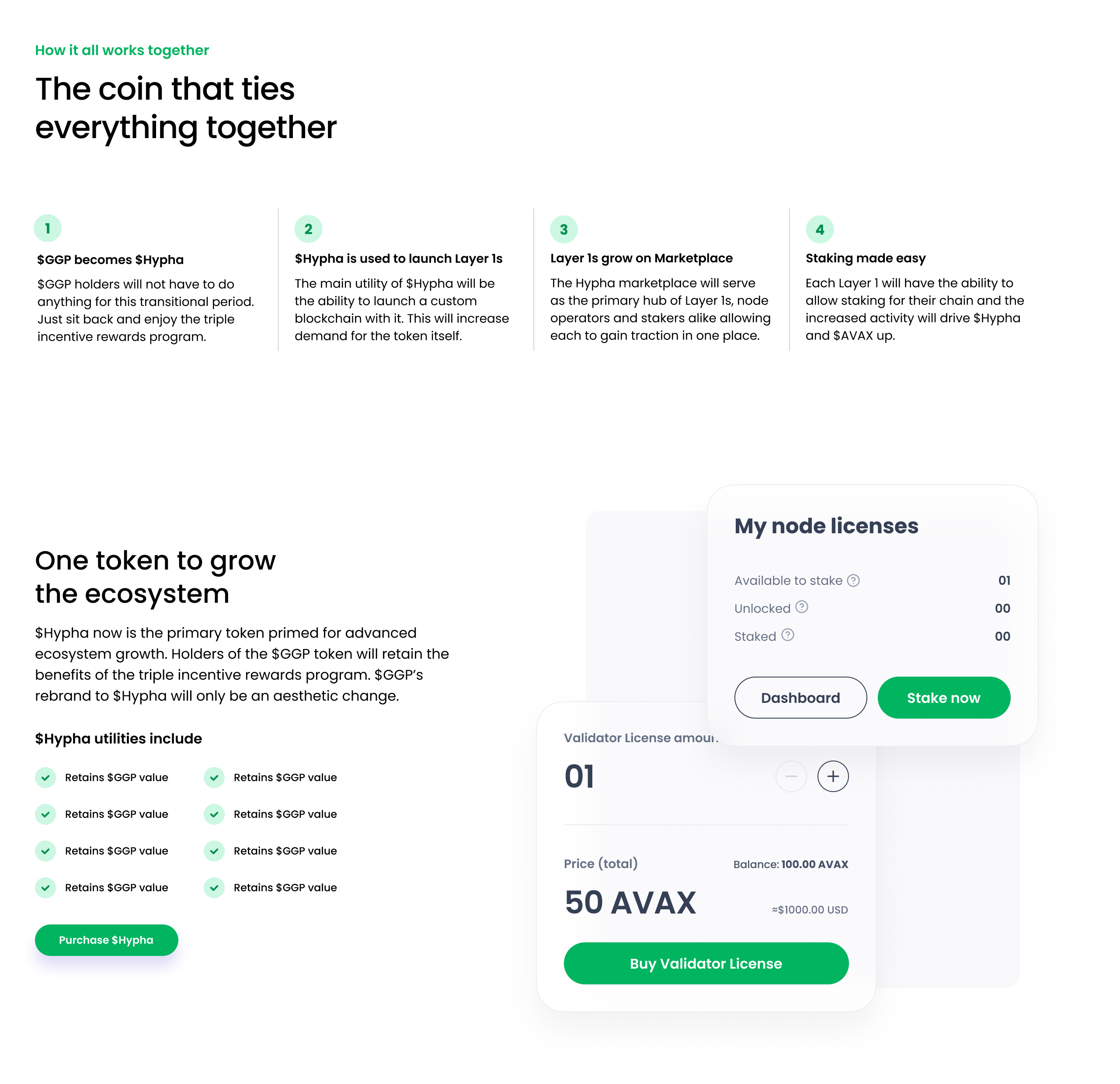
How It Works – A step-by-step breakdown simplifies complex token mechanics into four easy-to-digest points.
-
Ecosystem Growth – Additional visuals reinforce how Hypha ties everything together and scales with user participation.
- Visual Language
-
3D gradients & futuristic shapes → communicate innovation and scalability.
-
Clean typography & white space → balance technical credibility with approachability.
-
Iconography → used to translate blockchain concepts (staking, onboarding, licensing) into instantly understandable visuals.
- Guiding Actions
Every section pushes toward deeper engagement: from curiosity (hero headline) → trust (social proof) → understanding (how it works) → conversion (CTAs).


Outcome
The final brand identity established Awesome as bold, energetic, and scalable. The design system:
-
Works seamlessly across digital, social, and product applications.
-
Creates instant recognition through the iconic starburst/asterisk mark.
-
Reinforces the message of energy, momentum, and making it awesome.
-
The result is a brand that doesn’t just look good — it communicates a mindset.
